I have a lot of new material for you this weekend. Let me know what you think of it.
The GMI remains at +6 and the QQQQ up-trend is in its 23rd day. While we never can predict when a trend will end, we should not turn cautious now because of the longevity of the current rally. The great Jesse Livermore advised traders to hope when prices are rising, and to fear when prices fall. (Most persons, he said, do the opposite.) This is the season (and market) of hope. The QQQQ has closed above its 10 week average for five straight weeks. This is a sign of a strong market. In July, we had a six week rise like this, and in May, a six week sprint. Beginning in October, 04, we had a 13 week rise, and beginning in March, 03, we had a period when the QQQQ closed above its 10 week average for 44 of 47 weeks with only 2 consecutive weekly closes below the 10 week average! I (and I hope you) made good $$$$ during the 04 and 03 rises–these were a trend follower’s dream. So, we may be at the beginning of a multi-month rally or near the end of a short one. A weekly close of the QQQQ below its 10 week average will be a sign of potential weakening that I will watch for.
The GMI stands at +6, with all indicators positive. (The GMI components are explained in the favorite posts section to the lower right.) 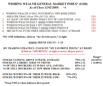 There were 187 successful 10 day new highs on Friday–stocks that hit a new high ten days earlier and closed higher on Friday than they did ten days before. Buying stocks at new highs has therefore been profitable. My favorite gurus all warned that when stocks breaking to new highs fail, it is an omen for the rest of the market. So I also heed this indicator. There were 314 new highs in my universe of 4,000 stocks and only 23 new lows. 51% of the Nasdaq 100 stocks rose on Friday, along with 49% of the S&P500 stocks and just 27% (8) of the Dow 30 stocks. 82% of the stocks that have doubled in the past year closed above their 30 day averages and 29% of all stocks are within 5% of their yearly highs. Only 7% of the stocks in my universe are within 5% of a new low.
As of the close on Friday, 65% of stocks are in a short term up-trend (10 day average above a rising 30 day average) and 73% are above their 10 week averages. 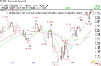 This chart shows how these two indicators relate to key recent turning points in the S&P 500. (Click on the chart to enlarge it.) The black numbers are the percentage of all stocks that day that closed above their 10 week average, and the red numbers are the percentage of stocks in a short term up-trend. Thus, at Point A near the top at the end of July, 81% of stocks closed above their 10 week averages and 57% were in a short term up-trend. (I was on vacation then and did not compute the stats at the actual top in early August .) The two indicators rose and fell together along with the S&P 500. However, I noticed one divergence. After the October bottom at Point G, the S&P 500 index rallied to Point H and both of my indicators rose. However, at the retest of the bottom at Point I, the percentage of stocks above the 10 week average declined from 36% to 24% while the percentage of stocks in a short term up-trend actually rose (consistently each day) from 14% to 22%. This divergence of the short term trend indicator from the longer term indicator using the 10 week average, may be a significant signal to watch for at future market tops and bottoms. Currently, both indicators have been rising together. The percentage of stocks above their 10 week average on Friday is still well below the percentage at the July top (73% vs. 81%) although the short term up-trend indicator is above that at the July top (65% vs. 57%). The bottom line is that we should pay attention to the consistency of both of these indicators as I post them each night……………
While the five indexes monitored in the WPM are strong, there was some indication of weakness in the Dow 30 index last week. 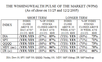 All five indexes again closed above their 30 day and 30 week moving averages. However, since last week there has been a decline in the percentage of the Dow 30 component stocks that closed above their 30 day and 30 week averages. For example, 73% of the Dow 30 stocks closed above their 30 week averages, compared with 80% last week. It is too early to tell whether this decline is meaningful. Moreover, the Dow 30 and QQQQ are the indexes with the most component stocks (73%) above their 30 week averages………………………………..
As you know, I concentrate on trading growth stocks. But the technical pattern of MCD that I noticed a few weeks ago was just too compelling for me to ignore. So, I went for junk food! 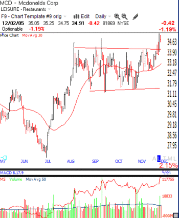 As this daily chart of MCD shows, the stock rose in July and early August and then consolidated sideways for about three months. I noticed that the stock bounced off of the resistance line again (top red line) in November and then held at its 30 day moving average (red line), instead of returning to the lower support (red) line. So, when MCD broke out Thursday on unusually high volume, I bought. Notice that the red line in the volume section is at a new peak. This is a Worden Brothers modification of on-balance volume and rises as up volume increases over down -volume. MCD is at a five year high, so I feel a little better about buying it. On Friday it closed lower on reduced volume. If it trades below Thursday’s low I will consider selling–it should not trade below the break-out point. The chart tells all! Notice the green spikes of up volume over the past few months. Well, today Barron’s reported that a hot shot investor is accumulating MCD. But let’s not get attached to "the story." The chart will tell us how to respond…………
Years ago I ran a scan of the market to find stocks that appear to be reversing their long term trend. I found an unknown stock (to me) called Enron and shorted it. I also found CPN the same way. So, I ran the scan today and guess what I came up with——JNJ! 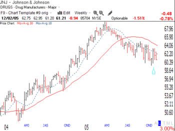 I have no idea what is happening at the company, but healthy stocks do not look like this. Note the reversing 30 week average (red line) and that the 10 week average (dotted line) is below the 30 week average. Maybe the stock will hold up. But if I were betting on it, and I am not–I would say that as long as the stock stays below the recent bounce of $63.78 it is in an ominous down trend–especially if it falls below $60. Let’s watch JNJ and see if some foreboding corporate developments surface, a la Enron and CPN……………..
NOTE: A NEW SECTION TO THE BOTTOM RIGHT PROVIDES LINKS TO MY FAVORITE PRIOR POSTS. THESE INCLUDE MY STRATEGY POSTS, DEFINITIONS OF THE GMI COMPONENTS, AND MY ANALYSIS OF WHY THE TRADING TECHNIQUES OF THE GREAT NICOLAS DARVAS WORK BEST DURING BULL MARKETS AT ALL-TIME HIGHS.
How have you used this site to inform your trading? Can you send me some experiences I can post for others (anonymously, with your prior permission)? Please send your pearls of Wishdom to me at: silentknight@wishingwealthblog.com.
 There were 359 new highs on Tuesday, the highest since July 20. The fact that the market closed off the highs of the day is troubling, but not enough to change the current outlook. Tuesday was the 25th day of the current up-trend. Between 53%-63% of the Nasdaq 100, S&P 500 and Dow 30 stocks advanced on Tuesday. Check out my discussion of JNJ as a sick stock posted on Saturday if you missed it. It’s all in the chart!


