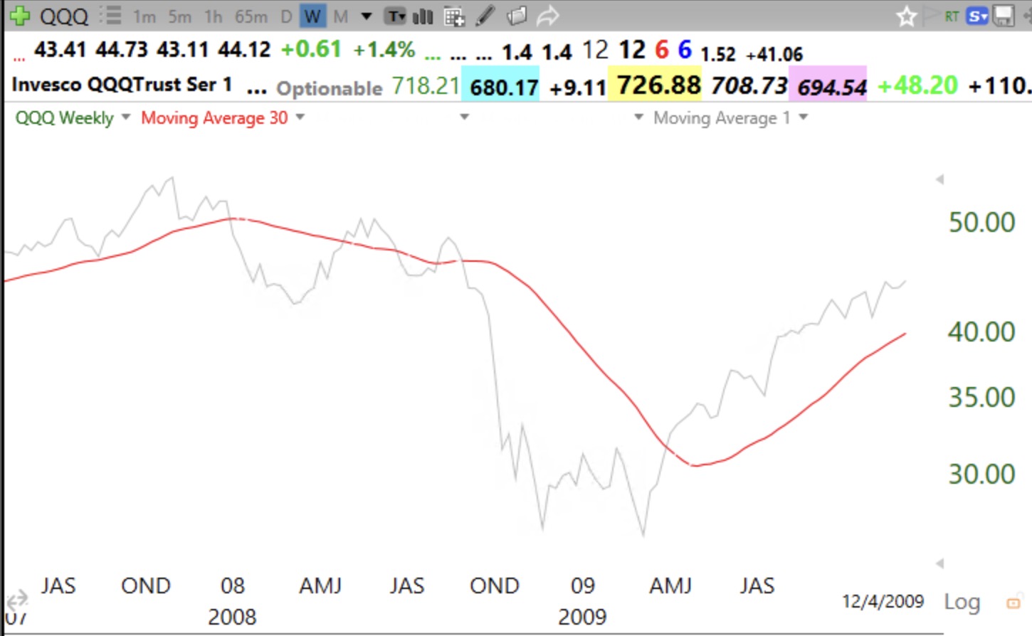
The media pundits who say that the markets now look like the 2002 or 2008 tops don’t understand technical analysis. Outside of the one day in October, 1987 when there was a 20% drop, significant market tops take time to develop. Yesterday’s post showed the 2000 market top and the contrasting current benign weekly chart pattern for QQQ. This weekly chart shows why I exited before the 2008 decline. When the gray line, showing weekly closes, declines below the 30 week average, I get defensive. When the 30 week average actually turns down, I exit completely. (If you understand moving averages, you understand that when the 30 week average declines it means the latest week’s value being included must be less than the 31st average back being dropped. That is a big drop.) After a major market decline, I reenter when the index is closing back above the 30 week average and the average has turned up. It saved me a lot of $$$. If you like posts like this, please give me a like.
Thank You Dr. Wish. Very helpful.
Any chance you show a chart(s) of recent GLG or Blue dots?
Thanks, Rick
30 week also turned down in the April 2025 Tariff tantrum. How did you navigate that ?
Thank you! You said “please give me a like.” I like! Did you mean here or somewhere else to like?
This is a great chart. Thank you.
Do I want to look smart or do I want to make money.
Wishing Wealth has the right answers.
Thank You Dr. Wish!
Thanks Dr. Wish, love your methods. I will be using this Wishing Wealth as a foundation in teaching my daughter soon. Hope you continue work on what promises to be a great course with some of your former students. If you have another blog where you post your routines on diet and exercise it would be nice to know. Thanks. I like timely information and it is so timely.