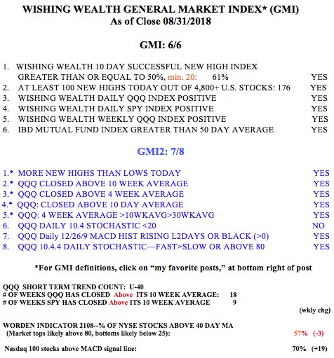
AAPL hit an all-time high of $233.47 on October 3, 2018. After that high was not exceeded for 3 months, I drew in a green line, designating a green line top. I could then set an alert on TC2000 to alert me when AAPL traded above the green line. It had a green line break-out (GLB) one year later on October 11, 2019. Note the above average trading volume that day confirming the break-out. AAPL has now advanced +12.5% since the GLB. Note that after the GLB, AAPL re-tested the green line for a few days, a common occurrence. If it had CLOSED back below the green line, I would have sold my position. I would then have repurchased it if it retook the green line. I have found that the GLB strategy works really well for me in a strong market. The idea is to buy a stock that has advanced to an all-time high, then rested for 3 months or more and subsequently closes above the green line on above average trading volume. The fabulously successful trader, Nicolas Darvas, concentrated on buying stocks breaking to all-time highs during a rising market. Every person should read his book, How I made…listed below. (It is the first book I require my students to read.)
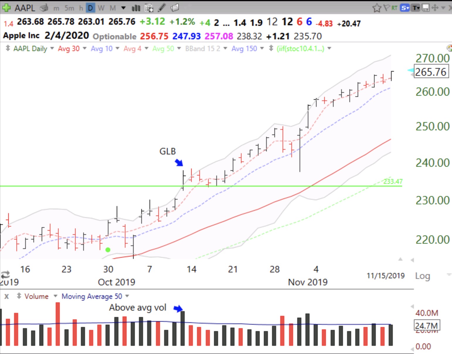
Note that during the time of the GLB and for weeks before, AAPL had been in a nice daily RWB up-trend.
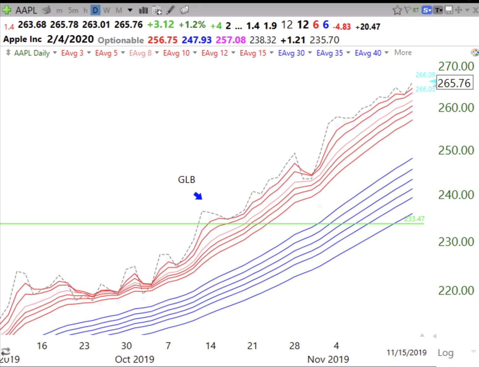
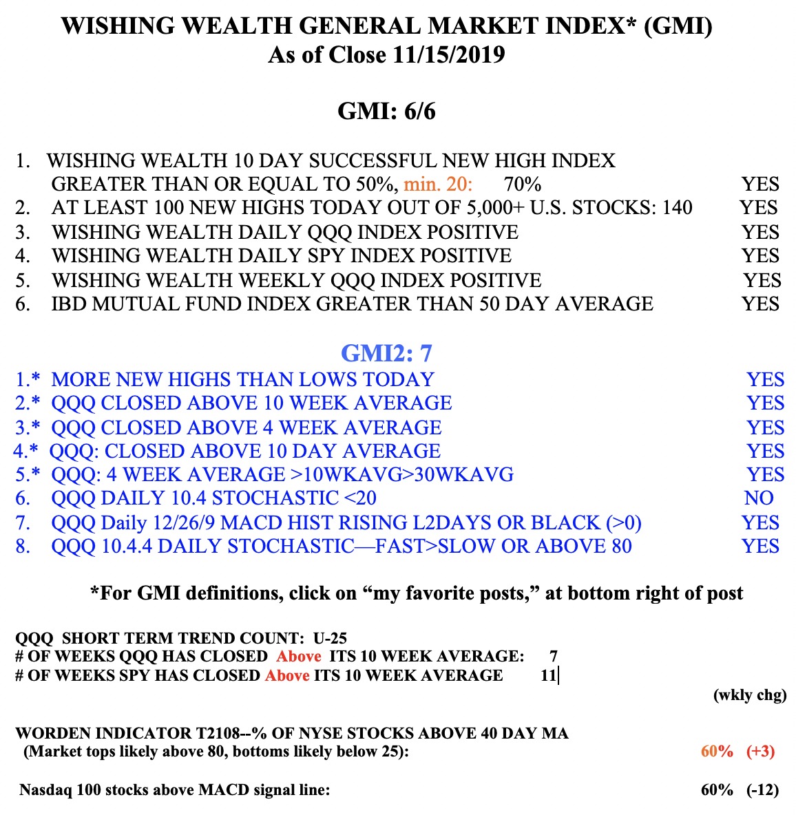
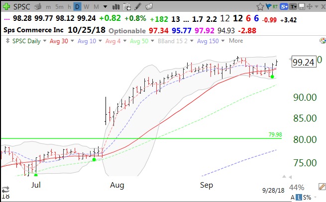
GMI remains at 6 (of 6).