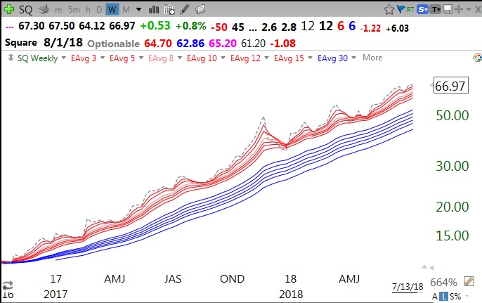
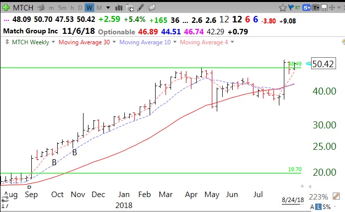
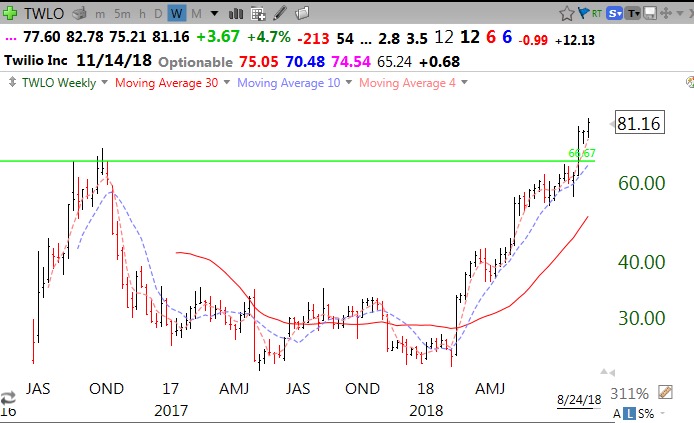
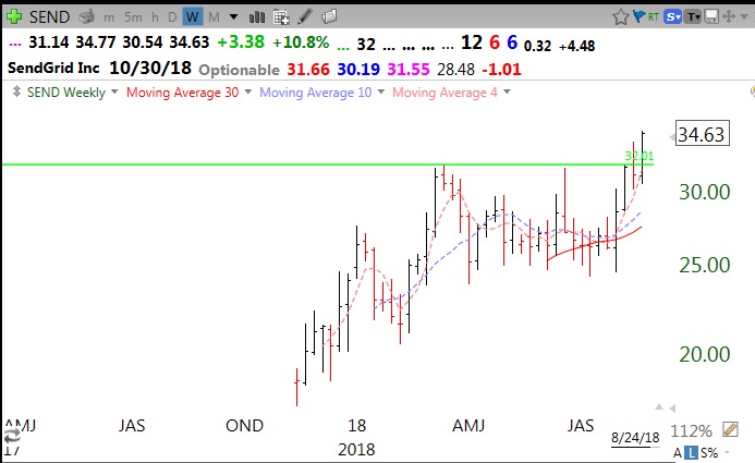
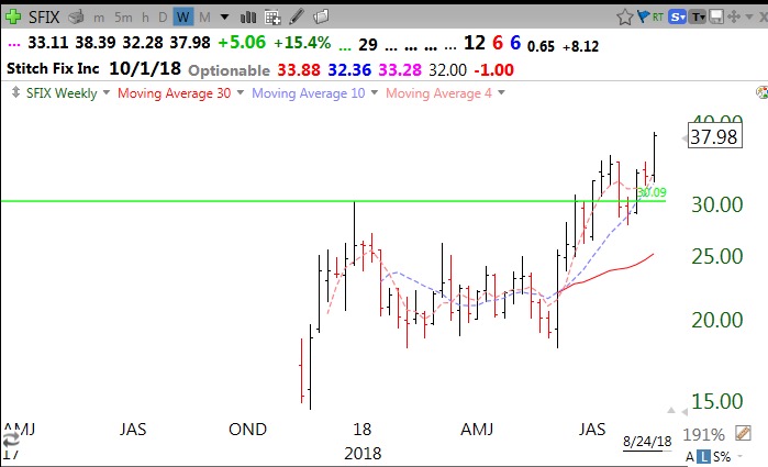
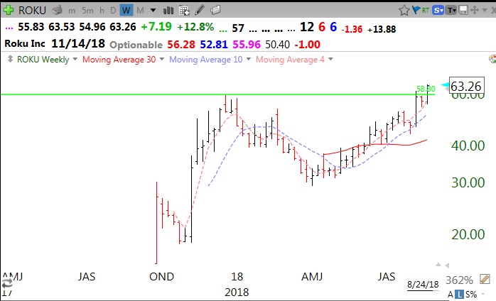
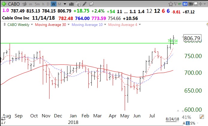
So many stocks are breaking out to all-time highs (ATH). Every rocket stock has a long series of repeated ATH. I went to barchart.com and filtered stocks that hit an ATH on Friday and copied the list to Excel and then to a watchlist in TC2000. I then used TC2000 to find the subset that came public since 2015 (created a column with a formula c/c4 set to yearly; those with a result of ** could not be calculated because they did not trade before 2015). I then manually looked at each monthly chart to find those that had hit an ATH and subsequently consolidated for at least 3 months. I drew a green horizontal line at the peak price it reached before it consolidated. I selected those that had a GLB (green line break-out, closed above its green line) recently. I also like to see above average trading volume the week of the GLB.
These recent IPOs are worthy of my researching for future purchase. The great trader, Jesse Livermore, liked to buy the first GLB (he did not use my term!) of a recent IPO. Note that if a GLB stock closes back below its green line, I sell it immediately. I may repurchase it if it closes back above the green line–see the charts of MTCH and SFIX below as examples of GLB failure and rebound. The 19 stocks from this exercise are, in random order: MTCH, PSTG, NTRA, NVCR, NXRT, TTD, TWLO, YEXT, SEND, SFIX, ROKU, RPD, SQ, CISN, CNDT, CABO, CVNA, APPF, ADSW. Below are weekly charts of a few of them. I sometimes tweet GLBs intraday when TC2000 alerts me. Follow my tweets–@wishingwealth.
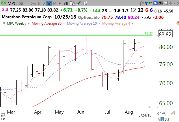
By the way, while not a recent IPO (in 2011) , MPC had a GLB on Friday, perhaps reflecting strength in oil. Looks like a cup and handle break-out….
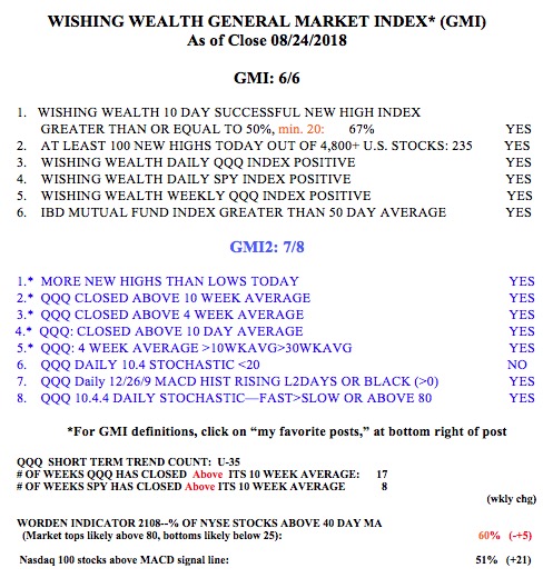
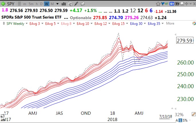
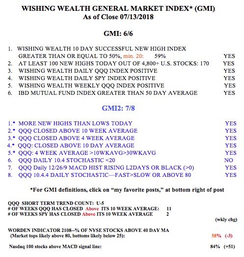
The GMI remains on a Green signal and the QQQ has reached the 35th day of its short term up-trend.