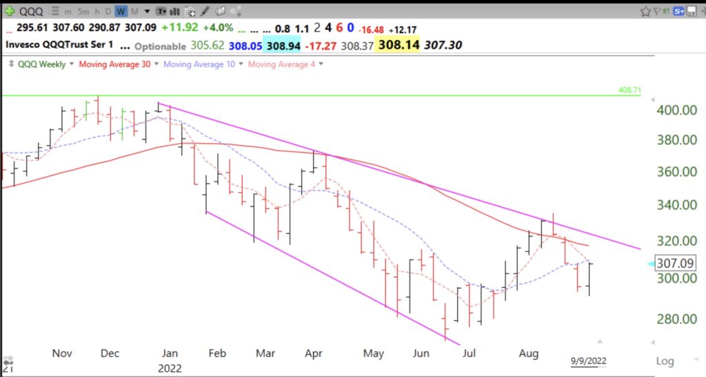
Blog post: 32nd day of $QQQ short term up-trend; Key to success in market is to have an objective, defined set-up that implies an immediate move up, then if it fails to move rapidly as predicted exit quickly with a small loss; I teach my students several set-ups that I like; one of them is the black dot signal, defined below

GMI5/6
GMI-27/9
T210846%

I have TC2000 (see TC2000 tab on blog)  draw a black dot when a stock in an up-trend bounces up from oversold. Oversold is defined as having a daily 10.1 stochastic value of 25 or less in any of the past 3 days. I have discovered that almost every significant rise in a stock begins from an oversold level. But not every oversold level leads to a big rise. Check it out for yourself. The key for me is to find a launched rocket near an all-time-high (ATH) that has become oversold and begins to move up. I can then buy it and place my stop loss below the low of the bounce. My recent TraderLion and Long Island Stock Traders Meetup presentation slides (see prior recent posts for the workshop  links) show how to put a green dot indicator on a daily stock chart. Here is a copy of the slide with the link.


To create the black dot signal instead replace the formula in the tutorial with the logic:

I want the 10.1 daily stochastic in any of the last three days to be le25 and for the stock to be higher today than yesterday and to be above its 30 day simple average or its 21 day exponential moving average. The dot is placed at the 5 day low price.

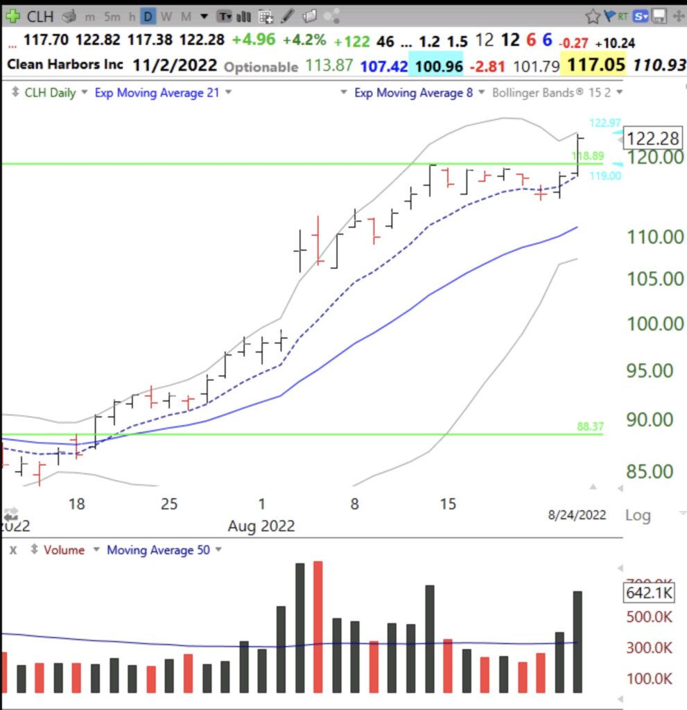
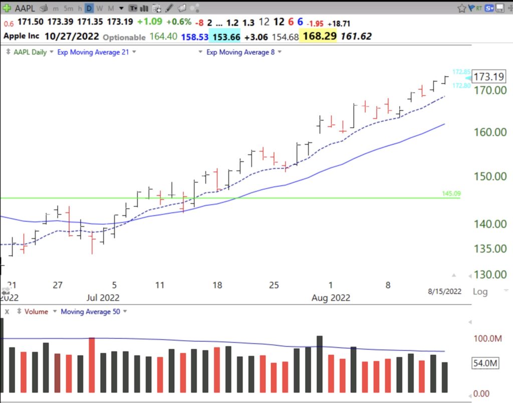
Here are 2 examples of stocks with black and green dot signals. See if you can replicate them and then add the 10.1 stochastic indicator below the price. I love a black dot signal soon after a green line break-out (GLB). I have a TC2000 scan to identify such stocks.


Follow on to TraderLion conference, this Wednesday’s Long Island talk; Examples of black dot signals; GMI=6 (of 6)

GMI6/6
GMI-25/9
T210862%

Welcome to new visitors who heard my presentation at the TraderLion annual conference. You may also want to check out my presentation to the Worden  2012 TC2000 users group here. If you are new to this blog you can sign up to receive it by email by completing the box on this page. Scroll down the page and see the list of books I mentioned yesterday.  Also, if you select the Topics tab on this blog you can access   My Favorite Posts or Nicolas Darvas, and view posts you may find interesting. And if you want to hear more from me, please attend the free Long Island Stock Traders Meetup on Wednesday evening at 7:30 PM EST. There may be sufficient time for me to answer questions.

I ran out of time yesterday to show some charts with my new black dot signals. Black dot signals appear on my daily charts when a stock’s daily 10.1 stochastic was <=25 in any of the past 3 days,  has a current price >prior day’s price, and is currently above either its 30 day average or its exp 21 day average. This is what the formula looks like for TC2000 to put the black dot on the chart. My co-instructor has posted a tutorial video (see below) showing how to  put green dot signals on a chart and it can be modified with this formula to place the black dot.


Black and green dot signals only work on stocks that are in an up-trend. You can see how I define and search for up-trends by watching the recording of yesterday’s, June 12, presentation on the TraderLion YouTube site. Green and black dots help me to find stocks that are bouncing from oversold conditions. I prefer to use these indicators as part of a scan I created that identifies stocks that hit an ATH (all-time-high) recently and then became oversold and started to rise. I like this set-up because I am looking for rocket stocks that have rested on the way up and I can place my stop loss just below the bounce and get out with a minimal loss if the stock fails to hold the bounce. Here are several examples. Below, the  chart for PGNY shows the 3 stochastic indicators I use (daily 10.1, 10.4 and 10.4.4). The black dot is based on the daily 10.1 stochastic shown by the gray line. When it is 25 or below, it represents oversold and a good place for me to consider buying only if the stock starts to turn back up. Note that a black dot appears only if the stock has regained its 30 day average or the 21 exp average. Note also the support often found simultaneously at the lower daily 15.2 Bollinger Band.


This black dot  on ALLY happened Friday and showed up in a TC2000 scan I use to find stocks in a yellow band up-trend that have just bounced from oversold. Will this bounce hold?

I love a black dot that occurs  after a GLB (green line break-out). Note the black dot followed by a green dot.


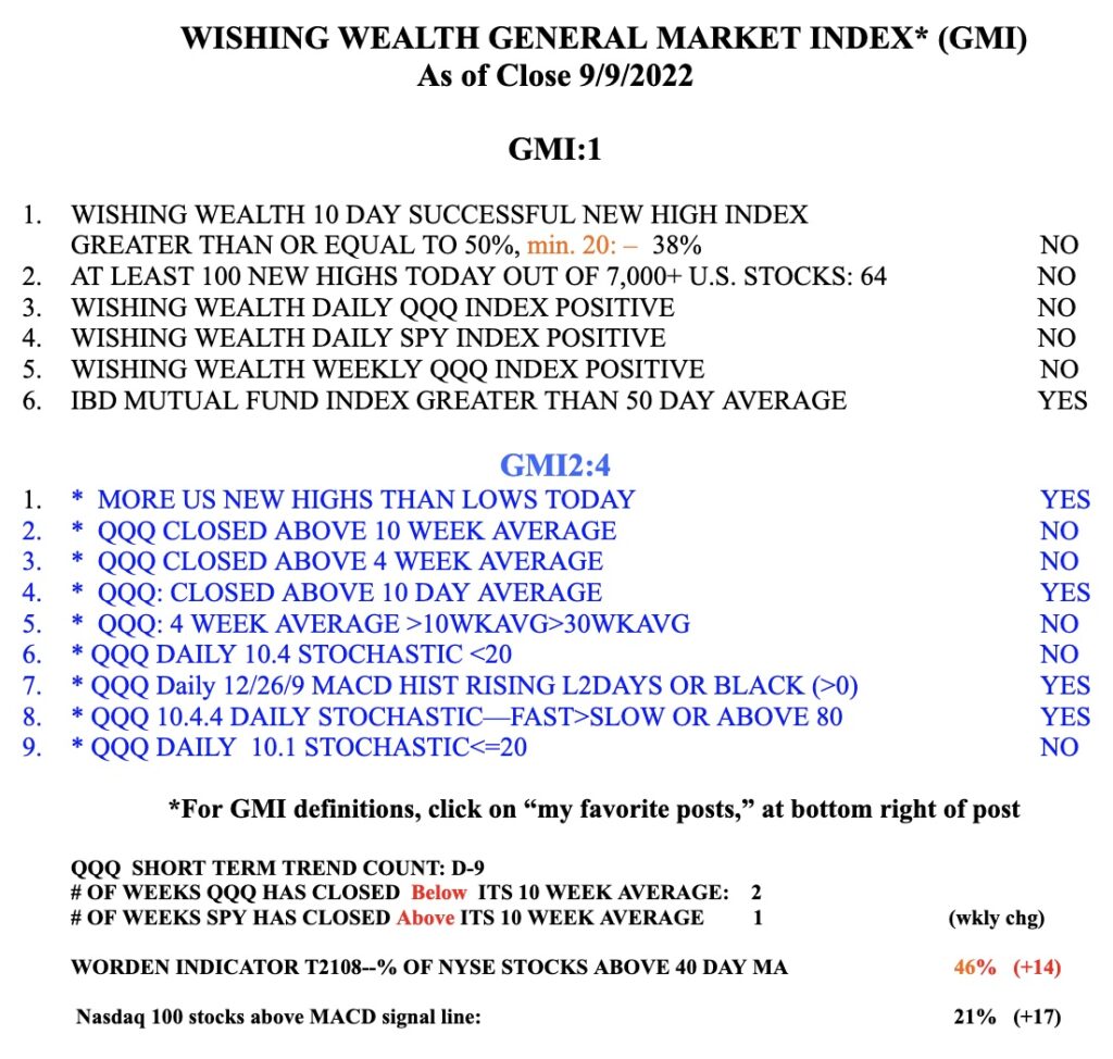
These set-ups work best in a rising market and I monitor market trend each day by my General Market Index (GMI). I post this GMI table each weekend but I update the GMI and T2108 after the close every time I post. The GMI is 6 (of 6) and on a Green signal. When it closes <3 for two consecutive days, it triggers a Red signal and I become more defensive. A GMI=0 is a very bearish signal for me. I also list in the table my short term QQQ trend count, currently indicating the 12th day (U-12)of an up-trend. I use this short term indicator to guide my buying of TQQQ or SQQQ, as discussed yesterday. The 3x leveraged ETF moves fast and requires one to be very nimble. The GMI2 is just a collection of indicators I want to monitor. Note also T2108, which is a pendulum of the market. As I showed in my presentation yesterday, when T2108 registers <10 one should be looking for a major market bottom and consider slowly buying a market index ETF. I tweet signals intraday @WishingWealth. Please follow me,  but understand that you have to evaluate for yourself any break-out or set-up I tweet or post about. I will post on this blog when/if I will offer a not for credit university based course open to the public.


Blog post: GLB (green line break-out) explained; Some stocks having a GLB last week: $MEC $OMP $TGLS $FLNG $CUBI

GMI6/6
GMI-26/9
T210854%

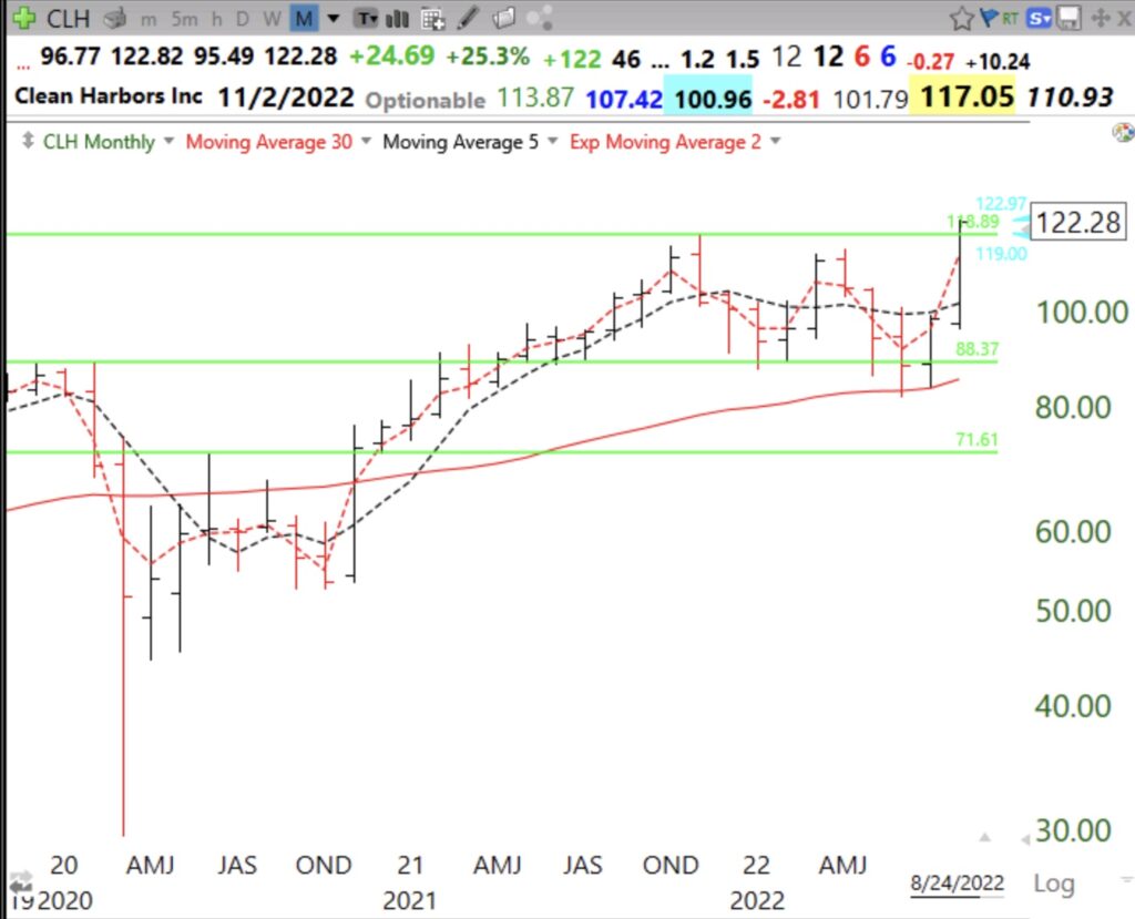
One of the most important innovations I developed was the GLB or green line break-out. I like to buy stocks that have advanced to an all-time-high (ATH), consolidated for at least 3 months, and then break out to close at a new ATH. I use TC2000 to draw in the green line on a monthly chart at an ATH and alert me the moment the stock trades above the line. A green line can only be drawn after 3 months (3 monthly bars) have passed since a peak price bar that has not been surpassed (see monthly chart below). I make an exception for recent IPOs when the green line may be drawn after consolidating a few weeks after reaching a peak ATH.

Last December, I posted a weekly chart showing that PGNY had had a GLB at 36.50 and a weekly green bar (WGB). PGNY closed Friday at $64.04,  75% above its GLB.

Here is its monthly chart showing where the green line was drawn.


If I buy a stock after a GLB I sell it immediately  if it closes back below its green line. A failed set-up on which I base my purchase must always be sold. It is preferable for the GLB to occur on above average weekly trading volume. This weekend I identified a few stocks that have met the above criteria last week or a few weeks before. Here are their charts.

It is impossible to tell if any of these stocks’ GLB will fail or if it will rocket higher. I did look up their fundamentals on MarketSmith.  Their IBD Composite scores are MEC (78) OMP (94) TGLS (99) FLNG (98) CUBI (99). All have floats of <30 million shares.

The GMI is 6 (of 6), flashed a Green signal, and the new QQQ short term up-trend has now reached 3 days (U-3). I have begun to purchase TQQQ, the 3X leveraged bullish ETF for QQQ. If this up-trend persists I believe this is where I will likely make the most $$$$. Note that QQQ has now closed back above its 10 week average while SPY has closed above its 10 week average for 17 straight weeks.