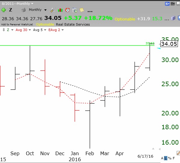
Now that I have returned from CA, I want to review two stocks I have tweeted about, Z and ATVI. This daily chart of Z shows that it broke through its green line top (GLB) on Friday, on higher than average trading volume. Arrows show high volume, likely fund buying.
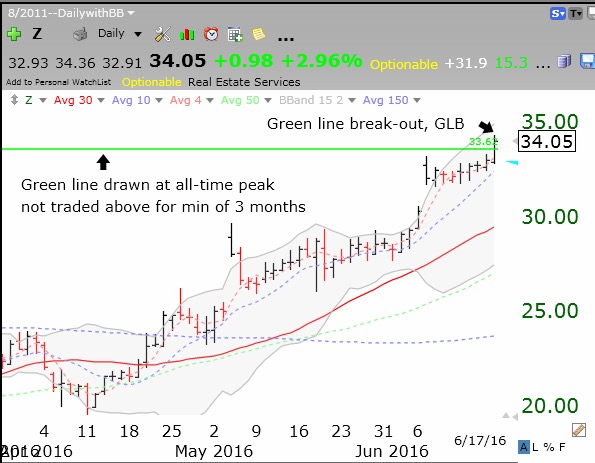
This monthly chart shows that the green line was drawn at the peak reached in October, 2015. A recent IPO (initial public offering) that forms a top, consolidates for months and then breaks out to an all-time high can prove to be a rocket stock (For example, FB did a GLB at $45 at month 17). It is critical, however, that the break-out hold and that Z not fall back below its green line. If it does, I will sell and then monitor the stock for support back above the green line. I like to re-enter a stock that rises after a failed break-out.
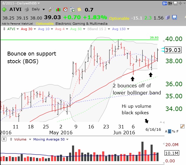
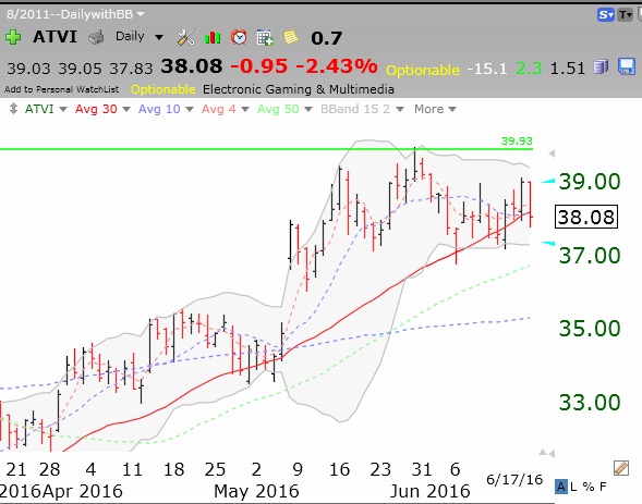
Another stock that I tweeted about was ATVI. This daily chart shows that ATVI failed its recent attempt at a GLB and found support at its lower 15.2 Bollinger Band and 30 day average (red line). With the weak market on Friday, ATVI closed below its 30 day average. I will exit if it closes below its lower Bollinger Band, around 37.
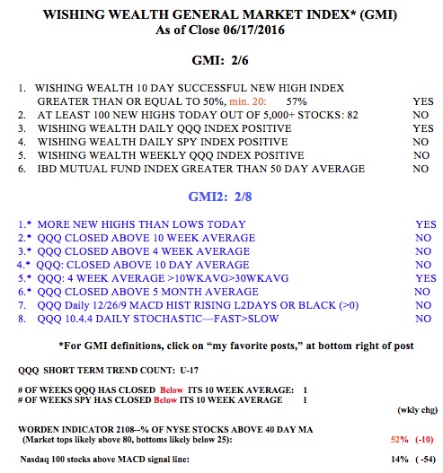
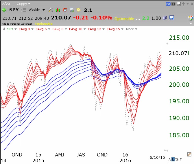
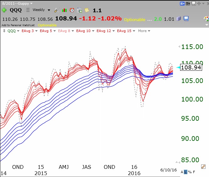
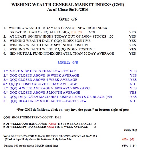
Meanwhile this market is getting very weak. Without a strong up day Monday, the QQQ short term trend (U-17) will turn down and the GMI may issue a Sell signal. The only thing keeping me in this market is my expectation for a strong end of month and end of quarter rally with mutual fund window dressing. Also, the market indexes look very short term oversold to me. However, we may have to first get through the vote in Great Britain and that may totally destroy the chances for any end of quarter rally. So this is time for me to be very vigilant and to have an exit strategy in place.