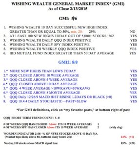
I read a lot of pundits who repeatedly claim that this market is topping. If they keep claiming this, someone will eventually be correct! But we technicians rely on indicators to guide our trading. We must always guard against marrying a scenario and be ready to change direction to be consistent with the market’s main trend. One of the methods I have found useful for timing the market is to use a modification of the the GMMA charts developed by the Australian technician, Daryl Guppy. Guppy charts plot 12 weekly exponential moving averages on a chart. Six are shorter term averages and 6 are longer term averages. I have added a 13th average, a simple average of length 1 to show me the closing price each week. I always plot the 6 shorter term averages in red and the longer term averages in blue. A chart where the red lines are rising above and separated from the rising blue lines is showing a RWB advancing pattern. The reverse, a BWR pattern, is evidence of a declining pattern. I make the price bars white so they do not visually distract from the averages.
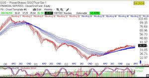
This chart of the top of the QQQ in 2000, shows how the RWB pattern failed and became a BWR pattern. This is what a market top looks like. The red lines converge, demonstrating little price movement over the different average lengths, and finally you get the red lines below the blue lines with a white area separating them. Note the re-emergence of the RWB pattern in 2003, after the bottom . (Click on chart to enlarge.)
 Now look at the 2007 top. Again we find the RWB pattern turning into a BWR pattern. Anytime the white space disappears and the red lines fall below the blue lines it is appropriate for me to become defensive.
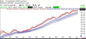
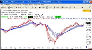 So what is the current GMMA pattern showing? A clear continuing RWB advance! In fact, it looks like we have broken out of a consolidation where the red lines converged and have now turned up again. Note that a RWB pattern has persisted since early 2013.
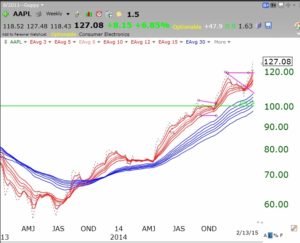
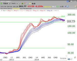
By the way, I like to use GMMA charts for analyzing individual stocks too. See AAPL below.
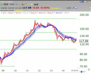
The entire bull to bear cycle in GLD is remarkably clear. Guess where we are now?!
With that said, I have begun to transfer some of my university pension funds back into mutual funds. The GMI has been on a Buy signal since January 23rd, and I have resisted it until now. Everyone has to sell down to their own comfort level.
