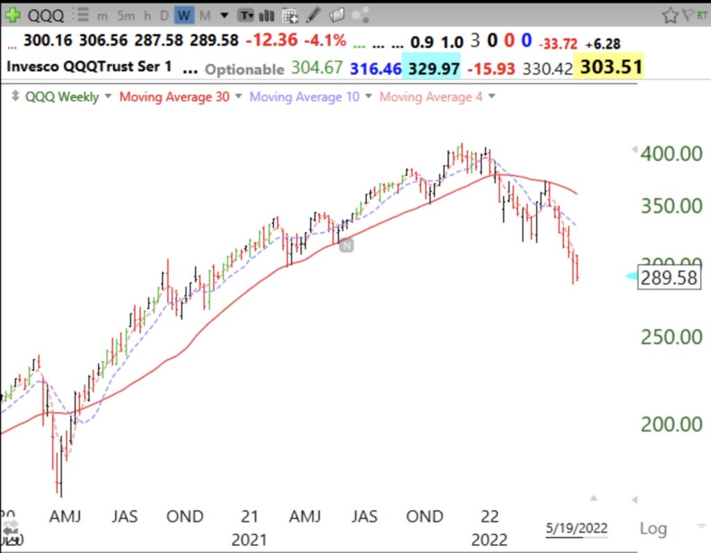
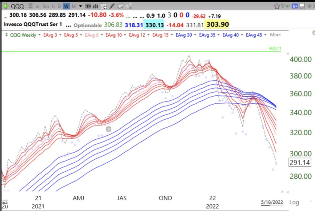
Blog Post: Day 26 of $QQQ short term down-trend; $QQQ is now in a weekly BWR down-trend, first since 2008; See weekly charts showing how decline ends.
QQQ is now in a weekly BWR down-trend. All shorter term averages (red lines) are declining below the longer term averages (blue lines) with a white space separating them. Note the prior BWR up-trend pattern that lasted from May 2020 until January 2022.
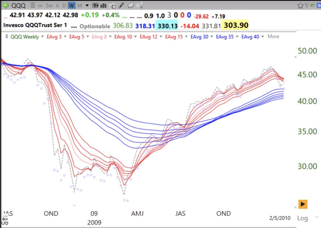
The last time there was such a weekly BWR down-trend was in 2008. See how it ended. The white space disappears and the red and blue lines overlap. You don’t have to get in at the bottom. One strategy is to wait for the BWR pattern to end and really go in when the next RWB up-trend pattern begins. Another is to wait for the weekly closes (dotted line) to rise above all of the red lines and lead them higher. In a down-trend the weekly closes are leading all of the red lines down.
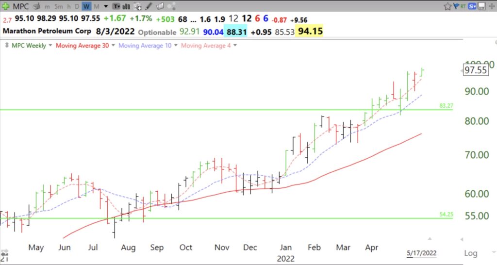
Blog Post: IBD calls market in Confirmed Up-trend but GMI remains at 0; 7 stocks at ATHs: $BMY, $MRK, $CVX, $MUSA, $PAG, $MPC, $PAG, see weekly charts
These seven stocks appear in my watchlist of stocks recently mentioned by IBD or MarketSmith. This weekly chart shows how MPC has been in a firm up-trend. Note the retest of its GLB. Its 4wk>10wk>30wk since January. Note how it holds its 4wk average and has multiple green bars indicating support at the 4 wk. It has also found support at its 10 week average.
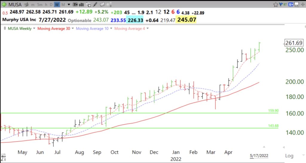
MUSA has a similar strong pattern. Note how it has closed 10 weeks in a row above its 4 wk average. That is a sign of a strong up-trend.
