I have taught my students the way I have adapted Daryl Guppy’s GMMA charting method, or Guppy Multiple Moving Average. I plot 12 weekly exponential moving average (6 shorter term averages plotted in red 3,5,8,10,12,15; and 6 longer term averages plotted in blue 30,35,40,45,50,60). A strong upward moving pattern has the red lines all moving above the rising blue lines with a white space separating them. Hence the name RWB. A strong declining trend shows the reverse pattern, BWR. I also plot a single week moving average as a dotted line to show where the security is actually priced. The challenge is to only buy RWB patterns and short BWR patterns. The same patterns can be applied to other time frames, for example daily, hourly or even monthly charts.
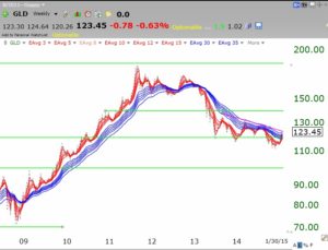
A strong RWB pattern also has the actual price trading above all of the red lines. If the security (dotted line) closes below the red lines (shorter term averages) it could signal a consolidation or worse, a change to a declining BWR pattern. Here is an example of GLD since 2009. GLD remained in a strong RWB pattern until 2011 when the averages began to converge. Note that since March 2013, GLD has been in a declining mostly BWR pattern. The astute investor could have used this chart to ride gold up and get out after the RWB pattern dissolved. It is clear that the averages are now converging again. Instead of anticipating a change in trend, I prefer to wait until a RWB or BWR pattern is evident.
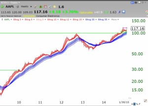
 This type of chart would also have guided one in investing in AAPL. Since the bottom in 2009, AAPL has been in an RWB pattern, with the exception of the weak period in 2012-13. AAPL continues to be in an RWB pattern since then.
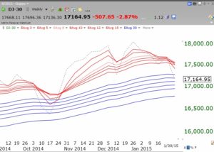
 So what can these charts tell us about the major market indexes? Here is the Dow 30 index. Since January, 2013, the Dow has been in an RWB up-trend, with the exception of the period around October, 2014 when the red lines touched the blue lines and closed the white separation between them.
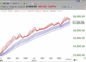 This zoom in of the last few months shows the closing of the Dow’s RWB pattern again. As happened last October, the last price of the Dow shown by the dotted line appears to have closed below the red lines and is now penetrating the blue lines. If the Dow should continue to sink below the blue lines, it could signal the beginning of a significant BWR decline or at minimal the end of the RWB up-trend. The SPY is showing a similar pattern to the Dow but the QQQ remains a little stronger. The fact that the red lines are converging again for the Dow and the SPY so quickly after they did in 2014, is a sign for caution. In addition, the converging and and even crossing of the red line averages shows that the Dow has been flat over the various time intervals measured by the averages (the 3 week average price=the 5 week average price=the 10 week average price, etc.). To me this is a sign for extreme caution.
I have therefore gone mainly to cash in my university pension and my trading accounts. My university accounts have grown considerably since the 2009 bottom and I am unwilling to risk giving the profits back in a protracted market decline. I am content to be on the sidelines and to even miss some of an advance if I am wrong. If the RWB returns I can always reenter the market in stages. If I am right, then I can reenter at much lower and cheaper levels, and can sleep better at night.
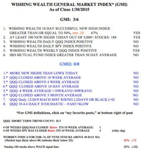
The GMI remains at 3 (of 6) and on a Buy signal but my QQQ short term trend count is D-3, the third day of a short term down-trend. Two consecutive days with the GMI less than 3 would signal a longer term Sell. The GMI-2 is at 0/8, with all of my more sensitive indicators negative. The QQQ is back below its 10 week average as is the SPY, and both the SPY and DIA have closed below their critical 30 week averages. This market is likely in transition and I suspect we could enter a severe down-trend soon. Based on me, the contrarians among my readers should be very bullish………. 🙂
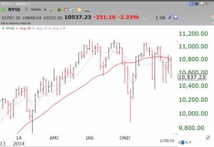
 After I wrote the above post, I read an email from a reader pointing out some bearish tendencies in the NYSE Composite index, one I do not follow. This composite reflects all of the US and foreign stocks listed on the NYSE. It therefore reflects larger, older and less speculative stocks than the other indexes I follow. When I looked at this weekly chart of the NYSE Composite index, I became even more concerned about the market’s trend. As you may know, over the past 20 years I have used Weinstein’s Stage Analysis strategy to help me time the market. The NYSE Composite index appears to be entering a Stage 4 decline. It is now below its 30 week average (solid red line) which itself has begun to decline. In 2000, and 2008, I exited the markets when the 30 week average of the QQQ began to curve down and avoided most of the carnage. Last week the SPY and DIA have only just crossed below their 30 week averages. Is the quicker weakening of the established NYSE companies going to lead the rest of the markets into a major decline? I cannot overemphasize the significance of this chart showing the multiple failed rally attempts since the double top formed in 2014. The October decline may just be only the first small crack in this bull market. (Anyone know an inverse bearish ETF for this index?)
Of the 2,000 stocks in the NYSE Composite, about 20% are foreign corporations. The remaining are USA corporations, REITs, and tracking stocks. Probably not the best index to use to judge the overall USA common stock market. The iShares NYSE Composite ETF (NYC) was closed last year due to a lack of interest from investors. The Wilshire 5000 ($WLSH), NASDAQ Composite ($COMPQ), Russell 3000 ($RUA), and S&P 500 ($SPX) are all above either both the 150 day ma and 200 day ma, or at least the 200 day ma. Although, perhaps not for long.