Welcome to new visitors who heard my presentation at the TraderLion annual conference. You may also want to check out my presentation to the Worden 2012 TC2000 users group here. If you are new to this blog you can sign up to receive it by email by completing the box on this page. Scroll down the page and see the list of books I mentioned yesterday. Also, if you select the Topics tab on this blog you can access My Favorite Posts or Nicolas Darvas, and view posts you may find interesting. And if you want to hear more from me, please attend the free Long Island Stock Traders Meetup on Wednesday evening at 7:30 PM EST. There may be sufficient time for me to answer questions.
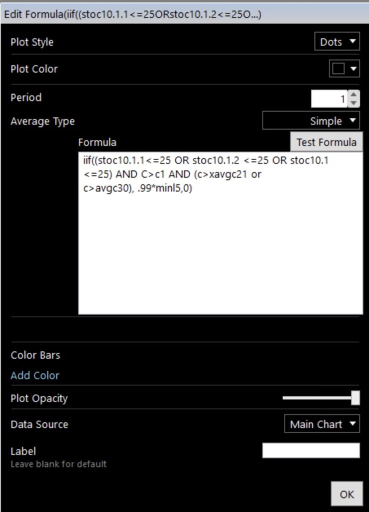
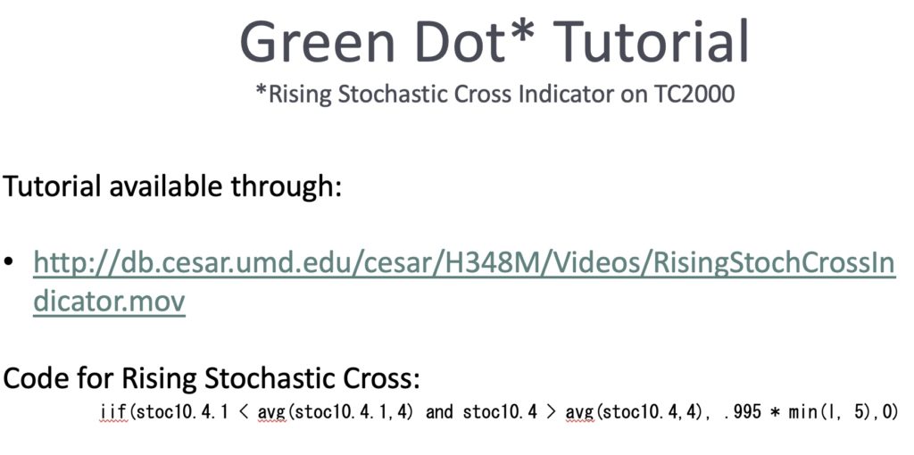
I ran out of time yesterday to show some charts with my new black dot signals. Black dot signals appear on my daily charts when a stock’s daily 10.1 stochastic was <=25 in any of the past 3 days, has a current price >prior day’s price, and is currently above either its 30 day average or its exp 21 day average. This is what the formula looks like for TC2000 to put the black dot on the chart. My co-instructor has posted a tutorial video (see below) showing how to put green dot signals on a chart and it can be modified with this formula to place the black dot.
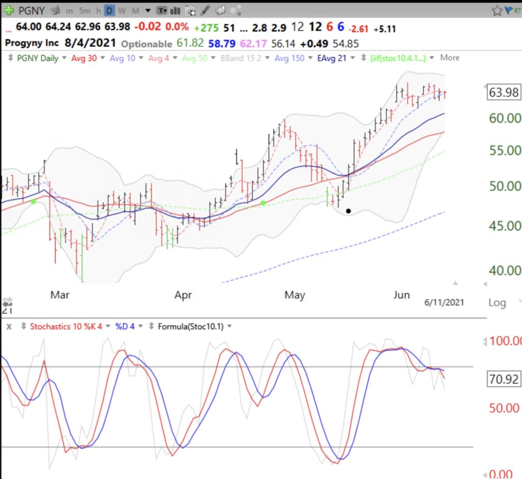
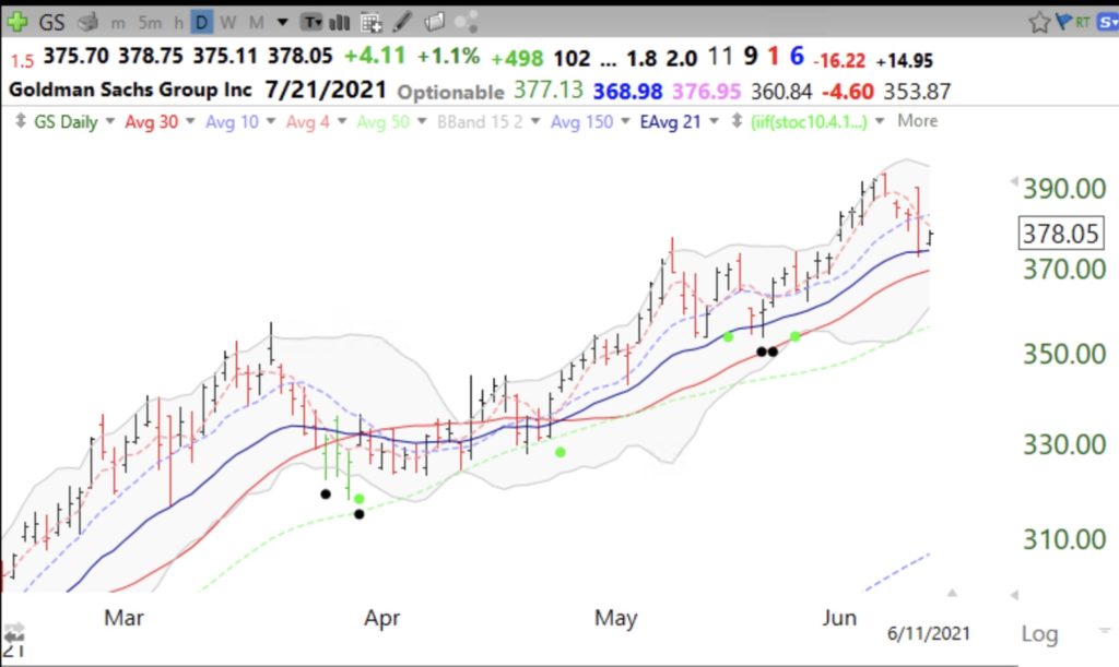
Black and green dot signals only work on stocks that are in an up-trend. You can see how I define and search for up-trends by watching the recording of yesterday’s, June 12, presentation on the TraderLion YouTube site. Green and black dots help me to find stocks that are bouncing from oversold conditions. I prefer to use these indicators as part of a scan I created that identifies stocks that hit an ATH (all-time-high) recently and then became oversold and started to rise. I like this set-up because I am looking for rocket stocks that have rested on the way up and I can place my stop loss just below the bounce and get out with a minimal loss if the stock fails to hold the bounce. Here are several examples. Below, the chart for PGNY shows the 3 stochastic indicators I use (daily 10.1, 10.4 and 10.4.4). The black dot is based on the daily 10.1 stochastic shown by the gray line. When it is 25 or below, it represents oversold and a good place for me to consider buying only if the stock starts to turn back up. Note that a black dot appears only if the stock has regained its 30 day average or the 21 exp average. Note also the support often found simultaneously at the lower daily 15.2 Bollinger Band.
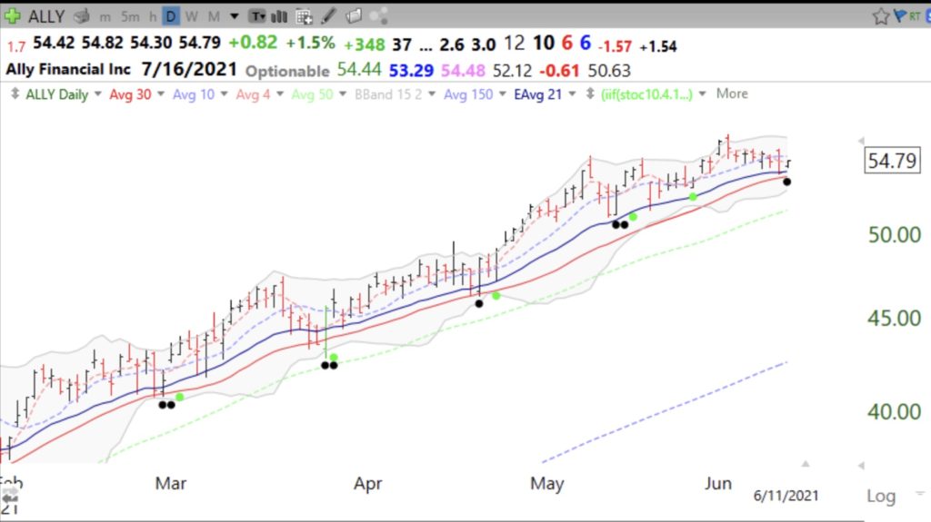
This black dot on ALLY happened Friday and showed up in a TC2000 scan I use to find stocks in a yellow band up-trend that have just bounced from oversold. Will this bounce hold?
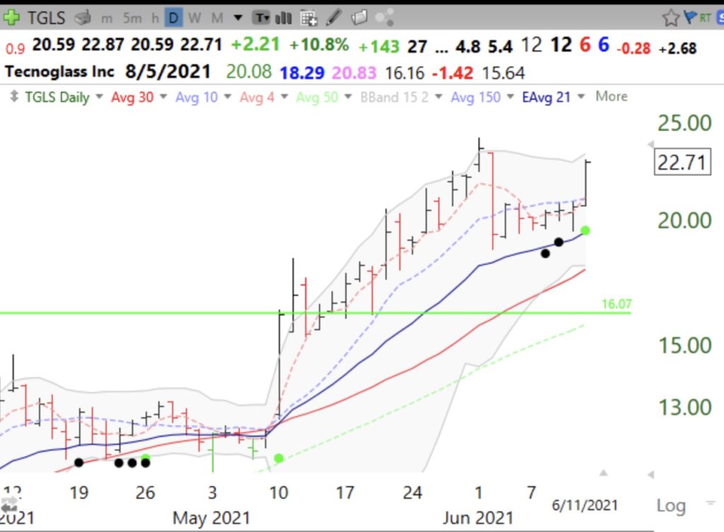
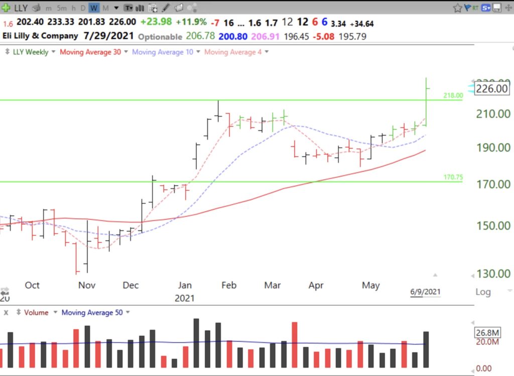
I love a black dot that occurs after a GLB (green line break-out). Note the black dot followed by a green dot.
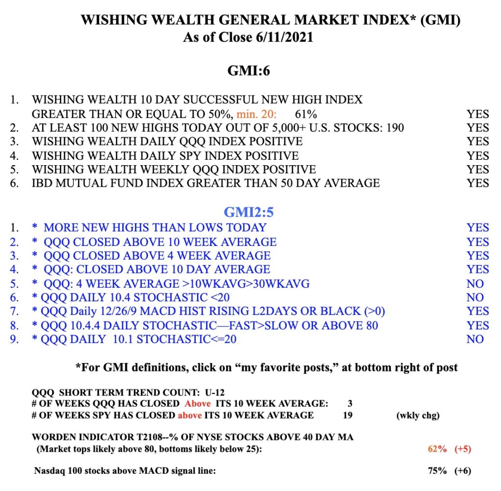
These set-ups work best in a rising market and I monitor market trend each day by my General Market Index (GMI). I post this GMI table each weekend but I update the GMI and T2108 after the close every time I post. The GMI is 6 (of 6) and on a Green signal. When it closes <3 for two consecutive days, it triggers a Red signal and I become more defensive. A GMI=0 is a very bearish signal for me. I also list in the table my short term QQQ trend count, currently indicating the 12th day (U-12)of an up-trend. I use this short term indicator to guide my buying of TQQQ or SQQQ, as discussed yesterday. The 3x leveraged ETF moves fast and requires one to be very nimble. The GMI2 is just a collection of indicators I want to monitor. Note also T2108, which is a pendulum of the market. As I showed in my presentation yesterday, when T2108 registers <10 one should be looking for a major market bottom and consider slowly buying a market index ETF. I tweet signals intraday @WishingWealth. Please follow me, but understand that you have to evaluate for yourself any break-out or set-up I tweet or post about. I will post on this blog when/if I will offer a not for credit university based course open to the public.
