After tradings stocks for over 50 years my trading strategy continues to evolve. I used to ignore indicators like stochastics and Bollinger Bands because I mistakenly believed that such concepts as overbought or oversold were useless. I fortunately began to re-analyze some of my trades using these indicators and found these indicators to be extremely valuable.
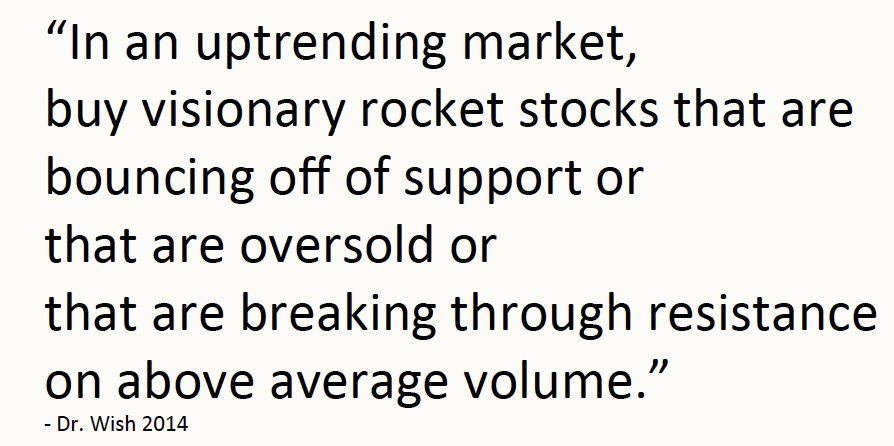
The biggest problem faced by me and my students is buying great stocks that then turn out to be “extended.” These stocks promptly turn around and decline right after what we thought was a perfectly timed purchase. Sound familiar? After listening to some of the expert traders who come to lecture to my students I decided that rather than buying stocks that break to new highs, I should buy strong stocks that have rested and become oversold and then start up again. I do like buying green line break-outs (GLB) but maybe should wait to buy them after the break-out when they subsequently become oversold. The GLB is just evidence of a strong stock that has broken out to an all-time high after a rest of 3 months or more. At the moment of break-out they are rarely over-sold!
I prefer to buy strong oversold stocks that are bouncing off of support (BOS) and to place a sell stop just below where they have bounced. This means that if the bounce fails I am sold out quickly with a small loss. Since a lot of my purchases will likely fail, it is critical to have very small losses when my trades go awry. When the bounce holds, I can then ride the stock and even add more to my position so that my relatively few large profits make up for my many small losses. There is nothing more freeing emotionally than to buy a stock and place an immediate GTC stop loss order to sell with a very small loss. My mantra is that each small loss brings me closer to the next big gain–no ego allowed.
I have written a number of scans in TC2000 that can detect strong rising stocks that have become oversold and that are bouncing off of support (BOS). My primary measure of oversold is a bounce up from the lower 15.2 daily Bollinger Band. Once I find a list of bouncing stocks I investigate such things as their trading volume, fundamentals, market trend and anything else that can help me decide which stock to buy. But these additional analyses really do not matter much because in the end it is impossible to reliably predict which stock’s bounce will hold. By the way, I have used this strategy successfully with all types of stocks and ETFs.
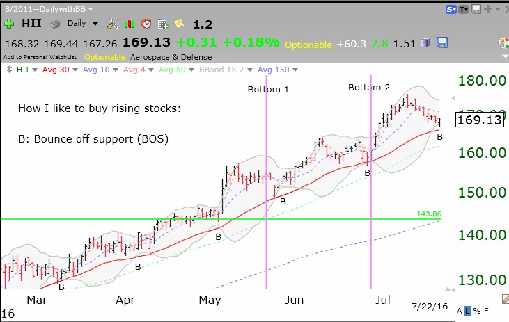
Below is a chart of a BOS stock that bounced on Friday, HII. Each previous bounce from its lower BB is shown with a “B.” The 2 magenta lines show when the major market indexes’ recent mini-corrections ended. Note that even though the decline to Bottom 2, the Grexit decline, was lower and steeper than the decline to Bottom 1, HII managed to show incredible relative strength and resist the declines. HII was actually trading higher at Bottom 2 than Bottom 1! Will HII’s Friday bounce hold? I do not know. But if I wanted to trade it I would buy it on strength (if it trades above Friday’s high) on Monday and place my sell stop below the bounce, perhaps around 167.19. I am presenting this only as an educational example of my technique. I do not own HII.
 While I am not showing its chart, my favorite water stock, AWK, showed a similar BOS on Friday.
During the trading day, when TC2000 alerts me to a BOS, I often tweet the symbol to the world. You can receive my tweets intraday at @WishingWealth. Just keep in mind that I tweet only to teach people and to enable them to evaluate any of these stocks using their own criteria. I do not trade all of the stocks I tweet about. I am looking forward to fall semester when I will teach a class of 180 freshmen what I wish someone had taught me at their age.
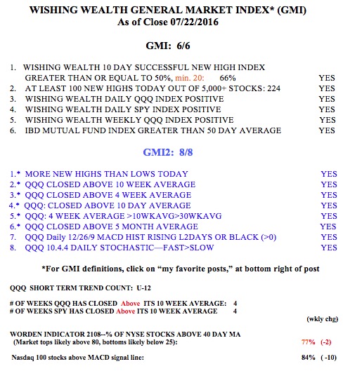
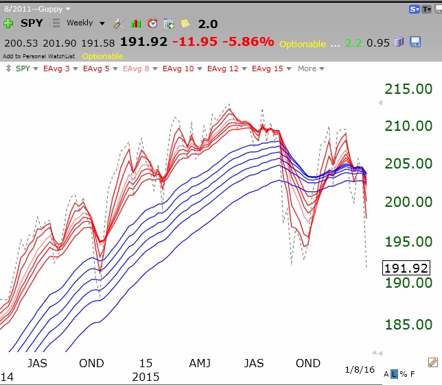
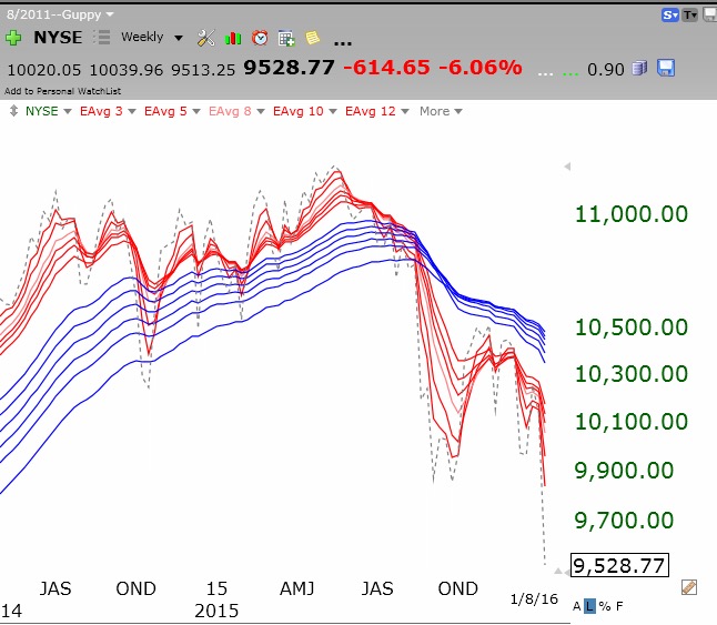
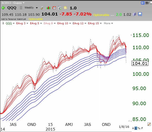
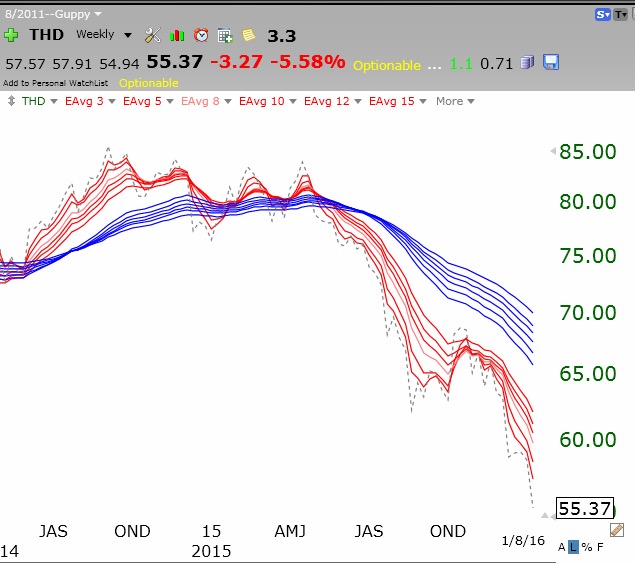
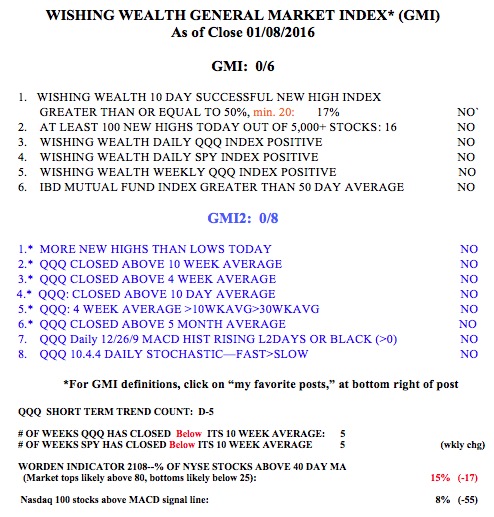
The GMI remains at 6 (of 6).