During weak markets like the one we have had recently, I find it useful to mine the daily new high list to create a watchlist of stocks hitting all time highs. A stock that can come through market turmoil and still hit an all time high is a stock that might take off when the market strengthens. That is how I found and wrote about the leader GMCR in April, 2009, when it emerged to an all time high early in the new bull market. Unfortunately, I cannot easily use TC2000 to search for stocks at all-time highs because that system returns a null result on a filter if the stock did not exist in the time period examined. For example, if I wanted to write a formula that gives me all stocks that hit a 10 year high, any stock that was not trading for the full 10 years would drop out. This is a major problem for stocks that came public in the past few years.
To get around this limitation I use barchart.com. I go to that site and click on “Stocks” at the top left, then select “New highs and lows.” When the table comes up, I change the 1 month default drop down to say all-time high. Once I get the spreadsheet of stocks at all time highs, I drag down across all stocks and copy the information. I then open an Excel spreadsheet and paste the information into it. Then I select the column of symbols, copy them and open TC2000. I create a new watchlist for all time highs and paste the symbols into it. I now have a new watchlist containing all stocks that hit an all time high that day. I repeat this process periodically creating a larger watchlist of stocks.
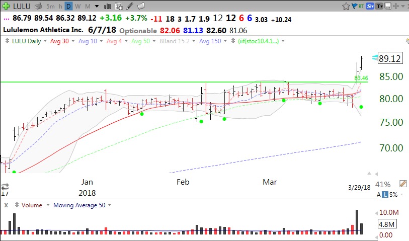
Next I open my all time high watchlist and go to a monthly chart and perform two procedures. First, the barcharts.com list is not perfect and I delete from my watchlist any stock that is not really at an all time high. Second, I draw a horizontal green line at a monthly high that has not been surpassed for three months (3 bars). I then look at each of the stocks to find gems to focus on. I monitor this watch list daily to see if any of the stocks exhibit any of my set-ups for purchase.
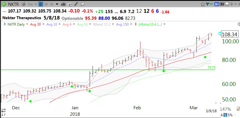
As an example, one stock on my recent all time high list had a green line break out to an all time high last Wednesday on above average volume and a green dot signal on Thursday — LULU.
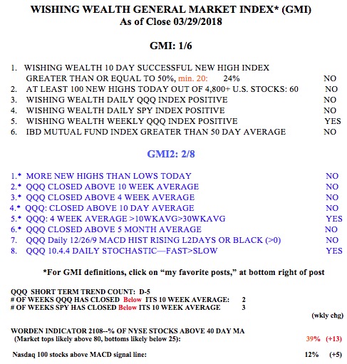
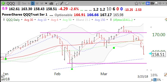
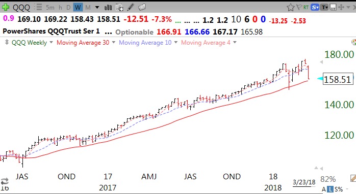
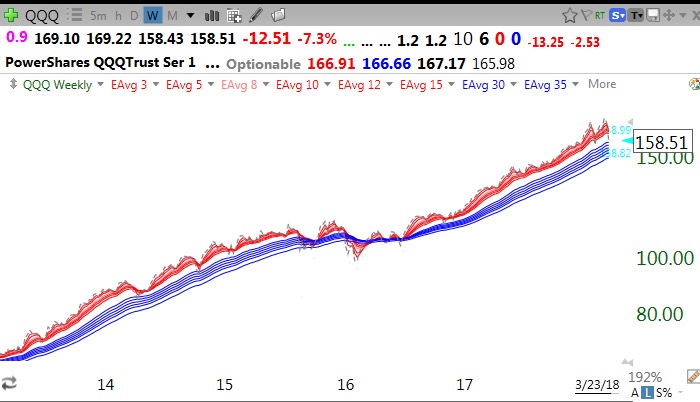
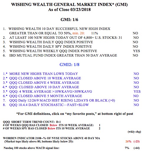
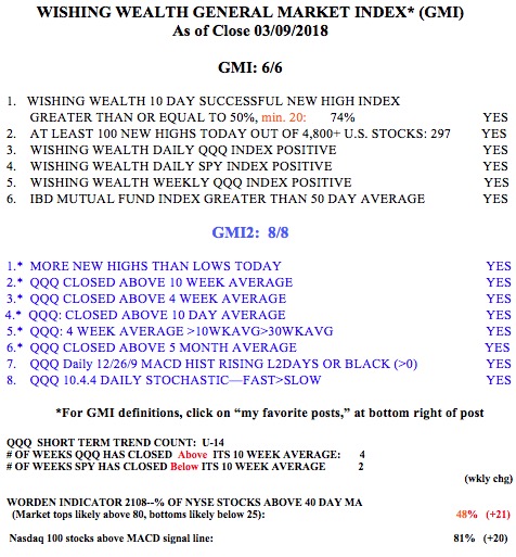
As the GMI is on a Red signal and we remain in a QQQ short term down-trend (D-5), if I buy anything, I will set a very close stop loss to get out if the stock falters.