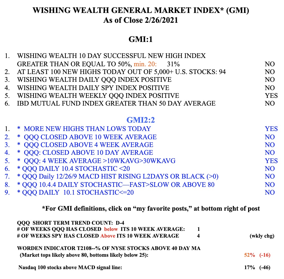
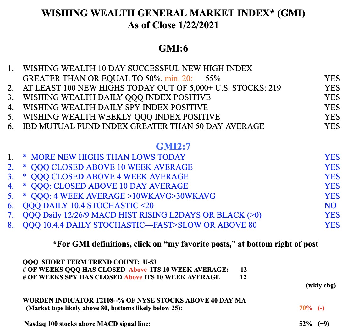
Those of you who have followed my posts know that I trade consistent with the general market’s trend. My GMI (table below) keeps me on the right side of the market. I avoided the 2000 and 2008 debacles. With the QQQ short term down-trend in its 4th day, I have pulled back from the market and gone mainly to cash and hold a little SQQQ in my trading IRA. I was prepared to refrain from making new purchases and to tell you this weekend how weak the market looks. It has been too easy to make money trading the past few months and too many of my students inform me about how well their trading is going. These are indicators of a frothy, extended market.
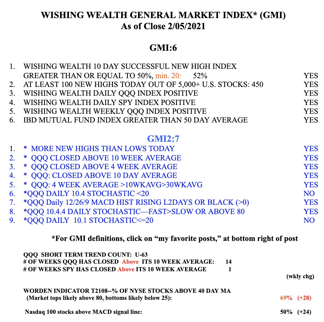
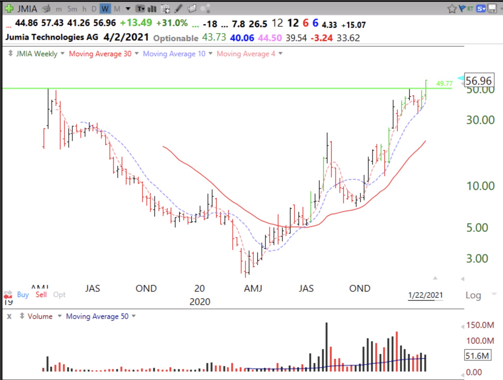
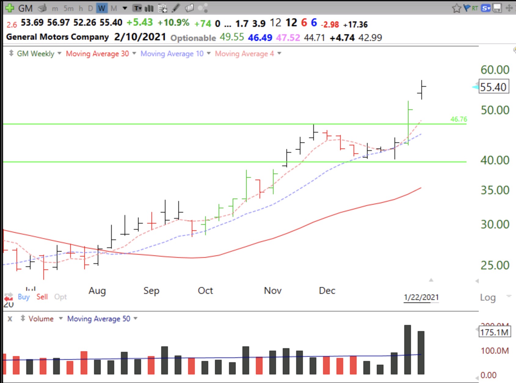
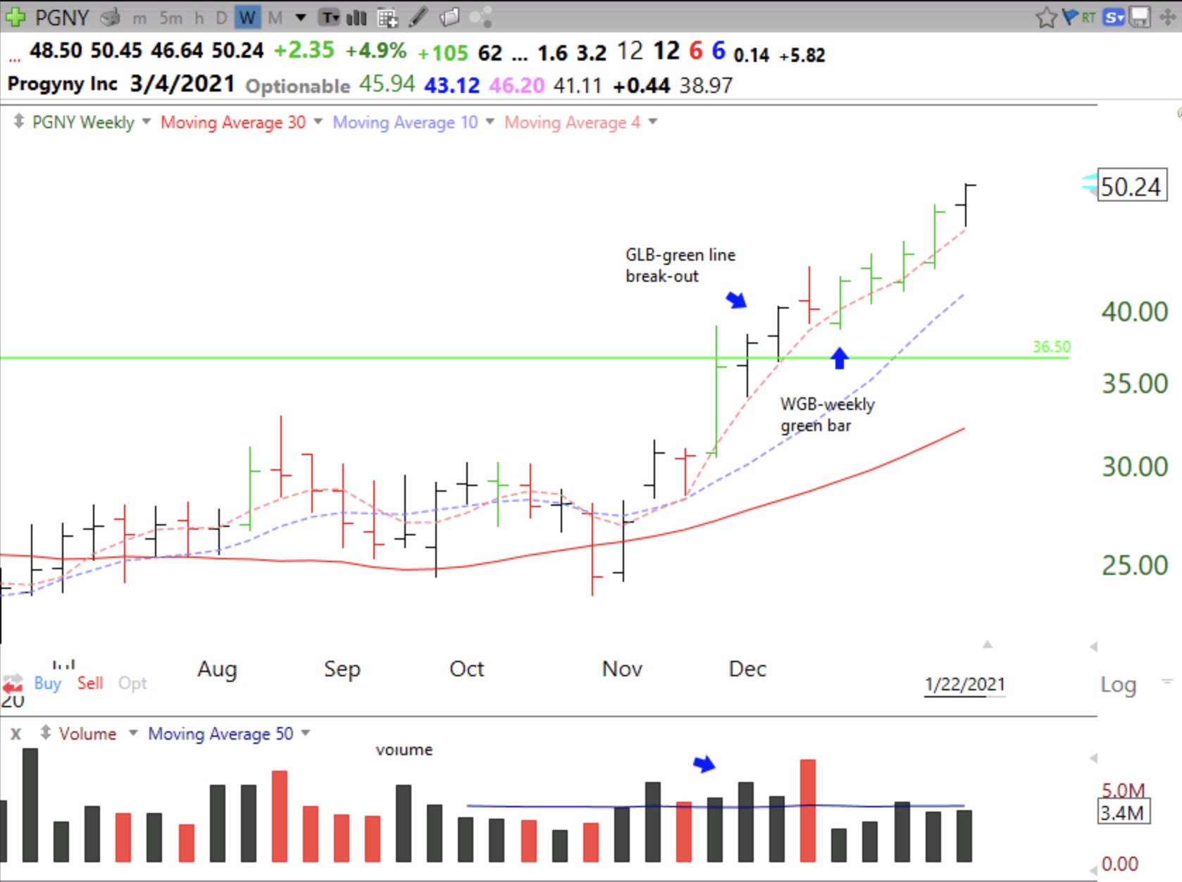
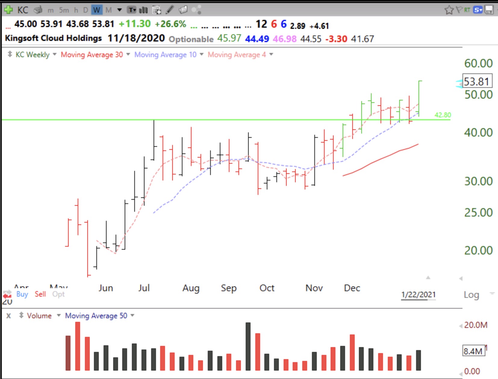
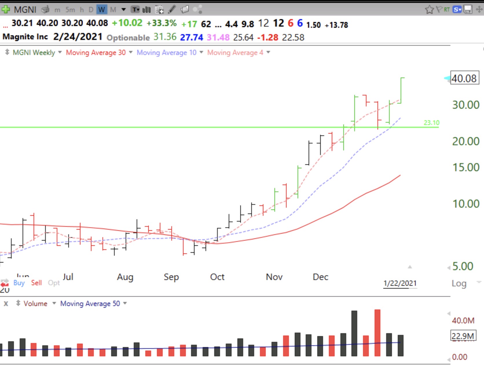
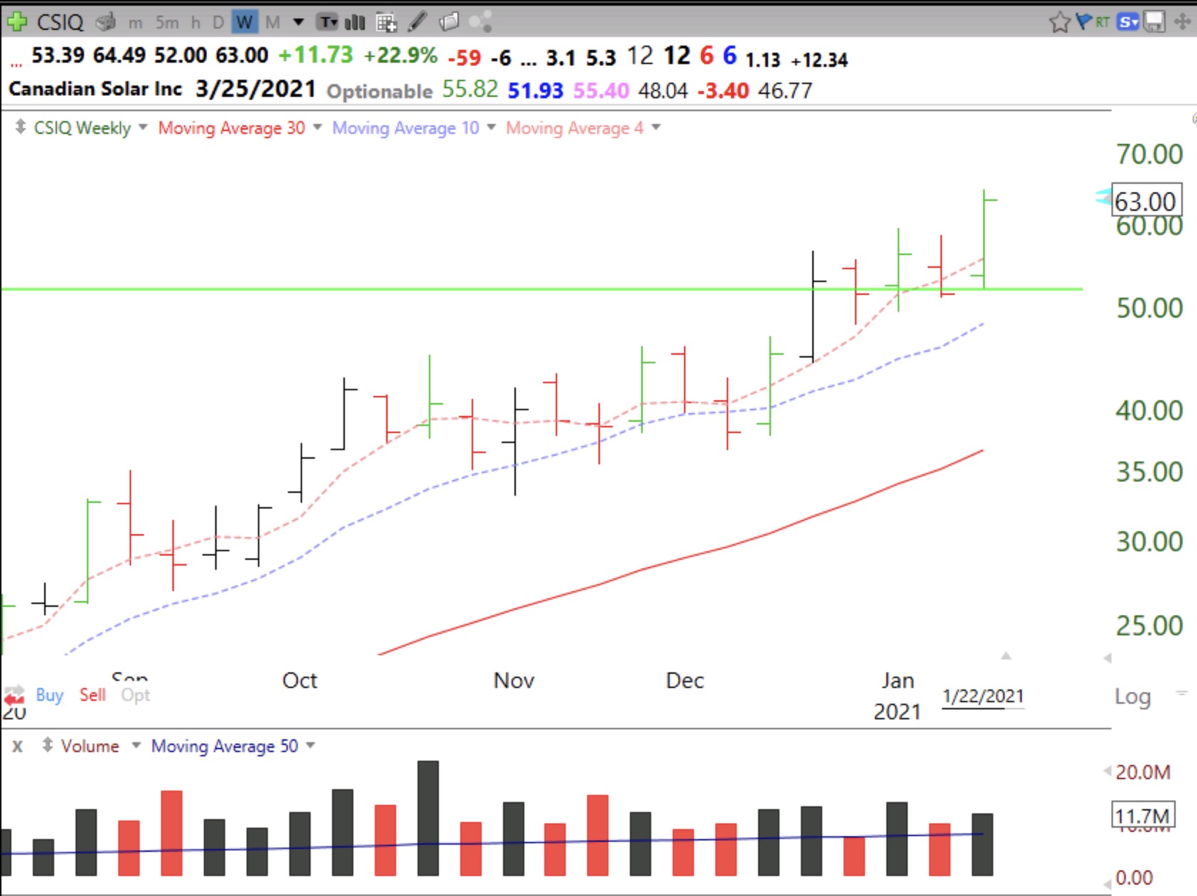
But then I ran a few scans this weekend and was surprised to find so many stocks with good technical action. These were not the stocks that have already skyrocketed and gone to lofty levels. The market may have experienced only a dead cat bounce last week and may still take out last week’s lows. (See the GMI discussion below.) However, so many promising companies had weekly green bars (WBG) last week that I had to reconsider. My WGB indicator, see formulas below, paints a weekly bar green if a stock is in an up-trend and has just bounced up off of its rising 4 week moving average. Two other averages must also line up, as described below, and the 4 week average must be rising. I applied my WGB scan to stocks that have been on several IBD or MarketSmith Growth 250 stock lists over the past few months. I then looked at the monthly chart of each of the the 47 out of 401 stocks in this watchlist that passed the scan and made sure they were above their last green line top. I only am interested in stocks trading above their last green line tops.
One of these stocks that impressed me the most was TWTR, and I am going to illustrate my approach with this stock. So many people are tweeting these days and I have noticed that my twitter feed has been increasingly filled with “promoted” tweets. It looks to me like twitter may have finally learned how to monetize its site. MarketSmith indicates that TWTR is also expected to become profitable in 2021. Finally, when people start using a company’s product as a verb (xerox, zoom, google) it often signifies huge societal acceptance and a superb investment. These fundamental characteristics also influenced me to focus on TWTR.
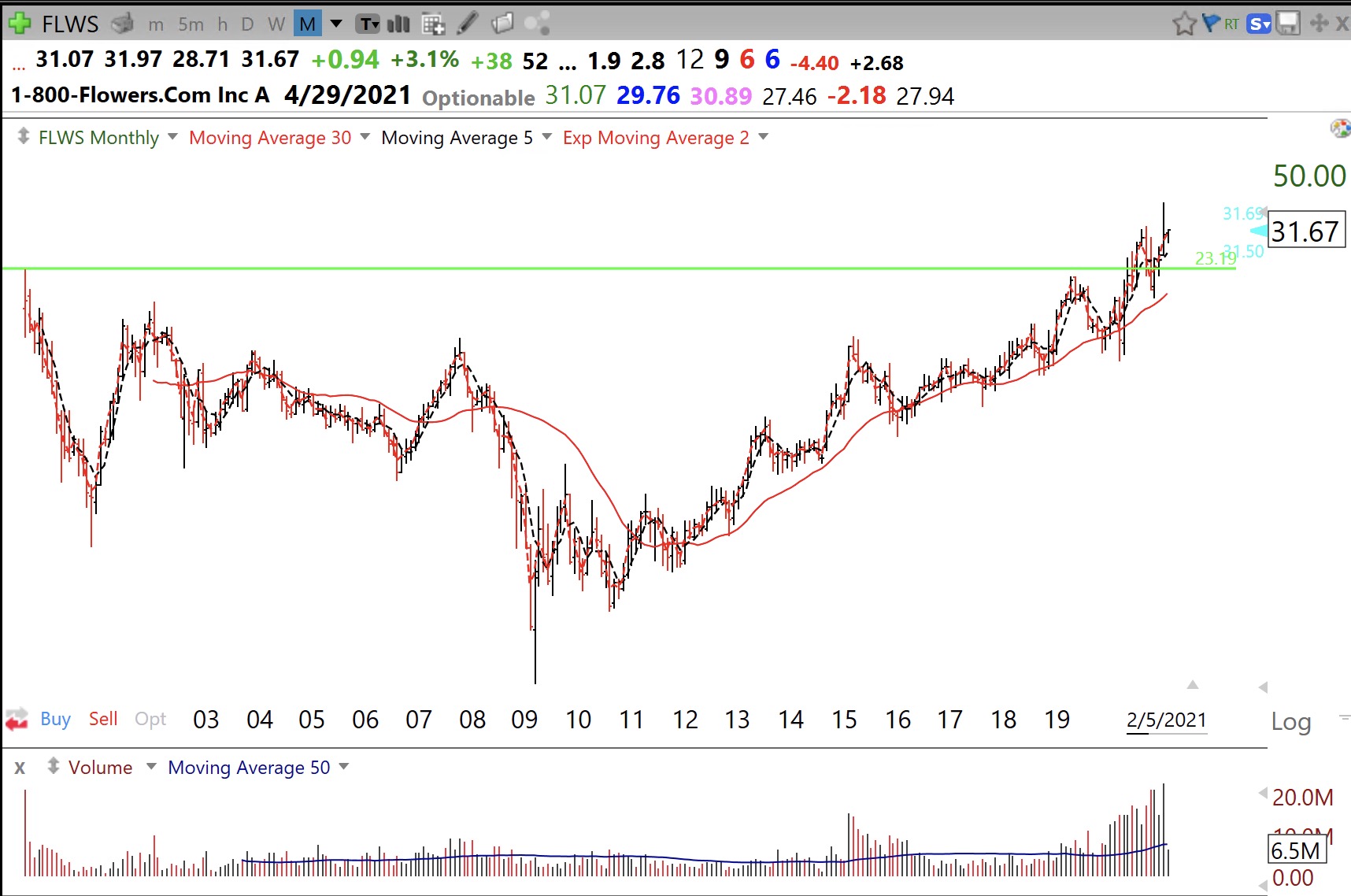
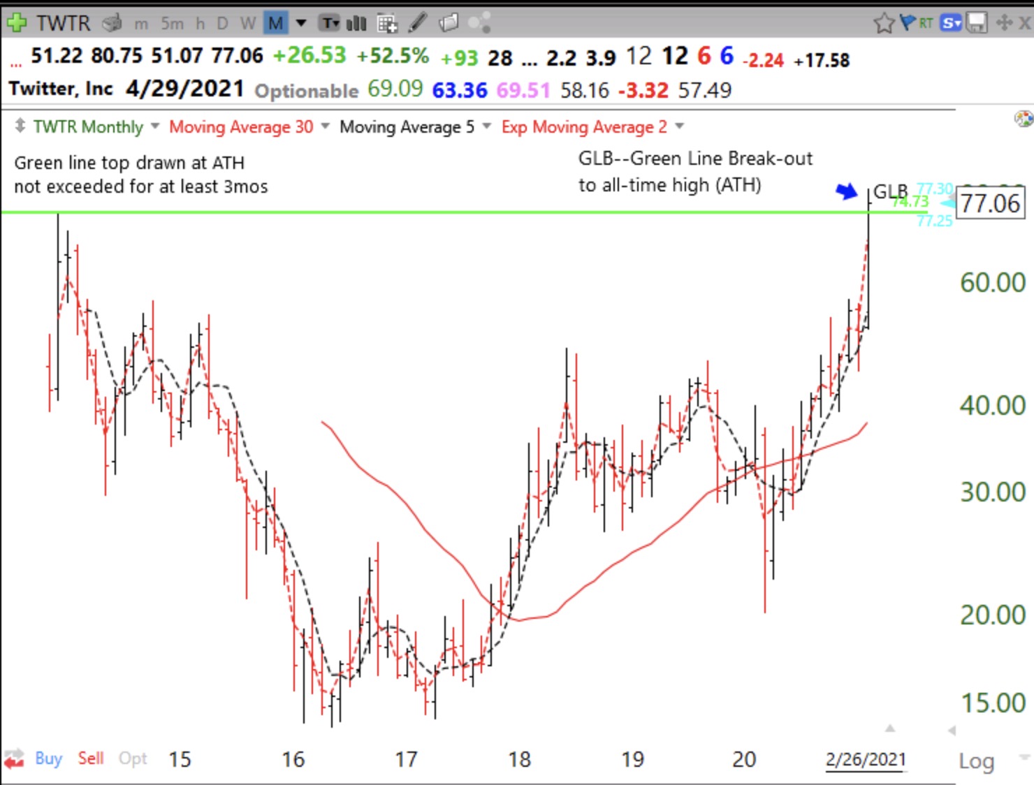
This monthly chart shows that TWTR formed a green line top at $74.73 in December, 2013, a month after its IPO. It stayed below its green line top for 8 years and finally had a green line break-out (GLB) in February, 2021. The GLB can be a major sign of technical strength, especially if it occurs in a company that came public in the past few years. IBD’s founder, William O’Neil liked buying companies that have broken out and had come public in the previous 8 years. After the post IPO frenzied buying, TWTR began a multiyear decline that bottomed in 2016 at $13.73. Since then, TWTR had to overcome all of the overhead supply of selling for years as people who bought it at higher prices sold as soon as they could get their original investments back. TWTR’s GLB is therefore evidence of strong buying interest which brought it back to an all-time high (ATH) after 8 years. This is very impressive!
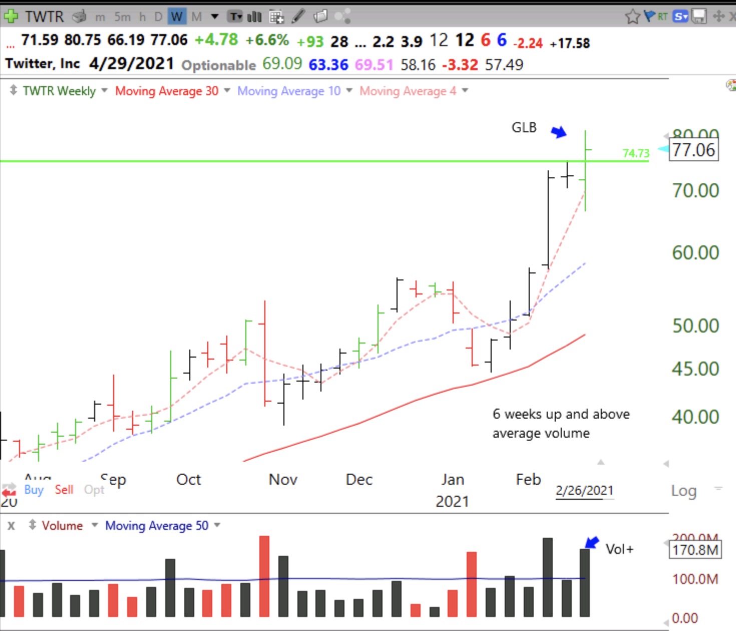
The weekly chart shows TWTR has had 6 consecutive up weeks, with above average trading volume last week when it had a GLB. Notice that last week there was also a WGB (weekly green bar) on above average volume, as required by my scan. The red dotted line is the 4 wk average, purple dotted line = 10 wk, and red solid line = 30 wk. I have noticed that an advancing stock will usually have the pattern: 4wkavg>10wkavg>30wkavg, which is part of my WGB scan.
My TC2000 formulas for the WGB scan are: avgc4>avgc10 and avgc10>avgc30; L<=avgc4 and C>avgc4; C>C1; avgc4>avgc4.1—all set to a weekly time frame. To learn how to color a price bar according to any indicator, check out the TC2000 tutorial videos. When I have previously described the WGB, I said a possible way to minimize risk would be to move up a stop loss just below the low of each succeeding WGB, as seen on a weekly chart. When a stock trades below its most recent weekly green bar it often signals weakness.
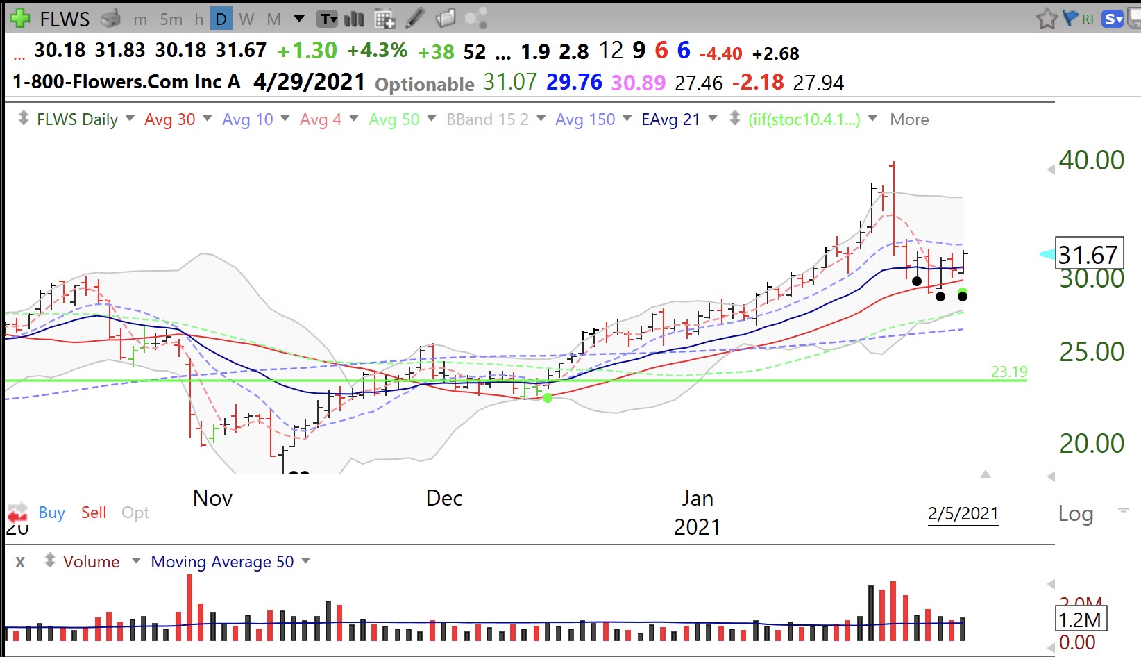
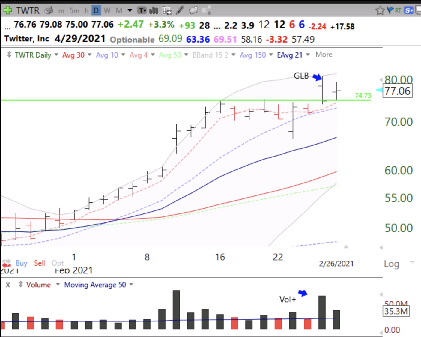
Finally, the daily chart shows the heavy volume on Thursday, the day of the possible GLB. In the weak general market on Thursday, with QQQ down 3.5%, TWTR reversed down from an ATH of $80.75 and closed at $74.59, $0.14 below its green line—a failed GLB. On Friday, it held above the green line and closed at $77.06, again on above average volume, indicating a successful GLB.
I do not own TWTR and do not know if the GLB will hold. As Nicolas Darvas and other traders have warned, failing break-outs is a sign of a weakening market. I may take a small position Monday morning. Note, I always sell any stock I purchased after a GLB if it closes back below the green line. This results in a minimal loss if I bought close to the green line. If the market holds, TWTR could take off. TWTR reports earnings at the end of April…
The GMI has fallen to 1 (of 6) but remains on a Green signal. A second day below 3 will turn the GMI signal to Red. It is very difficult to make money on the long side when the GMI signal is Red. The QQQ has now closed the week below its critical 10 week average. My separate, more sensitive QQQ short term trend indicator is in its 4th day of a down-trend. Time to be very defensive. I may hold off on TWTR.