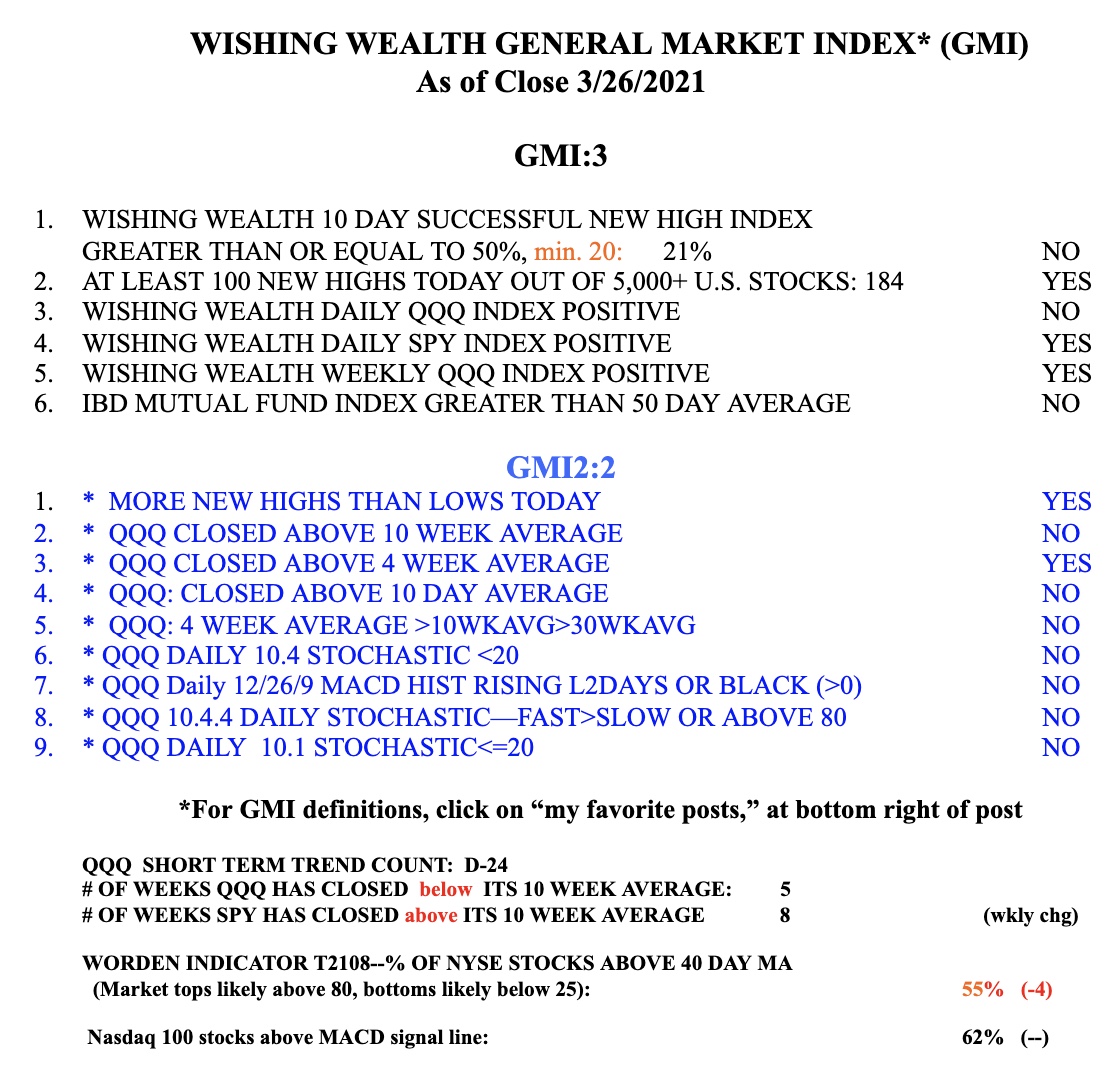
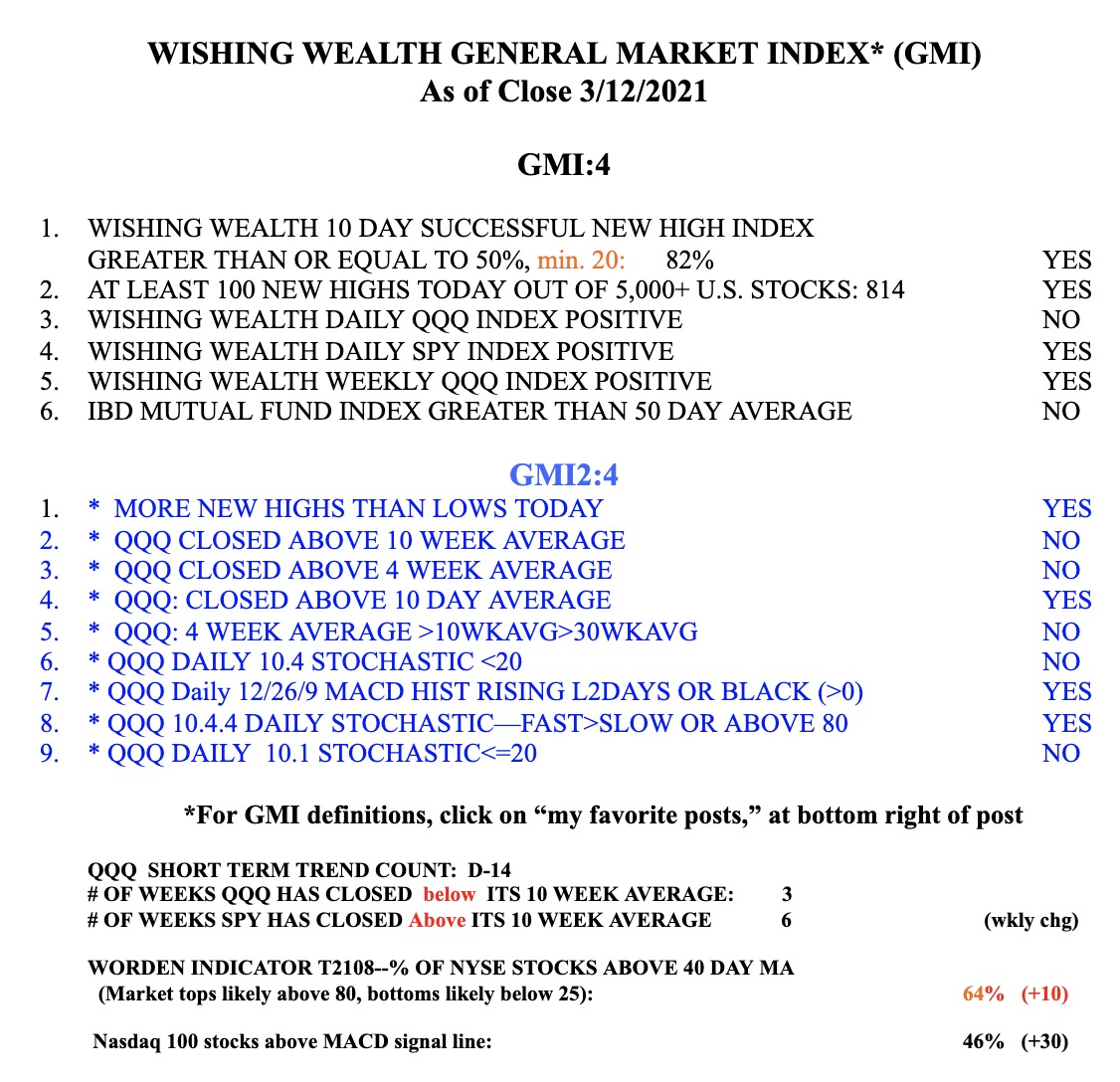
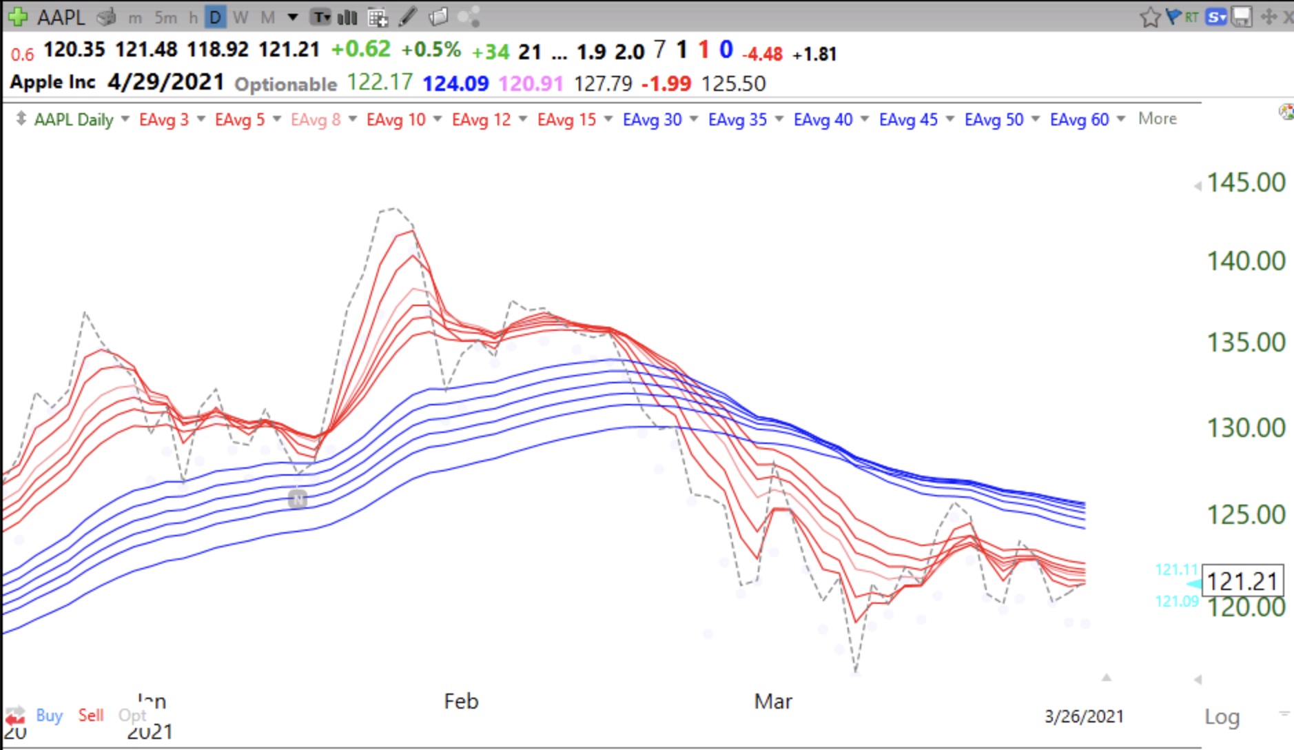
I should have mentioned earlier that the market might rebound with the end of quarter mutual fund window dressing period. Since mutual fund quarterly reports only specify account holdings and not when they were acquired, funds buy up the strong stocks so that they can show their customers how wise they have been. With that period ending we could see some weakness until earnings reports start coming out. Meanwhile, IBD now asserts that there has been a follow-through day (FTD) and that the up-trend has resumed. Time will tell, but only 3 of the GMI’s six components are positive. (See table below.) And look how bad a leader like $AAPL is doing, now in a daily BWR down-trend. (All six red short term averages below the falling blue longer term averages with a white space between them.)
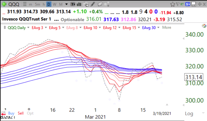
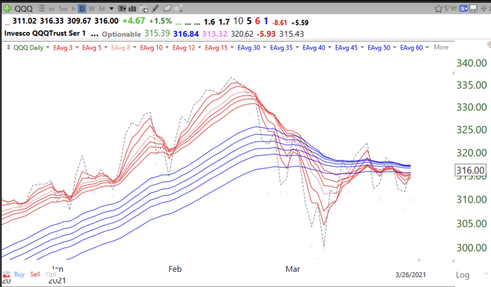
And QQQ is still making up its mind. Which way will it go? Trend followers stay pat until the trend is defined.
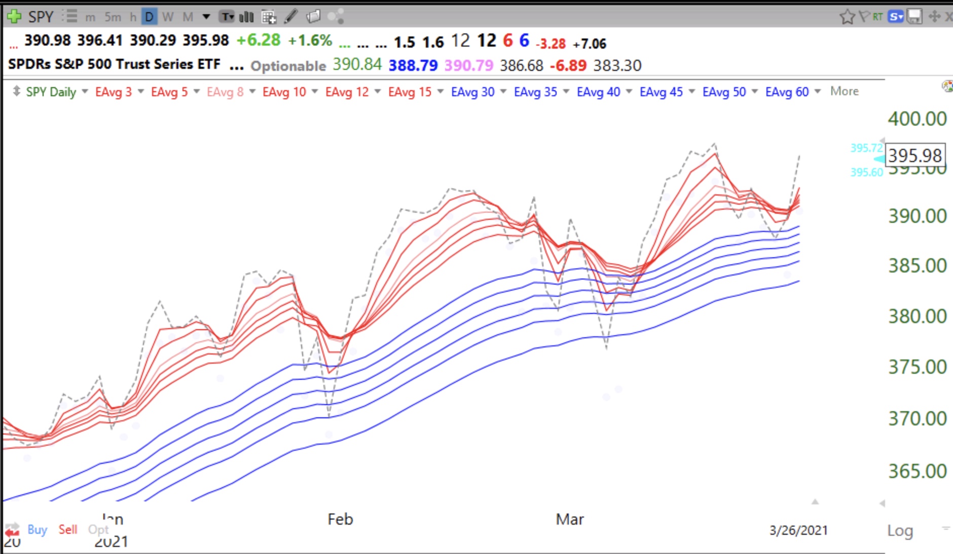
But SPY remains strong, hence the bifurcated market.