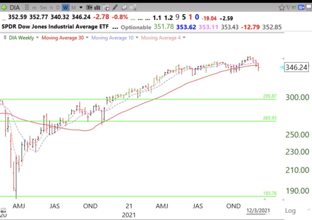
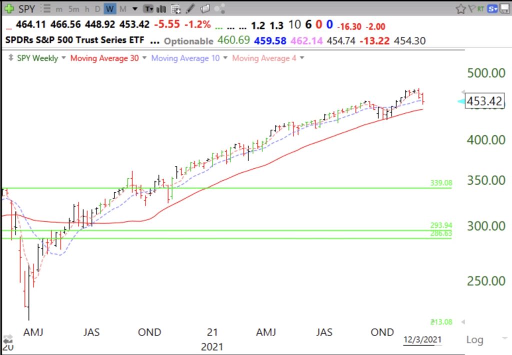
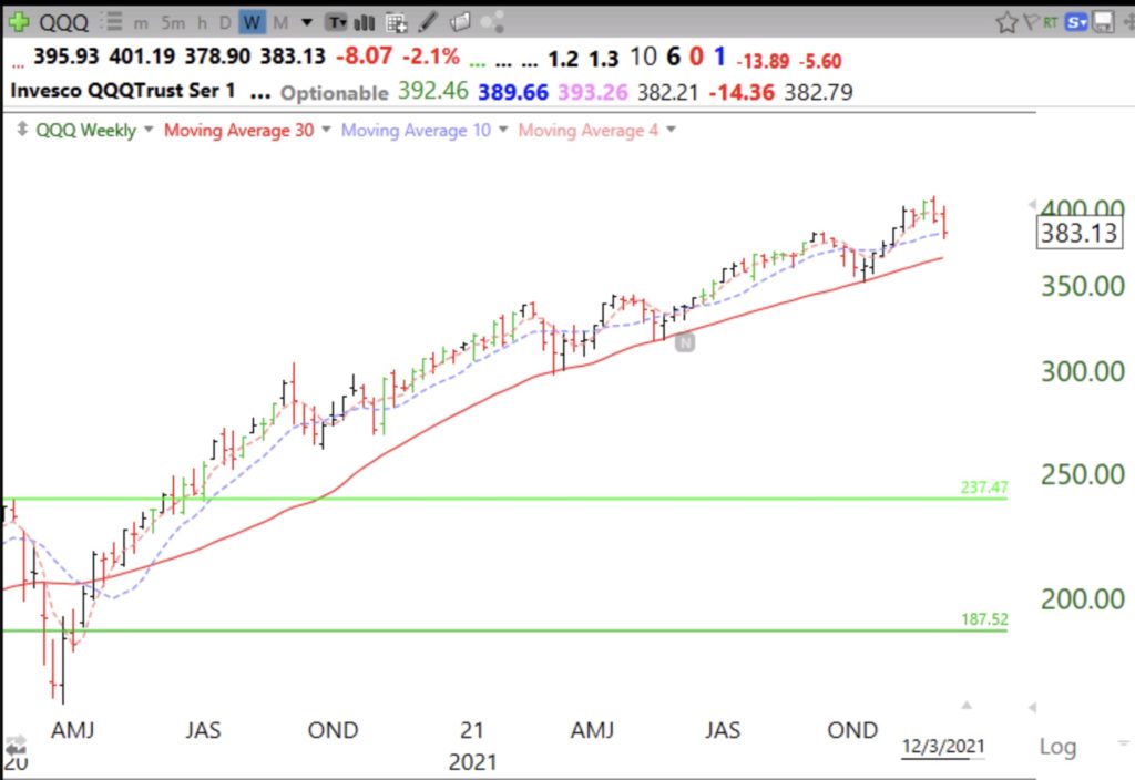
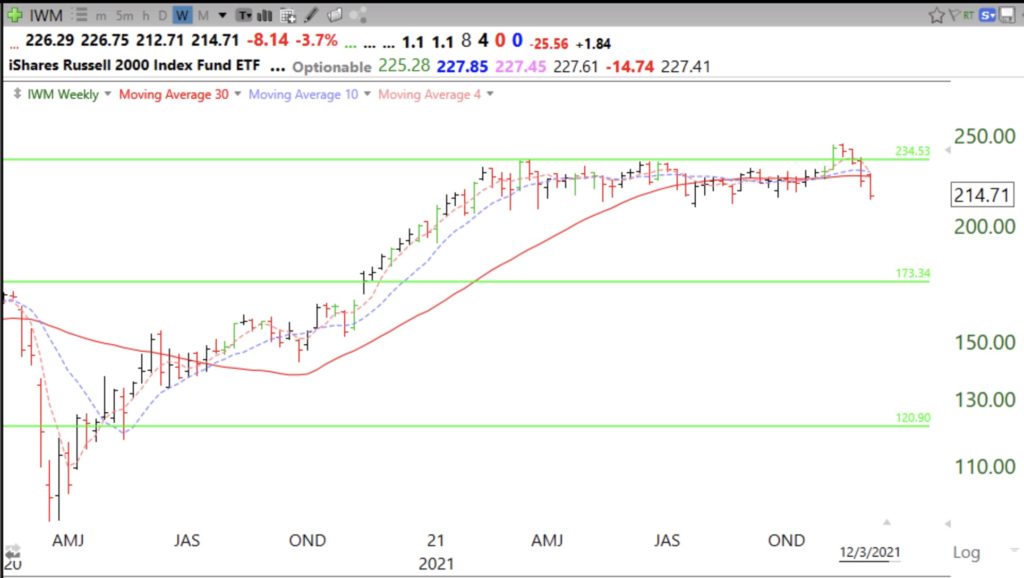
10 doublers that last week reached an ATH on above average volume and how I found them: $APPS, $TRUP, $DKNG, $FVRR, $NVCR, $GRVY, $NVTA, $PENN, $SWAV, $WKHS

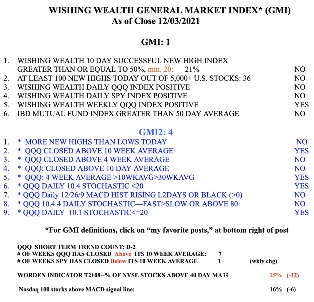
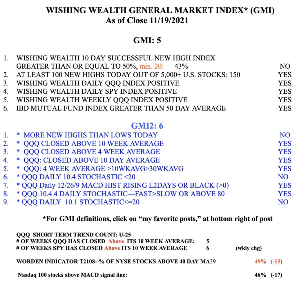
GMI1/6
GMI-22/9
T210843%

Most of the traders I admire (Darvas, Livermore, Ryan, O’Neil and Minervini)  concentrate on buying promising growth stocks that have advanced in price, built a base, and then emerge to an ATH (all-time-high) with a burst of trading volume. I find such stocks using my GLB (green line break-out) technique. I draw a green line on a monthly chart at the peak price after the peak has not been surpassed for at least 3 bars (months). I then often put an alert in TC2000 that emails or texts me immediately when the break-out occurs. I then can look at the chart and the volume buzz on TC2000 to tell me whether the GLB is occurring with above average trading volume. However, most of us who earn a living working and are not professional traders need a less eyes on the market and part-time approach to trading/investing.

Enter weekly charts. The great William O’Neil relied on weekly charts because they reduced the noise (volatility) that is found in daily charts. He could discern the trend better. Many times I look back at a strong stock that I was shaken out of because of its daily volatility only to find that its weekly chart could have kept me from selling.  I have created a note on my monitor that says I must look at the weekly chart before I sell. It turns out that one can  use weekly charts to see the true market winners as they emerge from a GLB and the required above average volume. To find these I created a late Friday or week end column scan in TC2000 with the following conditions, all done on the weekly time frame.

Syntax is: High this week was the highest in 50 weeks: H=maxH50; High this week was at least 200% the high 50 weeks ago or greater than 150% of the lowest low the past year: H>2H50 or H>1.5MinL50; Volume this week is greater than 130% of average volume the past 50 weeks: V>1.3*AvgV50; Closed this week greater than $20: C>20

The great Nicolas Darvas looked for stocks that had at least doubled over the past year. Past behavior predicts future behavior. Want to find a stock that will double in a year? Find one that has already done so. Taser went up 7x, consolidated, and then went up 7x again. I also accept if the stock has doubled from its lowest point in the past year. I don’t buy cheap stocks. Hence my minimum price of $20.

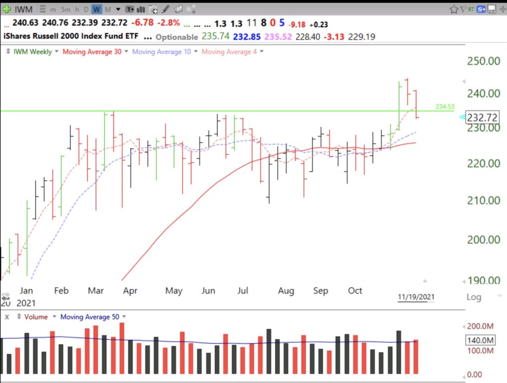
After I run this column scan I then look at each monthly chart for stocks that have passed it and draw in the appropriate green line. If it had a GLB recently I may become more interested in pursuing the stock.  This weekend this scan came up with 74 out of 5,096 US stocks and 25 out of 948 stocks in my IBD/MarketSmith stocks watchlist. Among these 25 that had had a recent GLB are: APPS, TRUP, DKNG, FVRR, NVCR, GRVY, NVTA, PENN, SWAV, WKHS. (DKNG had a rare flag pattern but not a GLB.) Stocks that have doubled already and can come through a declining market to all-time-highs on above average trading volume may prove to be true market leaders. Here are a few of their weekly charts:


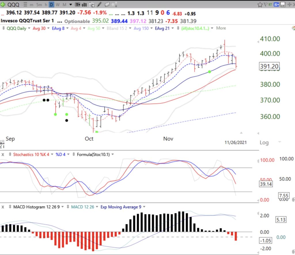
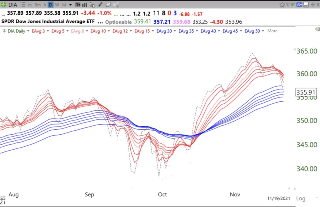
These stocks are acting strong in a weak market. However, the GMI=  1 (out of 6) and remains on a Red signal. This type of market requires me to hold small positions with close stops  and maybe an inverse index ETF…


New freshmen class and possible online workshop! How I use Bollinger Bands and how this indicator foreshadowed this decline; Just a brief shake-out? Short and long term trends of the market remain up

GMI4/6
GMI-23/9
T210855%

My new online class with 100 freshmen began on Friday. What a wonderful privilege to teach the next generation how to ensure their financial futures! Thanks to Mark Minervini (IBD), Irusha Peiris (MarketSmith) and Michael Thompson (TC2000) for making my class possible!!

Many of my students will be watching this blog and I will therefore take the time today to explain some things in more detail. Many people have asked to take my class and I have always responded that  it was only open to a small group of university students. I have arranged with the university to offer a noncredit online workshop to all persons worldwide who wish to enroll. I will announce the workshop in a few months. It will likely be 10 2-hour sessions, once a week, in the evening. There will be a fee paid directly to the university and  my research center on substance abuse will benefit from the proceeds. Stay tuned.

One of the most important indicators I put on my daily charts is Bollinger Bands. These bands create a 95% confidence interval around a moving average. I use a 15 day average and the lines are drawn 2 standard deviations above and below that average each day, yielding the 95% prediction. All you need to understand is that almost all prices will remain within these 2 bands and when a price moves outside it often times comes back in, reverting to the average or begins a new short term trend.

The bands are very useful. When a stock has been rising, once it goes above the upper band it can mean the end of the short term rise. However, if a stock has been consolidating, a rise above the upper band can signal a break-out. Similarly the lower band can show times when a stock will bounce up or begin a larger decline.

On Friday, the QQQ and APPL declined to near their lower bands and bounced. A failure of one of these bounces would suggest to me the likelihood of their further decline. The blue arrows show the last 2 times the QQQ has bounced off of its lower BB. An alternative interpretation could be that the indexes found support near their exponential 21 day moving average (blue solid line), an indicator used by many traders. If multiple indicators work, they must be somewhat correlated!  I prefer the BB because I think it works better for me. Notice how the QQQ stays mostly within the bands and think how you might use this phenomenon  in your trading rules..

AAPL, which is highly correlated with the QQQ (Nasdaq100 ETF), also bounced near its lower BB. Note that at its recent top, AAPL traded outside its upper BB and reversed to close below it, a sign that it was extended and could decline. The black dot indicates a bounce up off of an  extremely oversold short term condition and the green dot in July represents the possible start of a new short term up-trend which was confirmed by a break-out above the upper band. The two green price bars show a bounce up off of the lower BB. My students learn how to create all of these indicators using the TC2000 charting software, see the upper tab on my blog. My talented former student and current teaching assistant, Richard Moglen, has created a series of youtube videos that you can access.


One more example, ZM. The large volume break above its upper band was a sign of ZM’s being extremely extended. I mentioned in a prior post that more than 50% of Nasdaq100 stocks had traded that day above their upper bands. The following day we had that large decline.  Trading stocks without charts is like driving to a place for the first time without Waze!


On Wednesday, 56% of the Nasdaq100 stocks traded above their upper BB. On Friday only 2% traded above their BB and 42% traded below their lower BB, suggesting to me at least a market bounce. Meanwhile my $QQQ short term indicator remains in an up-trend at day U-106. The GMI remains Green and is at 4 positives (of 6). The more sensitive GMI2 fell to 3 (of 8). Note there were more new lows than highs on Friday, for the first time since last May. In view of  the extreme oversold condition of the market indexes and the many oversold stocks  on Friday and the  GMI on a Green signal, I have to say that last week may turn out to have been a rapid shake-out in the midst of a continuing up-trend. Enjoy the weekend!!!!!