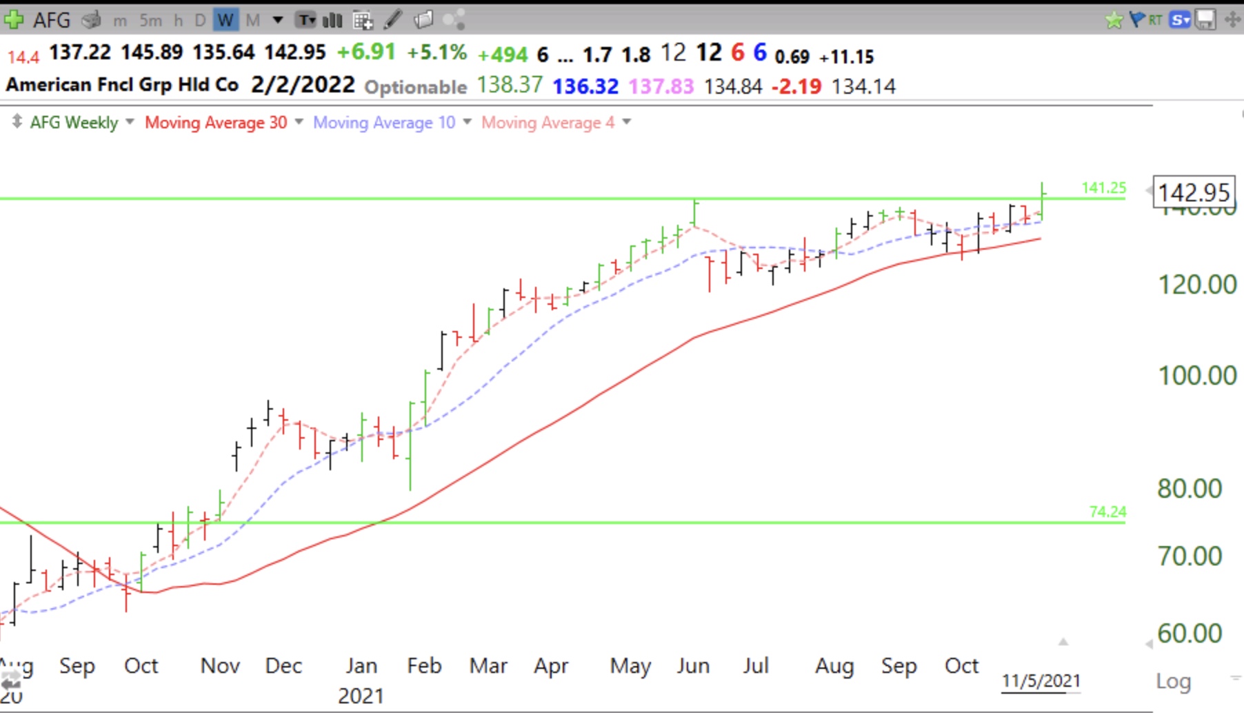
I put an alert in TC2000 to text me if SEDG has a GLB (green line break-out). I intend to tweet it out as soon as I get the signal. Solar has been hot lately, (pun intended). See the weekly chart below. MarketSmith listed SEDG under their Stock Ideas tab as a stock near a Cup with Handle pivot. MarketSmith is a great tool that my students are learning to use.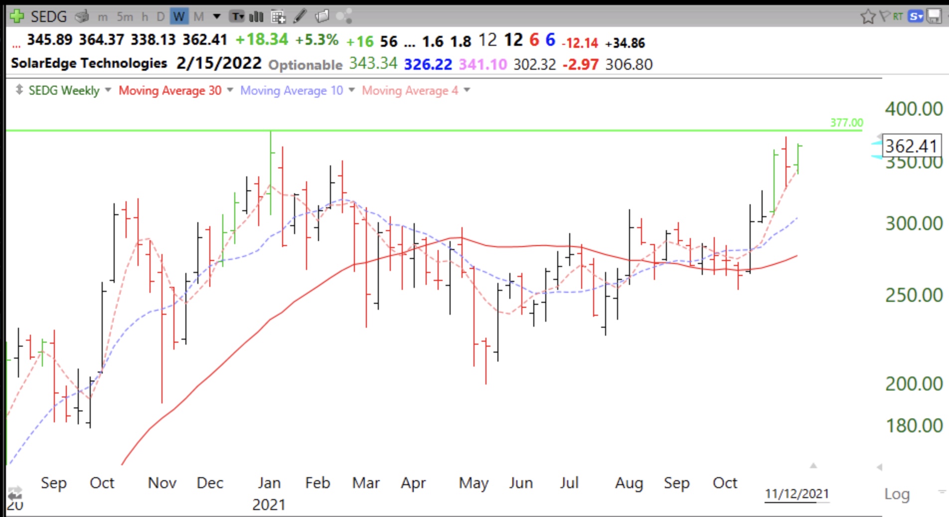
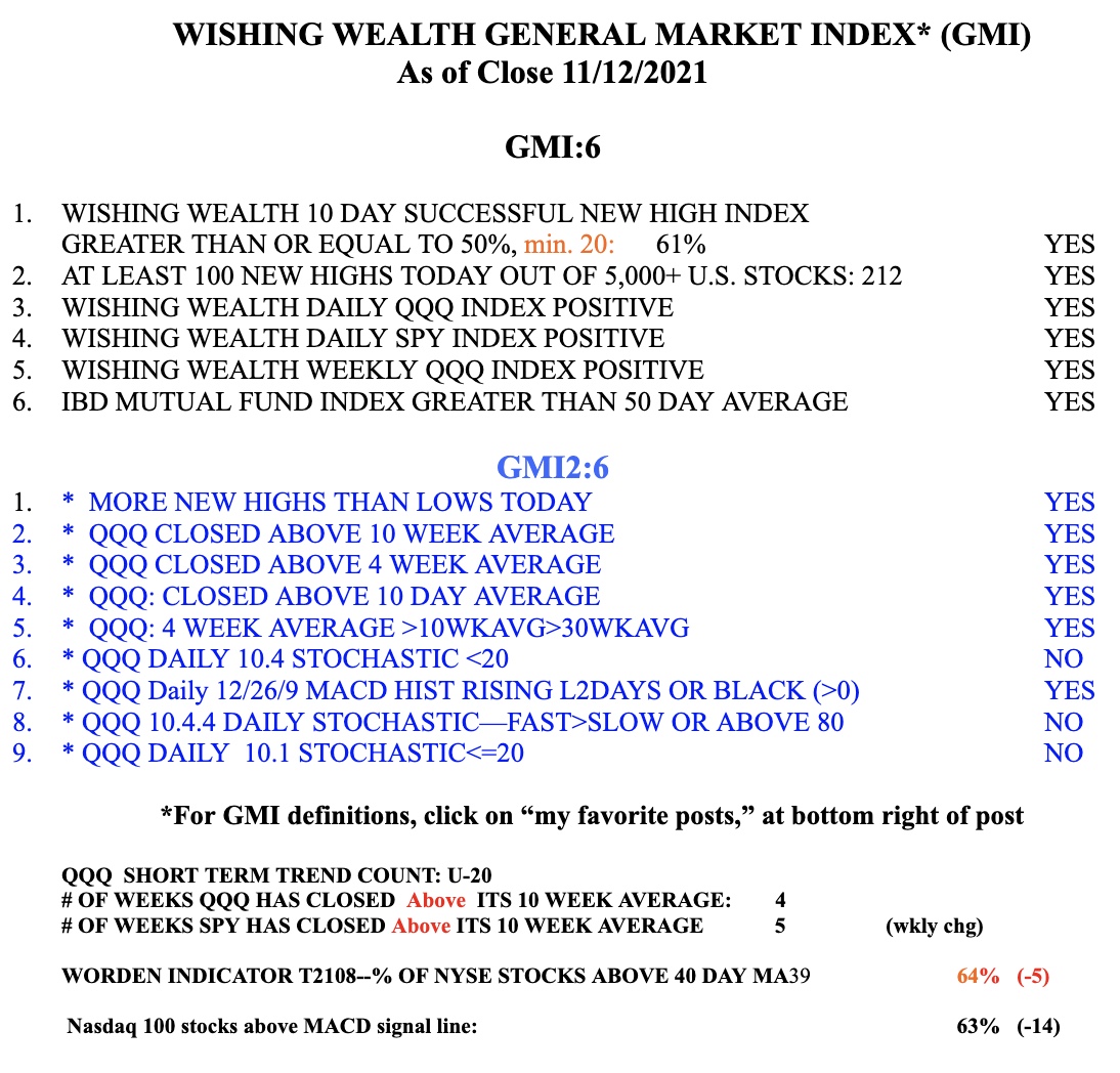
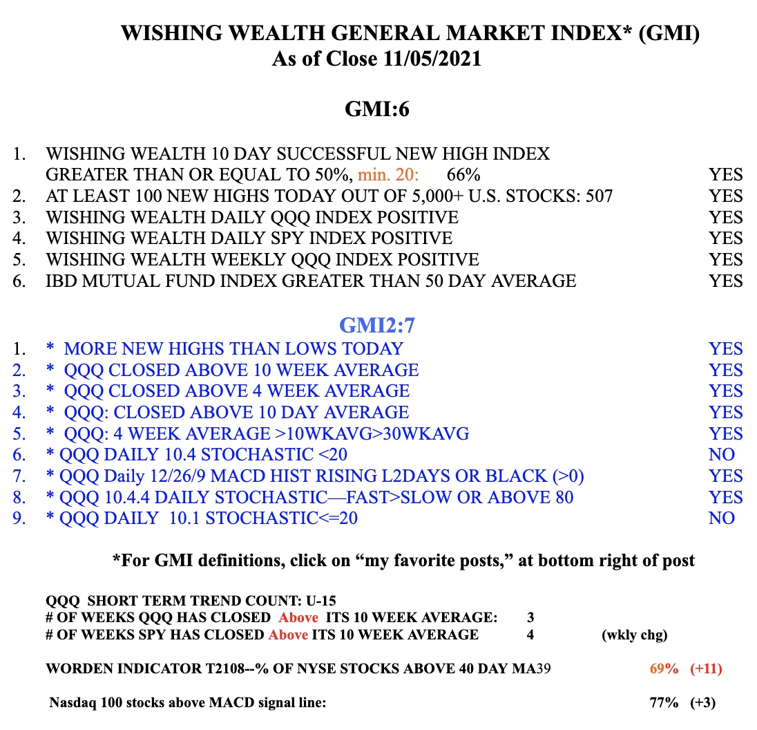
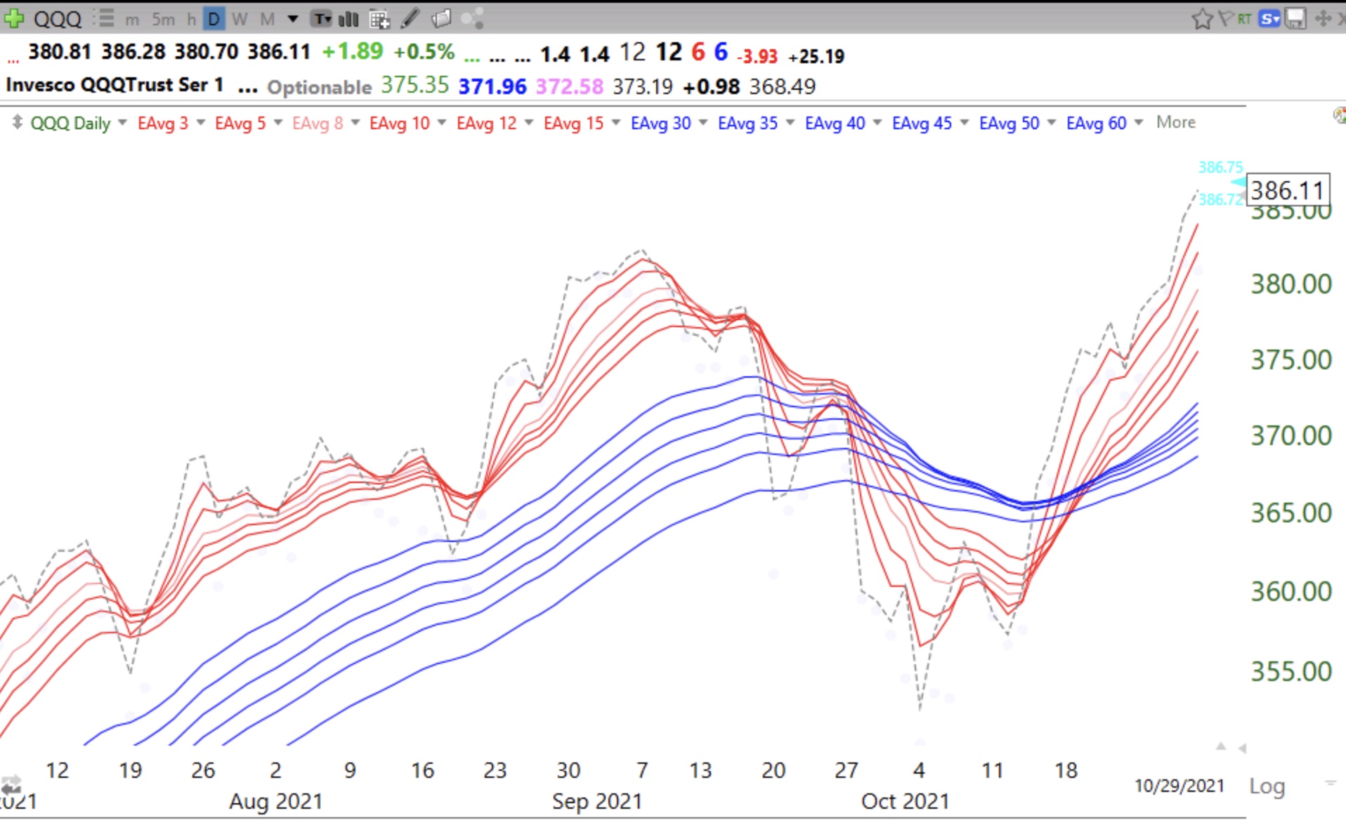
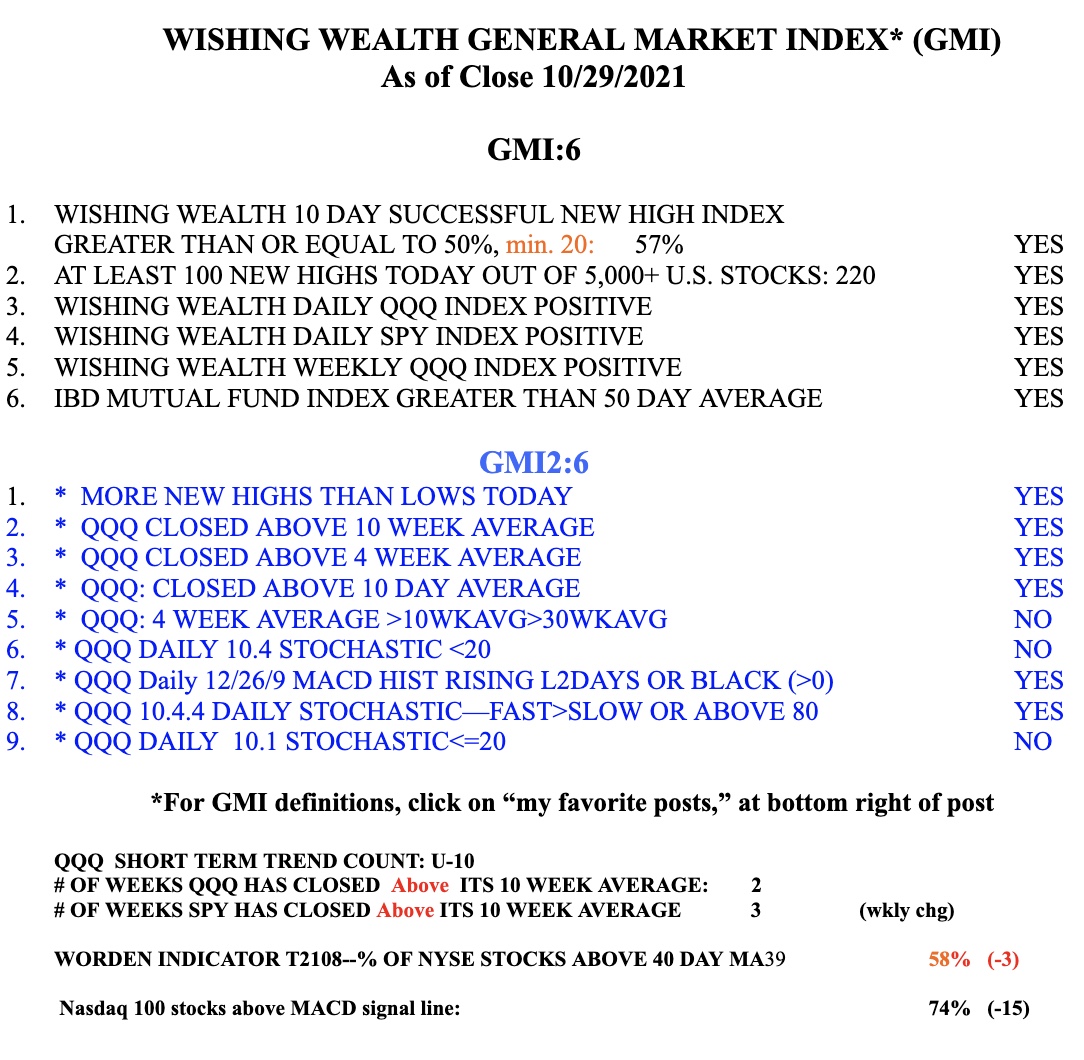
The GMI remains on a Green signal at 6 (of 6).