On my use of the GMI, A Darvas type RWB rocket stock: $AMBA

GMI6/6
GMI-28/9
T210864%

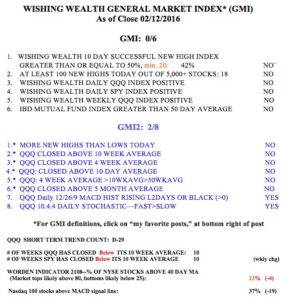
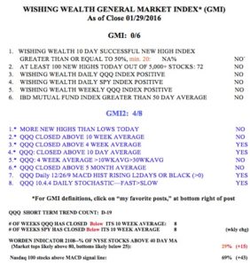
Most of my readers know that using many of the indicators counted by the GMI (see box at bottom of this page) I was successfully able to stay out of the market during most of the 2000 and 2008 declines. After a bottom was in I reinvested on the long side. The GMI has a very good track record but every time it turns to a Sell does not signify to me that a major decline is beginning. In the past, the 30 week average of the QQQ had to turn down to get me to pull my most conservative pension money out of the market. In spite of the fact that this critical moving average did not turn down in the past year, I mistakenly (in hindsight) took most of my university pension out of mutual funds and put the proceeds into money market funds. The huge increase in my pension account since 2009 together with my fear of losing the gains caused me to ignore my primary rule and to prematurely go to cash.   I am back in the market now. I wanted to clarify this situation for my readers, many of whom are interested in knowing what I am doing with my pension account. As one gets closer to retirement, s/he must deal with the fear of losing needed savings versus staying invested.   This is a very difficult challenge for boomers who wish to manage their money. I use the GMI and my short term trend count to guide my trading in my most speculative and short term accounts….

As you know, one of my most celebrated stock gurus is Nicolas Darvas, who made a fortune in two years in the 1950s by teaching himself how to trade. His book (How I made $2,000,000…” is listed to the right of this post and is the first book I assign to my university students. Over the years I have designed an EasyScan in TC2000 that scans all stocks for stocks that I think might have met Darvas’ selection criteria. I ran the scan of almost 6,000 stocks this weekend and it came up with 46 stocks. (I talk about the Darvas scan in my 2012 Houston TC2000 webinar video, whose link is in the green box on this page.) Below is one stock, AMBA, that came up in the Darvas scan and that is also   above its recent green line all-time top. This modified weekly GMMA chart shows that AMBA has the RWB pattern and recently broken above all of its shorter term averages (gray dotted line above all red lines). AMBA is worthy of my researching. Note that AMBA is due to report earnings this week, on March 3rd.

AMBAGMMA02272015

Meanwhile the GMI remains at 6 (of 6) and on a Buy signal.

GMI02272015


An important limitation of the GMI signals

GMI6/6
GMI-28/9
T210864%

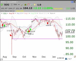
I have found that since 2006, the GMI has done a good job of keeping me on the side of the general market trend. It is my cardinal rule to trade consistent with the market trend.   While the GMI has helped me to exit the market in prior major declines, I have discovered an important limitation while examining GMMA charts. From the GMMA chart of the QQQ below, I can see that since early 2014, the GMI has issued 7 separate Sell signals (red arrows) followed by 7 Buy signals (green arrows). However, during this entire time the QQQ has remained in a strong RWB up-trend, with all of the shorter term averages (red) above the rising longer term averages (blue)!

QQQGMMA02202015It is clear to me that a GMI Sell signal should only be used by me   for short term trading decisions. Last week I posted that prior major market tops have been signaled when the shorter averages declined below the longer term averages. I should therefore probably remain invested long term in the market (at least in my university pension account) as long as the RWB pattern is in place, even when the GMI signals Sell. I am reinvesting my pension funds back into mutual funds. In the future I will use the GMI signals only to guide my shorter term trading in my more speculative accounts. I will heed the GMMA chart for longer term trends. One must never stop learning and adapting when it comes to the markets….

The GMI remains at 6 (of 6).

GMI02202015

GMMA charts show no market top in sight

GMI5/6
GMI-28/9
T210864%

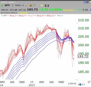
I read a lot of pundits who repeatedly claim that this market is topping. If they keep claiming this, someone will eventually be correct! But we technicians rely on indicators to guide our trading. We must always guard against marrying a scenario and be ready to change direction to be consistent with the market’s main trend. One of the methods I have found useful for timing the market is to use a modification of the the GMMA charts developed by the Australian   technician, Daryl Guppy.   Guppy charts plot 12 weekly exponential moving averages on a chart. Six are shorter term averages and 6 are longer term averages. I have added a 13th average, a simple average of length 1 to show me the closing price each week. I always plot the 6 shorter term averages in red and the longer term averages in blue.   A chart where the red lines are rising above and separated from the rising blue lines is showing a RWB advancing pattern. The reverse, a BWR pattern, is evidence of a declining pattern. I make the price bars white so they do not visually distract from the averages.

This chart of the top of the QQQ in 2000, shows how the RWB pattern failed and became a BWR pattern. This is what a market top looks like. The red lines converge, demonstrating little price movement over the different average lengths, and finally you get the red lines below the blue lines with a white area separating them. Note the re-emergence of the RWB pattern in 2003, after the bottom . (Click on chart to enlarge.)

Telechart2000QQQtopNow look at the 2007 top. Again we find the RWB pattern turning into a BWR pattern. Anytime the white space disappears and the red lines fall below the blue lines it is appropriate for me to become defensive.

Telechart2008topSo what is the current GMMA pattern showing? A clear continuing RWB advance! In fact, it looks like we have broken out of a consolidation where the red lines converged and have now turned up again. Note that a   RWB pattern   has persisted since early 2013.

Telechart2015

By the way, I like to use GMMA charts for analyzing individual stocks too.   See AAPL below.

AAPLgyppy02152015And TSLA–no more RWB!

TSLAguppy02152015

The entire bull to bear cycle in GLD is remarkably clear. Guess where we are now?!

GLDguppy02152015

With that said, I have begun to transfer some of my university pension funds back into mutual funds. The GMI has been on a Buy signal since January 23rd, and I have resisted it until now. Everyone has to sell down to their own comfort level.

GMI02132015