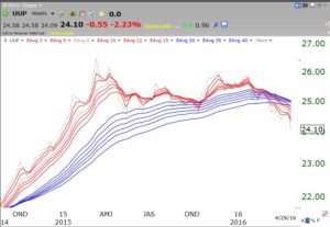
I think my adapted GMMA charts of gold and the dollar tell the whole story. This weekly GMMA chart of the dollar ETF, UUP, shows a developing BWR (blue/white/red) decline pattern. The six shorter term averages (red lines) are now below the longer term averages (blue lines). The white space separating them is yet to clearly develop. Note the contrast of the current pattern with that from the prior two years.
 And the gold ETF, GLD, now shows the opposite advancing RWB pattern with a white space developing between the red and blue lines. Again, note the long period the past 3 years when gold was declining and the red lines were consistently below the blue lines.
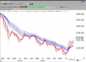 I will leave it to others to opine about why the dollar is declining. However, a weakening dollar might help international companies when they convert their foreign earnings into more dollars. But a weak dollar means higher commodity prices and therefore more inflation. Will higher inflation then lead the Fed to raise interest rates and to support the dollar? Such a scenario of higher interest rates would eventually hurt the stock market. It always has. Regardless, for now, with GLD in an RWB up-trend, it may be advisable for me to hop on the gold train….
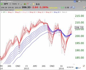
In contrast, the GMMA of the SPY shows a gyrating market with the nice RWB pattern of 2014 to mid 2015 clearly over. At some point a persistent RWB or BWR pattern will develop and it will pay to be fully invested with that trend.
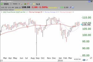
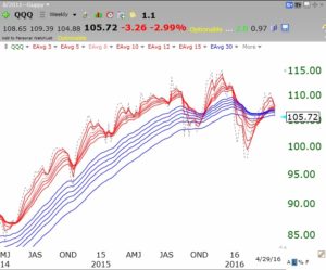
The tech stocks, measured by QQQ, look a lot more weak. A major decline will be likely if the short term averages (red lines) continue their decline below the longer term averages (blue lines.) A possible head and shoulders top formation is quite evident in this GMMA chart of QQQ. The downward sloping neckline, caused by the most recent decline having ended lower than the prior decline is considered by technicians to be a major sign of weakness. Regardless of whether a major decline materializes, it is obvious to me that the momentum of the tech stocks is quite different now than we had in 2014 and the first half of 2015. I need to be very careful. It is much easier to profit on the long side when the averages are in RWB up-trends….
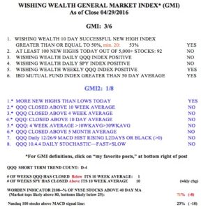
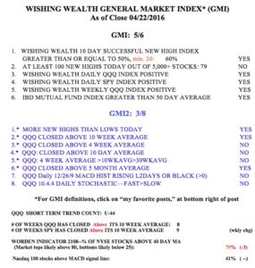
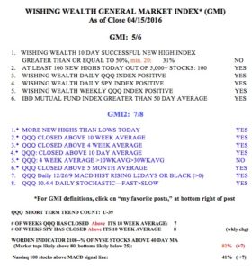
 And almost on cue, the GMI, at 3 (of 6) and the GMI2, at 1 (of 8) are telegraphing market weakness. And the QQQ has now closed below its critical 10 week average. With the beginning of the Sell in May period, a possible Fed interest rate hike in June, and a tumultuous election period on the horizon, this aging bull market may be about to be Trumped…….
