A trend follower discerns the likely current trend of the market or stocks and rides it until it ends. S/he enters after a bottom and exits after a top is formed. Jesse Livermore said the big money is made by staying with one’s winning position until there is evidence of a change in the stock’s behavior. In spite of the many people who subscribe to this approach, it amazes me that so many of us seem unable to resist the temptation to proclaim tops and bottoms before they occur! Is it just ego and attempts to appear smart? For me, part of the answer is that the day that I will depend on my pension accounts for survival grows ever near and I become more of a chicken with my trading. So I exit too soon.
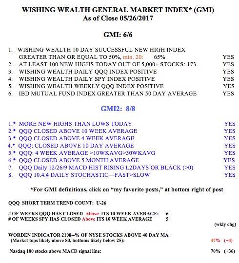
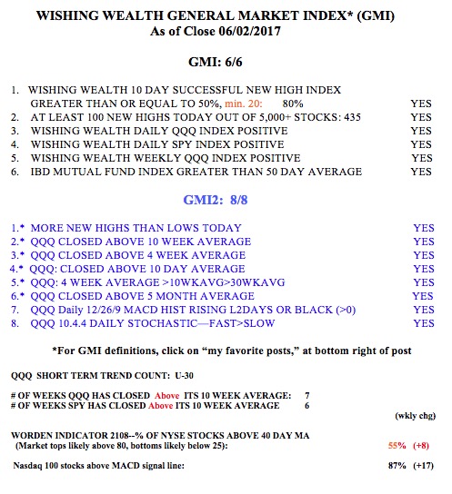
But the major market indexes remain in Weinstein Stage II up-trends, and I have been resisting it by holding back and looking to take profits before the expected dreaded decline begins. However, my GMI indicators did alert me to get out of the market in 2000 and 2008 before most of the carnage. So why should I disregard what they are telling me now? Therefore, with the GMI at 6 (of 6, see table below) I am continuing to hold stocks and keep my university pensions fully invested.
But I repeatedly took profits in my trading accounts and sold out of many stocks that have continued to climb to the sky. I am therefore working on correcting that weakness in my trading by focusing more on weekly charts than daily charts. One would go crazy checking his blood pressure or cholesterol levels multiple times each day. I believe that focusing on daily charts has worked against me as a part-time trader also managing a full-time job. I have reviewed many of the stocks I exited on their daily chart because of weakening technical signals, only to see that there were no danger signals showing up on their weekly charts. You might want to try this type of review exercise for yourselves. I recall that William O’Neil relied primarily on weekly charts. What did he know about this that I do not? I think I am on the right track and will discuss these ideas in my future posts as I figure it out….