End of window dressing; day 78 of $QQQ up-trend; turbulence ahead? $PNRA, how to have patience after a GLB; GLB: $FIZZ

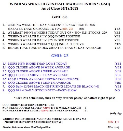
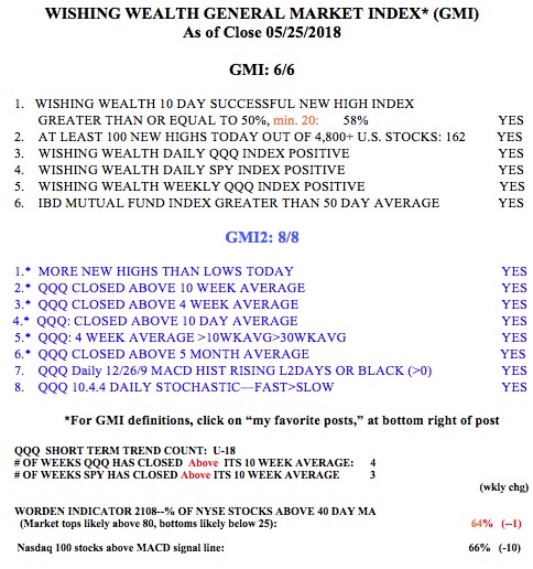
GMI4/6
GMI-28/9
T210850%

I have been writing that strong stocks often rise during the last week of the quarter as mutual funds spruce up their portfolios to look smart in their quarterly reports sent to investors. The indexes sold off on high volume at the end of the day on Friday and I am waiting to see what happens this week now that the quarter is over. The SPY and DIA are weaker then the QQQ and up against some technical resistance.  Also, having passed day U-78 in the current QQQ short term up-trend, we are approaching the longest up-trend since I began recording this in 2006 (at U-88). I therefore would not be surprised to see some short term turbulence this week….

Chart patterns often times mislead us into thinking that obtaining gains is easier than it is. Often times a stock has a major break-out (GLB) only to have it vacillate and consolidate before it takes off. On a chart the consolidation looks small and rapid but in reality it often means that we buyers need to have incredible patience to hold on. The greatest trader, Jesse Livermore, said that it was his sitting tight not his trading that made him big money. When you see on a chart that after the GLB a stock eventually continued its rise you think that patience with the position must have been easy. But in fact holding on in the days and weeks after a break-out is psychologically very difficult because we do not know what the outcome will be. This daily chart of PNRA provides a good example of this situation. After a green line break-out (GLB) to an all time high (ATH) on above average volume PNRA went sideways for about 23 days. Would you have held on through its ups and downs and all of the media pundits’ predictions of a market top during PNRA’s consolidation? It appears so easy to wait only when we can see how the story eventually ended! (Trading is mostly psychology.)

This is one of the reasons why I like the daily RWB strategy that I have been describing lately. It helps me to cut through the daily noise. PNRA remained in a nice RWB pattern after its GLB. It never closed below all of its red lines (RLC never equalled 0). There were 4 days when any daily low (indicated by purple dots) was below all of the red lines and in the white space between the two sets of lines, but PNRA always rebounded to close within the red lines (dotted line tracks the daily close). Hence my preference to use mental stops sometimes and to check my positions around 15 minutes before the close each day. But even a close below all 6 red lines is not necessarily the preferred exit point. Alternatively, I might just reduce my position or wait for a close below at least one blue line. As long as the RWB pattern is in place with any white space between the red and blue lines the stock is in an up-trend. Also, after a GLB, I must sell if the stock closes back below the green break-out line. (When a set-up fails to proceed as expected, I exit.) PNRA never breached its green line……

FIZZ is a perfect example of  the RWB of a stock that never hesitated after its GLB. Note that FIZZ has closed above all of its 12 daily averages for weeks, even before its GLB. No daily low has even occurred in the white space! Its pattern is still a perfect 12/12/6/6.

Had I only traded FIZZ on the day of its GLB or sooner……

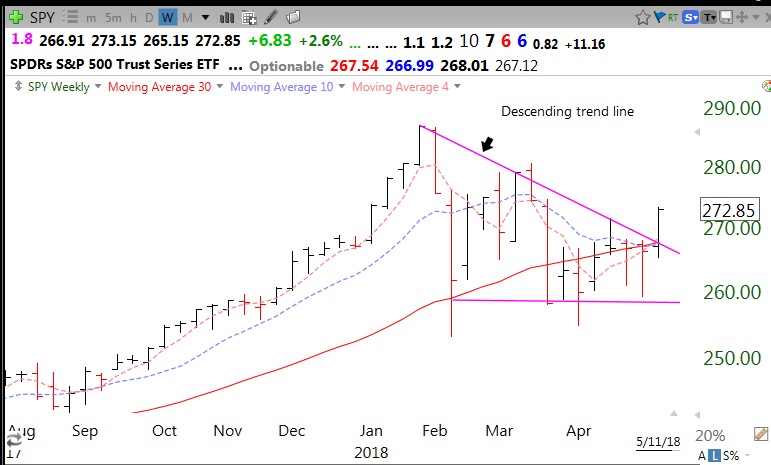
The reason I am very skeptical of the health of the overall market is this chart of the SPY. The chart has a 9/6/6 daily pattern which shows that only 9 of the 12 daily averages line up perfectly and SPY closed Friday above the 6 red lines and 6 blue lines. However, the RWB pattern broke down last week and the red lines are back floating just a little above the blue lines. Note the diminished white space between the red and blue lines. Whether this minimal RWB pattern can survive will tell me the likely short term direction of this market. The 12 (12/9/6/6) shows me that all 12 weekly averages line up perfectly on a weekly RWB chart, indicating a strong longer term pattern. The DIA has a similar pattern, not shown. But remember, by definition, the short term trend always turns down before the longer term trend.

Note the stronger RWB pattern in the QQQ (12/12/6/6), reflecting strength in the non-financial and tech stocks contained in the NASDAQ 100 index.

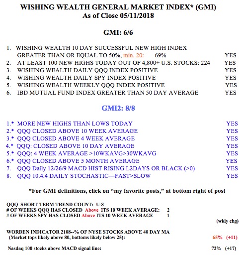
This explains why the GMI, with its  components focusing on the QQQ,  remains at 4 (of 6).


Market rally over? My refined strategy for timing exits and entries; Recent GLB: $LITE

GMI3/6
GMI-24/9
T210837%

I spent a lot of time over spring break last week reviewing the market and my technical approach. I gained a renewed interest in the value of daily RWB charts.  RWB charts consist of 12 exponential moving averages (see this blog’s glossary for definitions) plus a simple one day average to show the daily close. Daily RWB charts move more quickly than weekly charts and provide possible exit points for stops that are closer to my entry points. Minimizing losses are critical to trading success.

I developed 3 quantitative measures that  help me to characterize a daily RWB chart pattern. The total line count (TLC) is a count of the averages that fall into line with the close and each average higher than the next longer average. A perfect TLC of 12 means that the current price is higher than all the remaining averages that are lined up in order below it. This daily chart shows a TLC=12. The dotted line is the daily close.

The purple dots show each daily low and provide a way of assessing volatility and support for placing stops. The red line count (RLC) counts the number of the 6 red line averages (shorter averages) that the close is above. It goes from 0-6. The blue line count (BLC) counts the number of blue averages that the close is above (0-6). The top line of this chart indicates that CRTO has values of 12/6/6. (TLC/RLC/BLC) which is a perfect score. Note the wide white space between the rising red and blue lines. This is the pattern of a RWB up-trend. I only buy equities that are  in an RWB up-trend.

As a stock starts to weaken, the RLC will quickly decline. A possible first exit or place for me to reduce a position is when the stock closes below all of the red lines and RLC=0,  But as long as the BLC=6 the stock is above the 6 blue lines and the up-tend may continue. If any red line crosses below a blue line the white space has disappeared and I must sell the stock. The stock must stay in an RWB up-trend for me to buy or hold it. If the stock registers 0/0 (RLC/BLC) it is another warning to exit.

My strategy is to own strong up-trending stocks that have recently rested and are now resuming their advance. I look for stocks in an RWB up-trend which have recent oversold indicators. In addition, the RLC must currently be back to 6 (of 6) and leading all 12 averages higher. The TLC must also be at 12, ensuring that it is an RWB pattern and all averages have lined up perfectly. My TC2000 scan finds such stocks by identifying those that have had a lower Bollinger Band bounce or  low stochastics in the last 5 days plus a rising relative strength versus the S&P500.

Two Dow stocks meet these criteria now, MCD and MSFT. I will just show MCD as an example, never as a recommendation. MCD is a 12/6/6 (TLC/RLC/BLC) but had  low stochastics within the last 5 days (not shown). If I bought MCD on Monday, likely around 129,34, my first partial exit could be at the lowest red line (currently 128.39, on second line in above chart). A close below its top blue line (127.45) would be a greater sign of weakness. If a red line declines into the blue lines,  the RWB disappears entirely and I must exit. What I really like about this approach is that my exit/stop points can be quite close to my purchase price. Note that MCD has not closed even once below all of its red lines since late January! The purple dots show a few times where the daily low closed in the white space but the stock always closed back within the red lines. It may therefore be preferable to avoid such whipsaws by employing mental stops and assessing each position for a signal near the close each day.

AAPL has also never closed below its red lines since January, but it has weakened a little to a 11/4/6. For now,  its RWB pattern remains very much intact.

Recent GLB, LITE, has a rebounding  12/6/6 RWB pattern after retesting its green line. My scan would have picked it up lower, below $50.


GS provides an example of how a stock’s up-trend turns into a down-trend. GS is now a 5/0/0.  This method might have gotten me out around 246 when the RWB pattern disappeared, or earlier, around 250, when the white space was first encroached by the daily close. Note also the entry set-up last February when RLC=6 after weakness.


This technique also works well for me to analyze ETFs and market indexes. The current readings for the major indexes are: SPY 6/0/3, DIA 6/0/4 and QQQ 9/1/6. Thus the SPY and DIA have both closed below all of their red lines but are still above 3 or 4 of their blue lines. Their RWB advance is over for now. The QQQ is above 1 red line and all of its blue lines and still has a RWB pattern. Below is SPY and QQQ.


So the QQQ remains in an RWB up-trend pattern, though it has weakened. Note that it closed above all red lines much of the time since February. The SPY (and DIA) are wounded and if  their BLC turns 0, it will suggest at least a likely short term decline. A BWR decline pattern could suggest much more weakness………

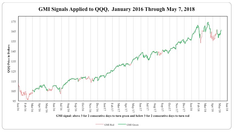
Because of its focus heavily on the QQQ, the GMI remains Green. The QQQ short term trend count is U-73, and approaching the longest such up-trend since 2006, which ended at 88 days (U-88). The end of this QQQ short term up-trend is likely imminent, but it is better to react to a technical signal than to try to act in advance.


How I use daily RWB charts to size up the market and individual stocks; run my new scan

GMI5/6
GMI-26/9
T210850%

For many years I have been  a fan of Stan Weinstein’s Stage Analysis (see his book on this page). That approach looks at a stock’s price compared to its 30 week moving average. A lot of analysts use this technique. My students all know to only buy or hold stocks that are above a rising 30 week average,  or in a Weinstein Stage II. This is one of the six components I assess in my GMI (see table below).

Another approach I like to use is an adaptation of the 12 exponential moving averages that Australian technical analyst Daryl Guppy uses. His GMMA (Guppy multiple moving averages)  plots the following weekly moving averages (six short averages 3,5,8,10,12,15 and 6 longer term averages 30,35,40,45,50,60).

I have developed  a modified chart using the 12 exponential averages plus a simple average =1 which shows the close each period on the chart. The six shorter averages are red and the six longer term averages are blue. The dotted line on the chart is the close each period. The background is always white. The period depends on the time period of the chart shown.

I have been using the weekly charts to show a RWB (red/white/blue) up-trend when the red averages are rising above the rising blue averages such that there is a white space between them. A BWR down-trend is simply the reverse pattern.

I recently came to the conclusion that the weekly chart is good for showing the longer term trend but not very useful for timing entries and exits. It just takes too long for the weekly averages to show a change in trend. I have therefore decided to focus mainly on RWB daily charts. I also added a plot of the new single day average of the daily lows to show the low price of the equity each day (purple dots). These dots can aid in visualizing support and where to place stops.

This daily chart helps me to immediately determine the short term trend. An advancing equity will have a RWB pattern with the daily price (dotted line) above all 12 lines and leading all of the shorter term (red averages) averages higher. I now compute and show on each chart a count of the number of red averages that the equity is above (RLC or red line count). Thus an advancing equity will have a maximum value of 6 of 6. A value of 0 means the equity is below all of the red averages. This is a signal to me for caution. As long as the stock remains in an RWB pattern it is still advancing, but if the RLC is 0 I might raise my stop. I would definitely sell out my position  if the red lines converge with the blue lines so that the white space between them disappears.

It is much easier to demonstrate the above description with an equity. Here is the daily chart of QQQ.


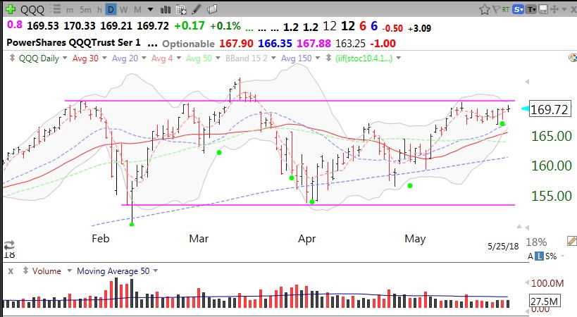
The QQQ has been in an RWB up-trend since last December. There was one day, December 30, when the QQQ closed below its red lines and entered the blue lines. But the RWB pattern never disappeared. For most of the days since then the QQQ (dotted line) closed above all of the red lines. As of Friday, the QQQ closed above only 5 of the 6 red lines. Note the 5 at the end of  the top line of my chart. This is the red line count (RLC). What caught my attention was this daily chart of the SPY.

The RLC=0 for the SPY! While this is not a huge sign of weakness, it is the first time it has happened since January. In those cases the SPY rebounded right away. Will it do so on Monday? The RLC=2  for the DIA and is also showing an RLC rarely seen since this rally began. What really concerned me was this chart of the Dow Jones Transportation Average.

Not only is the RLC=0 but the RWB pattern is totally gone and the DJ-20 has now closed below all of the red and blue averages. This may be significant because one classic way of sizing up the market trend is the Dow Theory, which uses the Industrial and Transportation Indexes. A strong economy and market should show up in strong rails and airlines….

I also find the daily RWB charts very useful for analyzing individual stocks. I use TC2000 to scan for stocks in a steady RWB daily up-trend that have recently been oversold. The RWB chart shows me where I might place my sell stop if I make a purchase. I either want to sell if the stock returns below the lowest rising red line (which will be the 15 day exponential moving average) or if it breaks recent support. I can find these levels easily by looking at the pattern of daily lows (purple dots) or the values of the 15 day exponential average which appears on the second line of each chart in large digits. Here is an example of a stock that came up in my scan for daily RWB stocks that have been oversold and resumed their advance. This is not a recommendation for purchase and is for illustrative purposes only.

AZPN is a strong stock (up 70% this year) that is in an RWB pattern. The RLC=6, indicating that AZPN has closed back above all of its red lines. The value of its lowest red line is 58.51 (second line, big digits after next earnings date) and a conservative place for a sell stop might be just below this level. AZPN has rarely closed below all of its red lines.  However, the purple dots show that the daily lows of AZPN have recently been below all of the red lines. This is to be expected because this scan looks for stocks that were recently oversold (low stochastics). So a more liberal stop might be below its lowest recent daily low, somewhat less than 58. Note also the above average trading volume on Friday’s rise. One thing I do not like about AZPN is its low recent quarterly earnings, up only +9%.

I like this scan a lot. But I suspect that if the averages rest over the next few days, these set-ups will fail. We are approaching the end of first quarter period. Often times there is a brief decline that sets-up end of quarter window dressing by the mutual funds. So I am watching very carefully this week while I am out on spring break.

I ran this scan on my list of stocks that have hit an all-time high since I started informally aggregating them this year. The scan identified  59 stocks. If you want to run this scan, go to my TC2000 Club and access the scan from 03182017. This scan is further described in the glossary to this blog page. Let me know if it works well for you, please.

The GMI is at 5 (of 6)  and the GMI-2 is 6 (of 8), but note that the two negative components in the GMI-2 (stochastics and MACD) are the most sensitive ones and the first to weaken if the QQQ is ending its up-trend. My up-trend count is now U-68, closing in on the longest short term up-trend since 2006 (88 days).