I had a wonderful time presenting to the DC metro chapter of the AAII in Virginia. I was pleasantly surprised to see that the youngest person there was a former student of mine who attended with his father and uncle! David and I presented slides from our undergraduate course and we focused primarily on investing in index ETFs rather than growth stocks. This conservative strategy was most appropriate for a largely gray haired audience, like myself. What a terrific audience. I also announced that David and I are planning a free multi-week lunchtime course on stock trading at the University of Maryland library that will be open to the public. I will announce details here in December. The course will be planned for spring semester next year. The toughest problem will be navigating and parking at the campus. I realize that I did not tell the audience about an extensive webinar I did for a Worden TC2000) workshop in Houston in 2012. Here is a link to it. You can also access it from the webinar list at the top of this blog.
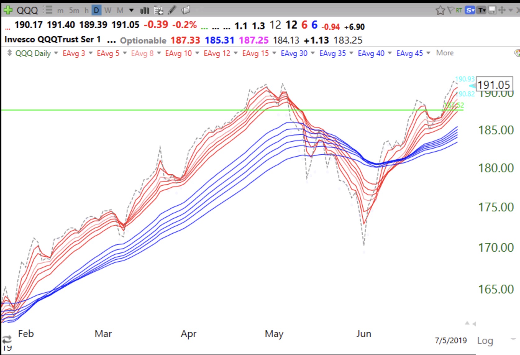
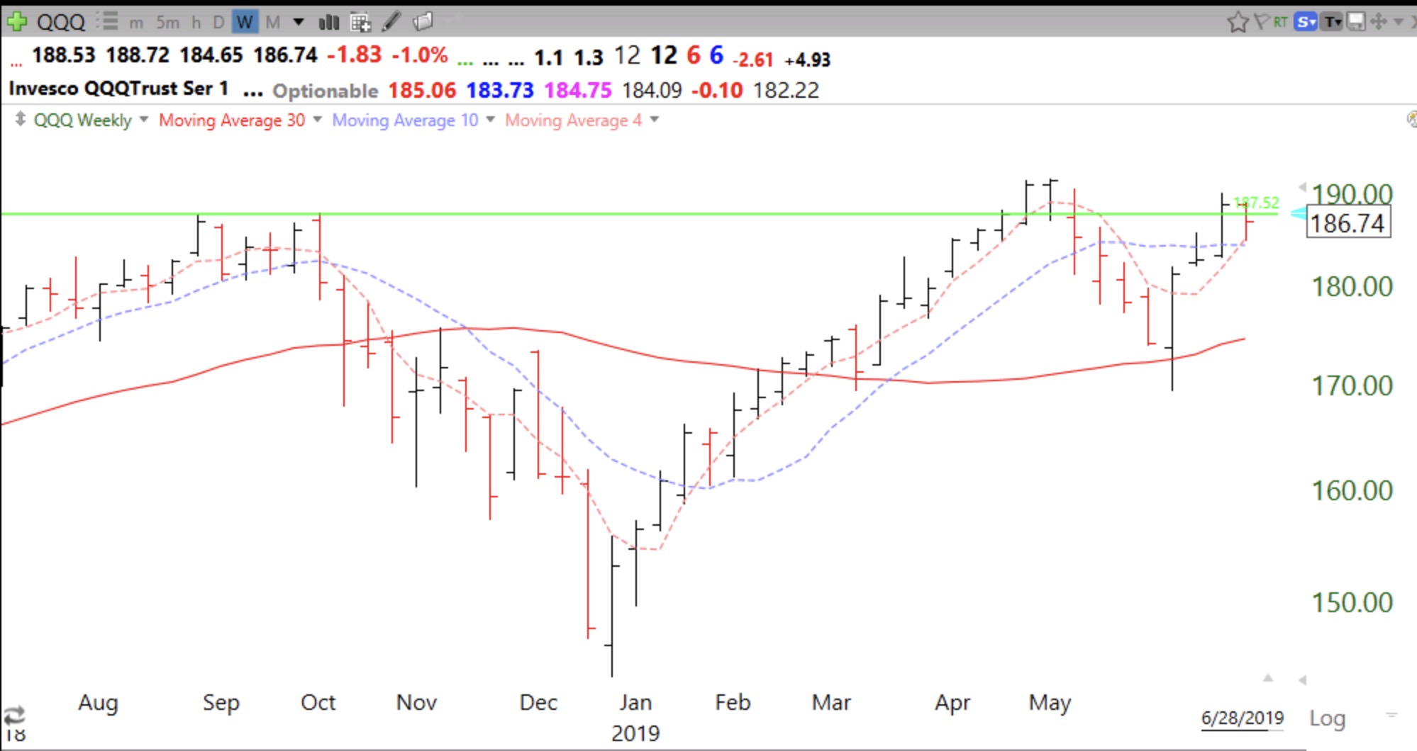
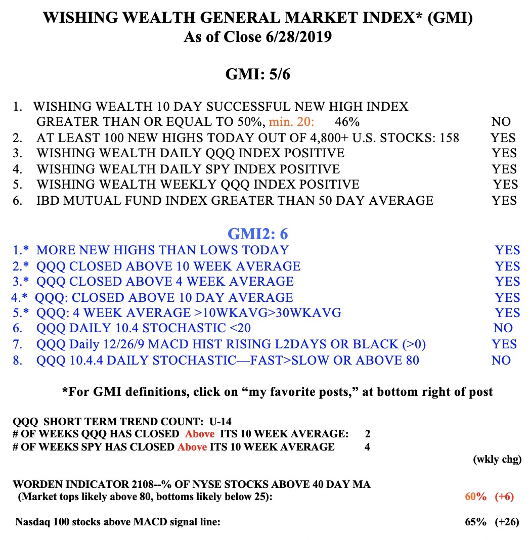
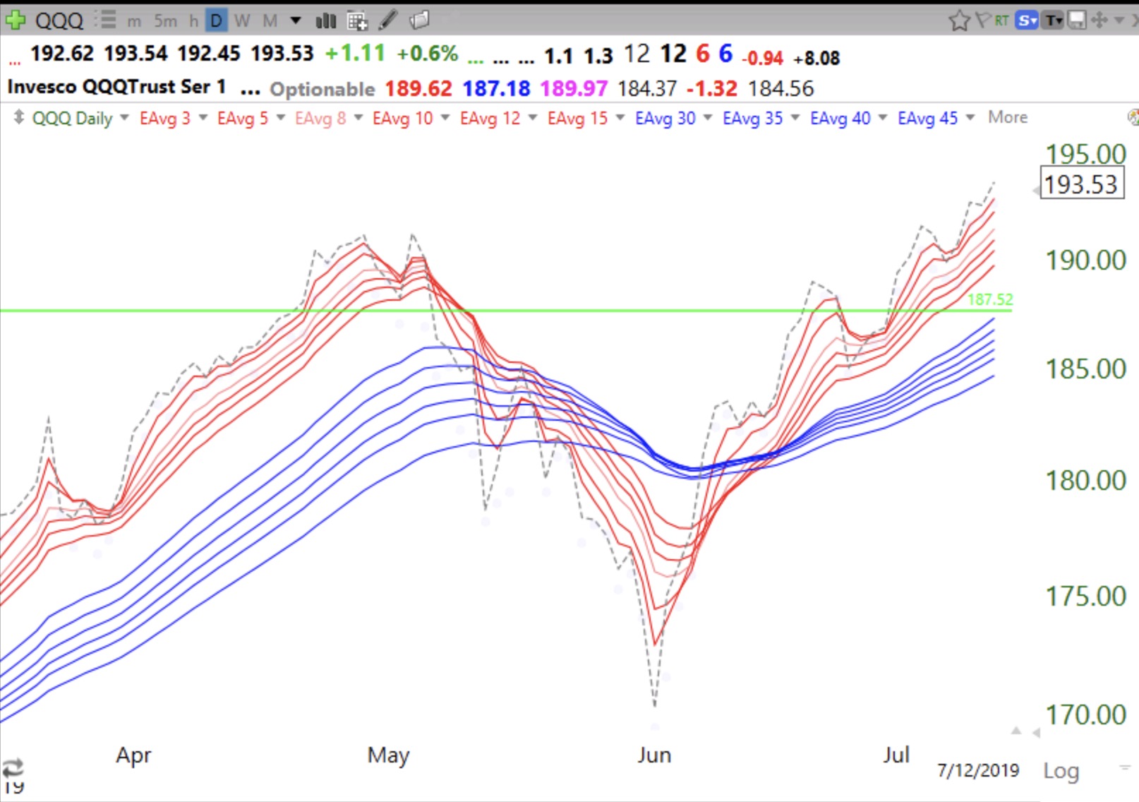
I am riding SPY and TQQQ during this market up-trend. The daily RWB pattern is just too strong to ignore. As I told persons on Saturday, I do not argue with the market or listen to media pundits. I simply follow the general market’s trend until it ends. Check out these beautiful daily RWB patterns in the QQQ and SPY.
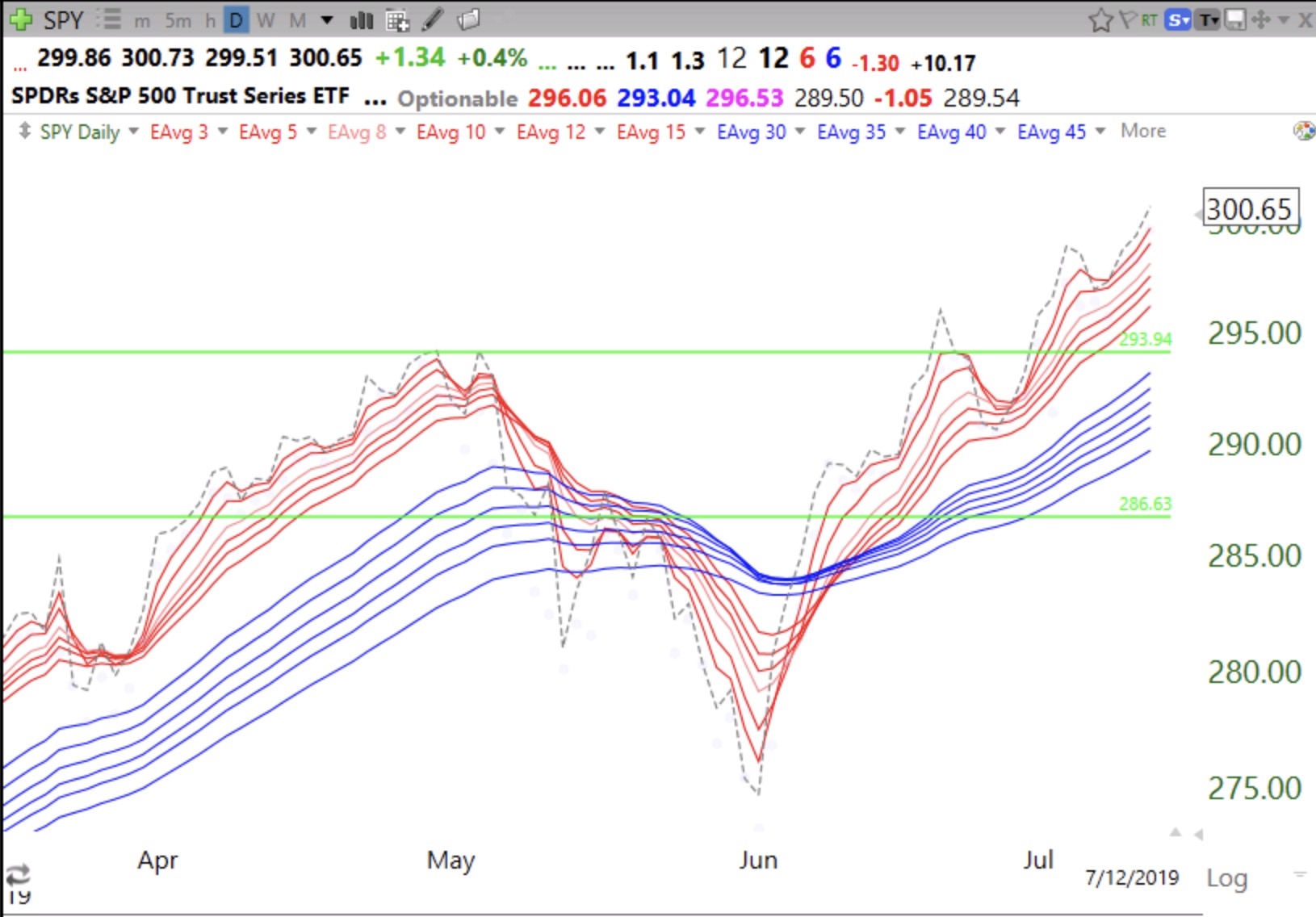
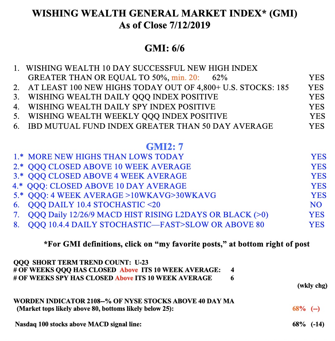
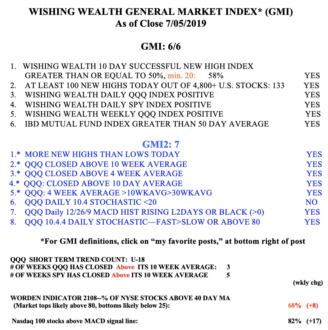
And the GMI signal remains Green at 6 (of 6).