On Friday, the business media talking heads were blaming the sudden market decline on the inverted yield curve. Am I the only cynic who suspects that advance warning of the Mueller report’s release leaked out to some big traders and triggered some selling that led to an avalanche of automated algorithmic selling? If the sell off was caused by fears of the Mueller report’s release after the close at 5 PM Friday, then the large Friday sell off will probably not lead to a continuation on Monday. If the sell off continues this week, it could, in fact, signal the existence of other problems. China trade talks anyone?
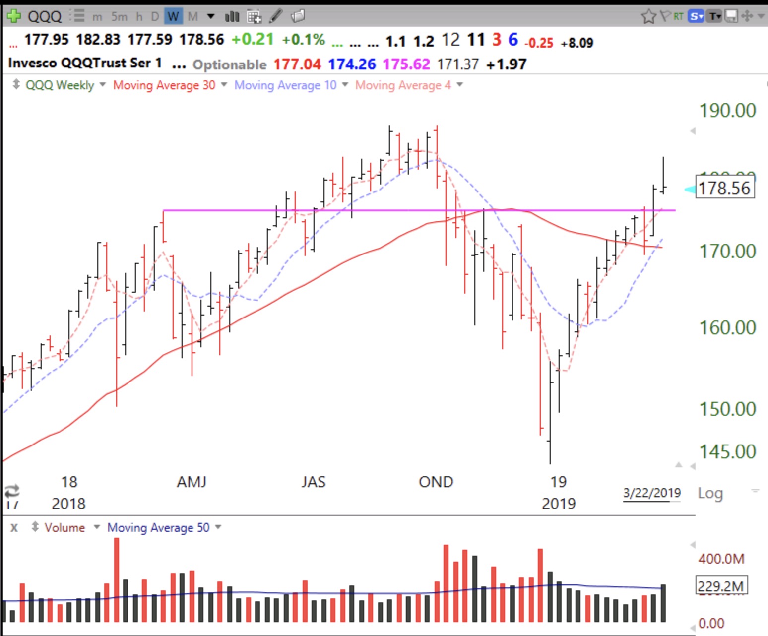
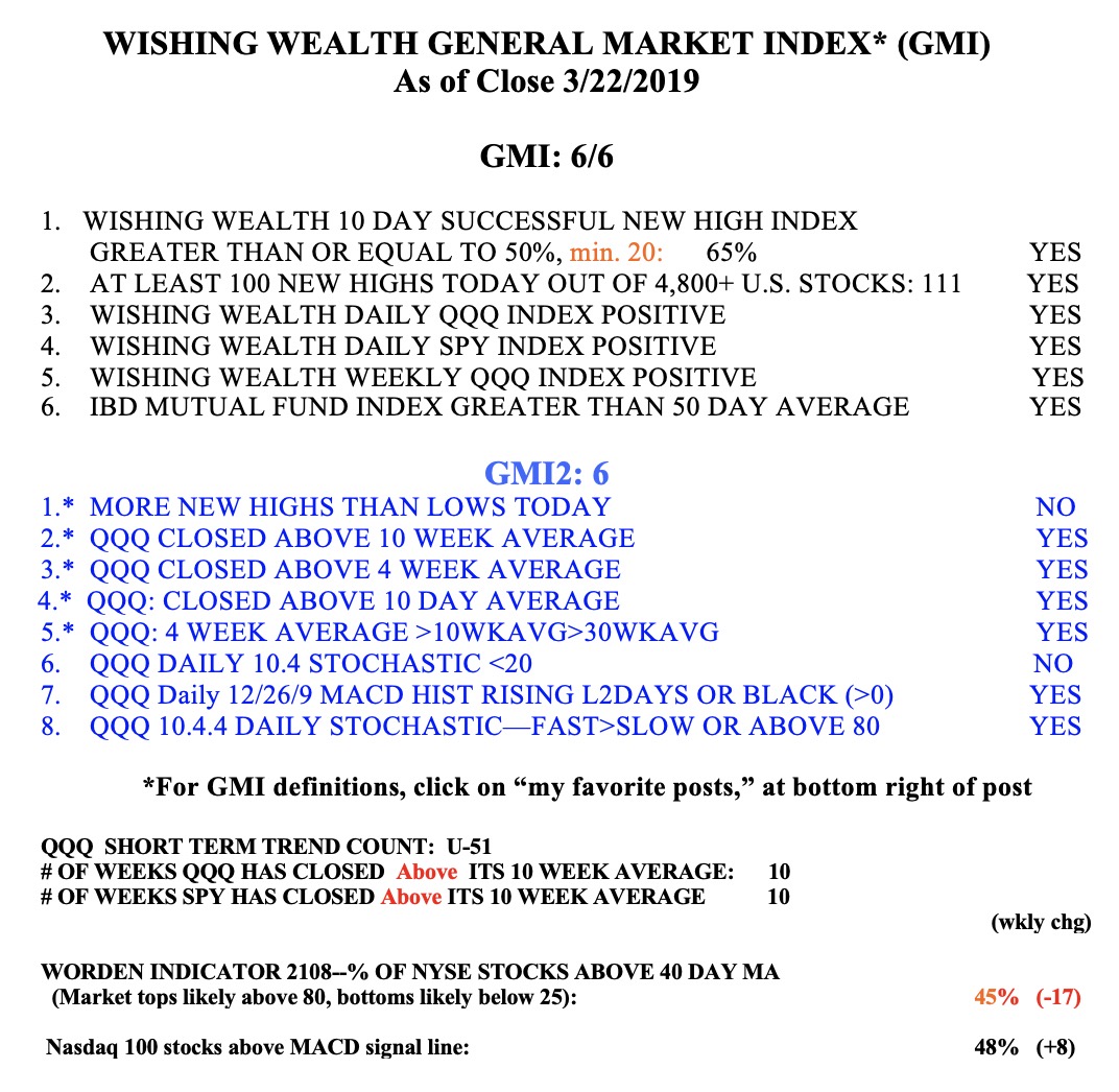
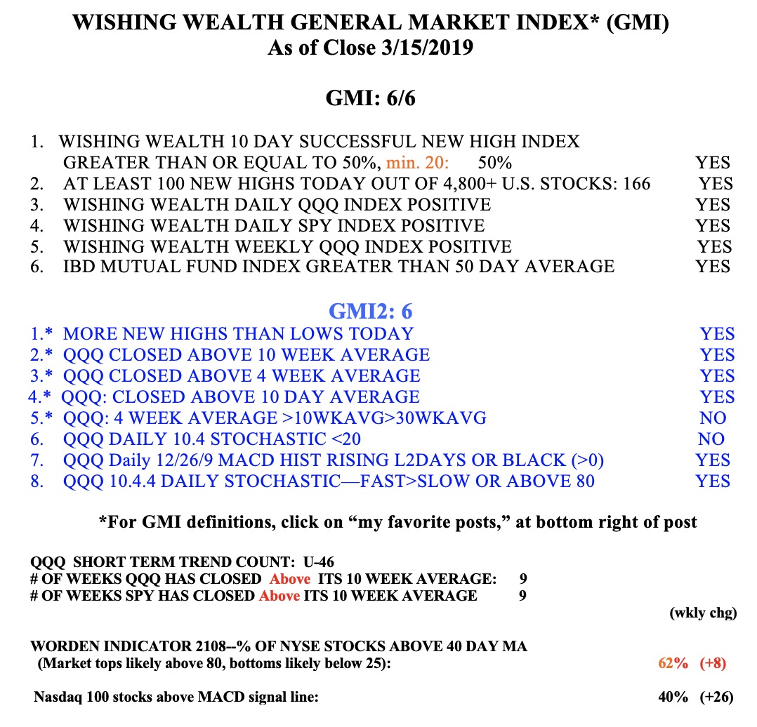
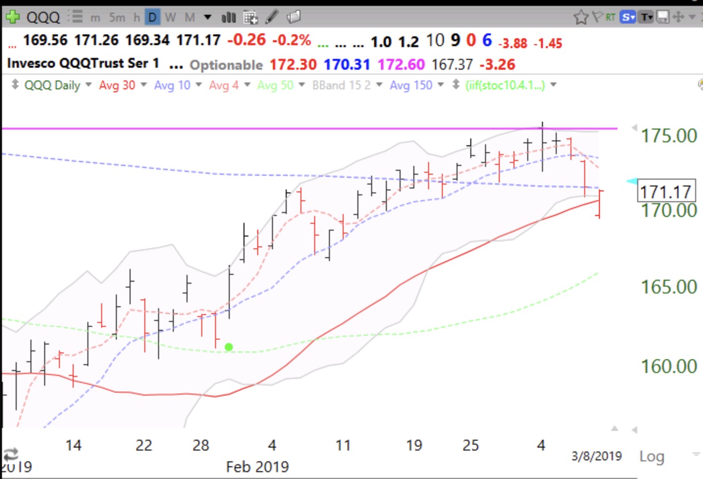
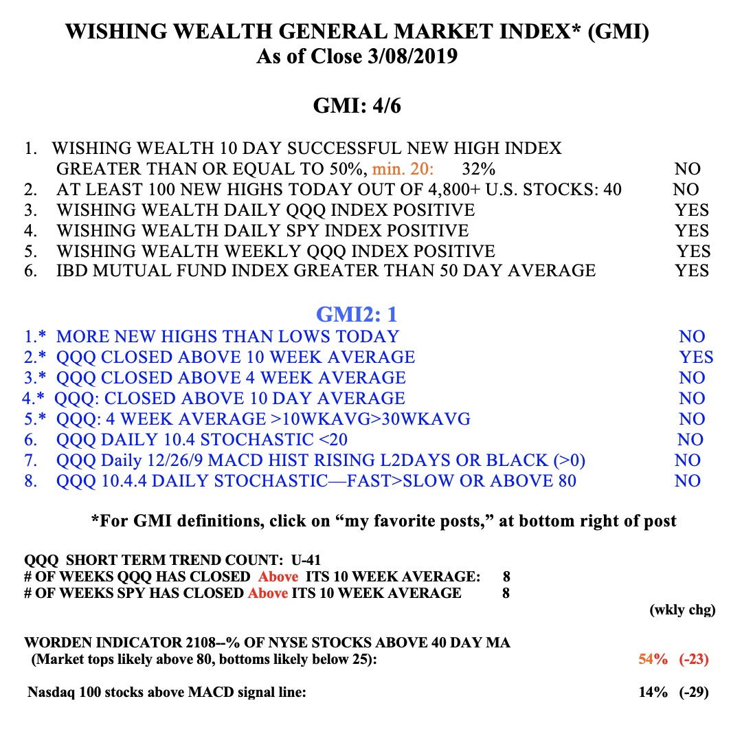
Meanwhile, the GMI remains at 6 (of 6) and even my GMI2 indicators have not weakened much. I lightened up on Friday and will look for some entries if the market rebounds. Most troubling to me is that for QQQ and SPY the 30 week average (red line in weekly chart below) is still declining. This is a major sign of weakness for me, as it could indicate a Stage 4 decline. In prior large down-trends I would wait for the 30 week average to curve up before tiptoeing back into the market. However, the market was extended early last week and the Friday decline may have merely reflected that? Let’s see if the QQQ finds support back at the 4 week average (red dotted line on this weekly chart, around 175.62). The horizontal pink line could also be a place for support to come in. A close back below the 30 week average could be ominous for the longs.