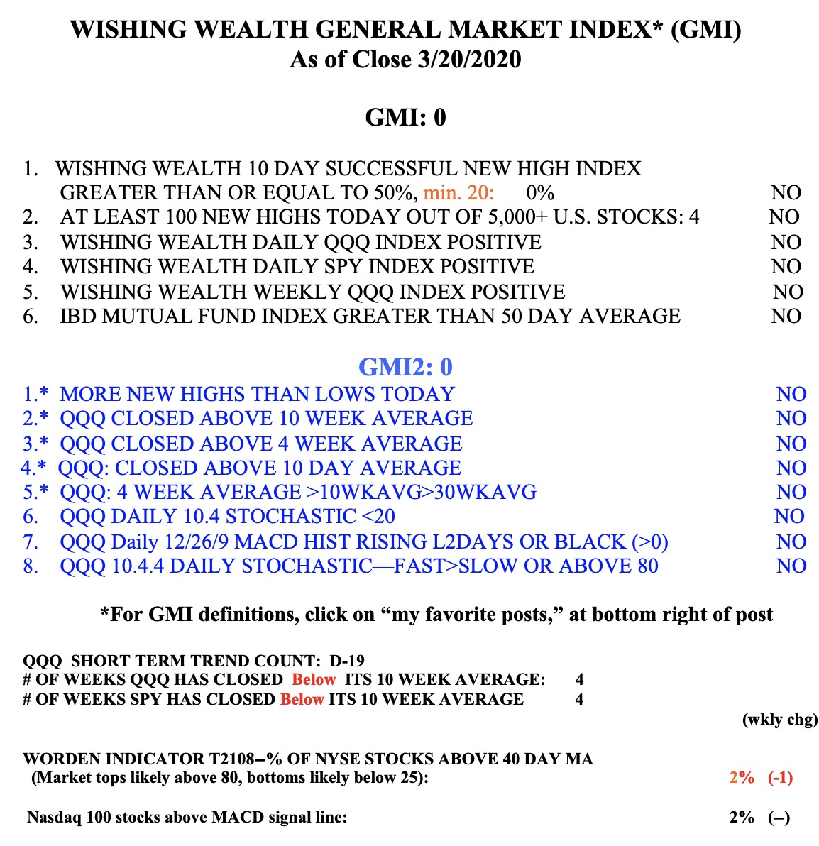
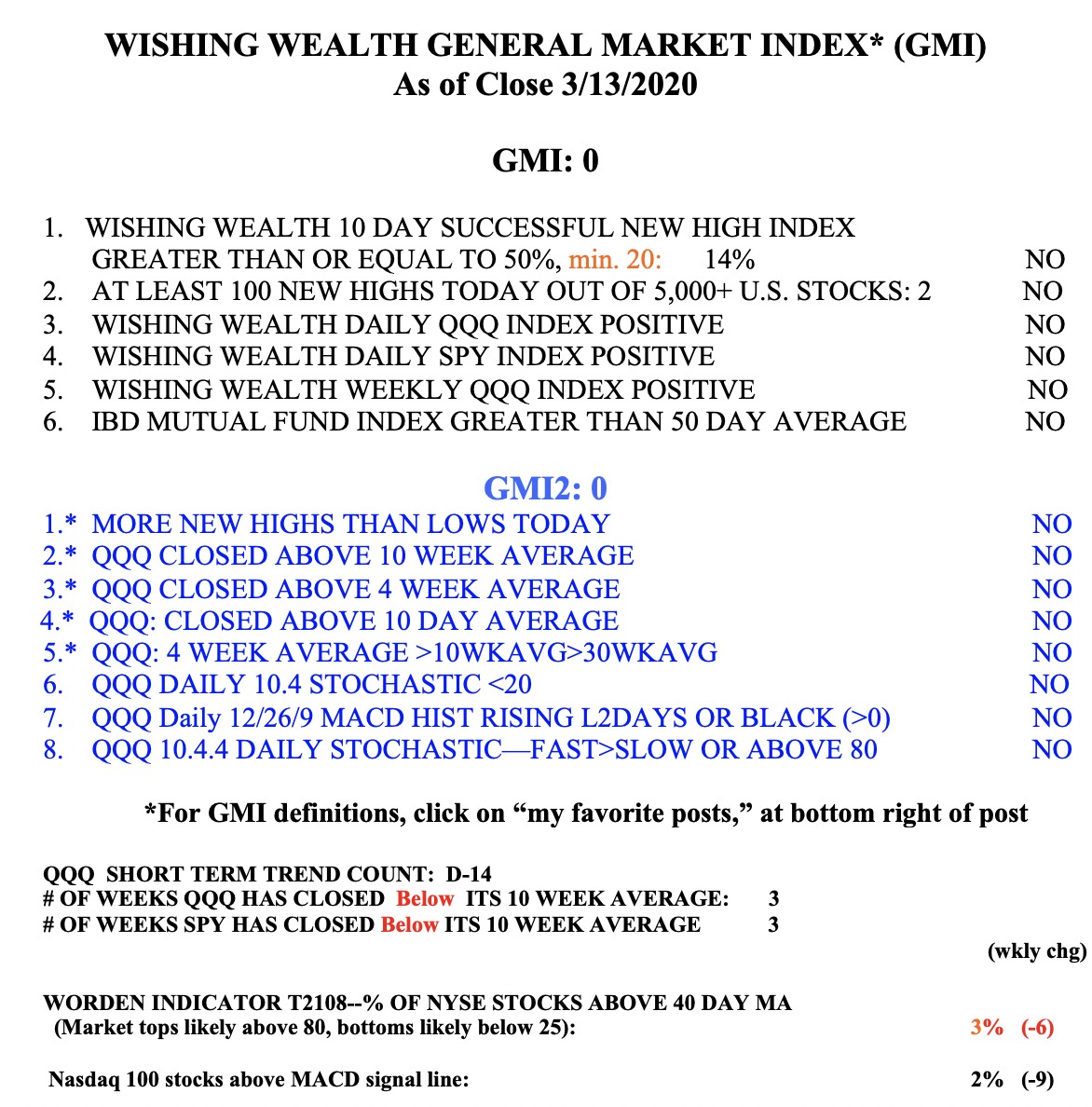
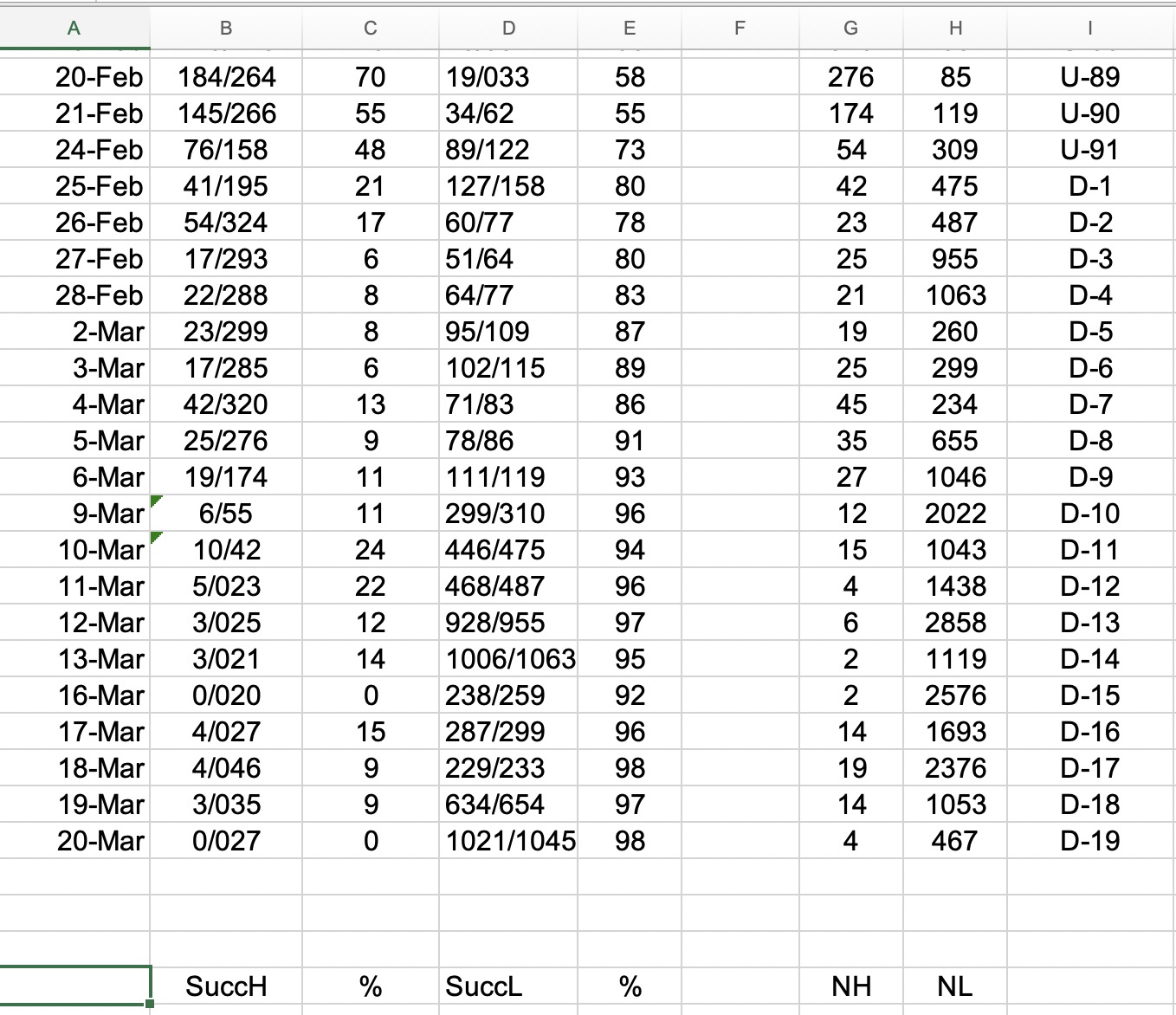
Below is a segment of the spreadsheet I update every day after the market closes. One of the GMI indicators (table below) uses the Successful New High indicator, which measures the percentage of stocks that hit a new high 10 days ago that closed higher now than they did 10 days ago. Nicolas Darvas had said that when the stocks that he was buying at new 52 week highs started to falter it told him to exit the market. That is why I calculate the Successful New High indicator each market day. I also calculate a Successful New Low indicator which measures the percentage of stocks that hit a new low 10 days ago that closed lower today. These two indicators are the first two in the spreadsheet below. Note that on February 21, the two indicators were equal at 55%. Almost all of the prior days (not shown) there were more successful new highs than new lows. Since February 21, every day there have been more successful new lows than new highs. in fact, since February 27, 80% or more of new lows were successful. I use the word successful because it tells me that if I had shorted stocks at new lows, I would have made money 80% or more of the time. Just as one can make money in an up-trend by buying stocks at new highs, one can profit in a down-trend by shorting stocks at new lows.
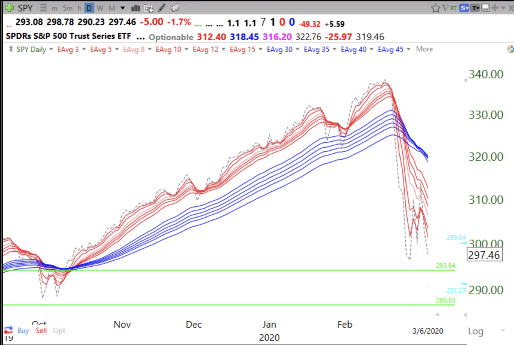
Note also the NH and NL columns which show the preponderance of stocks hitting new lows versus new highs since February 24. Next to those columns is my QQQ short term trend count, now at D-19. The change in the QQQ short term trend occurred on February 25, after a record up-trend (since 2006) that lasted U-91 days!
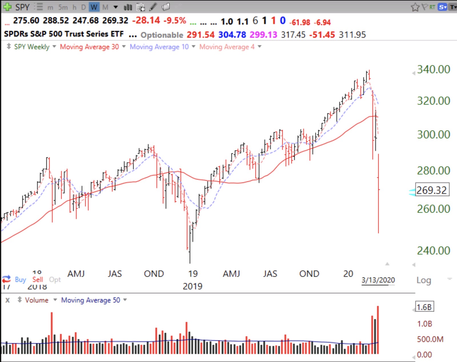
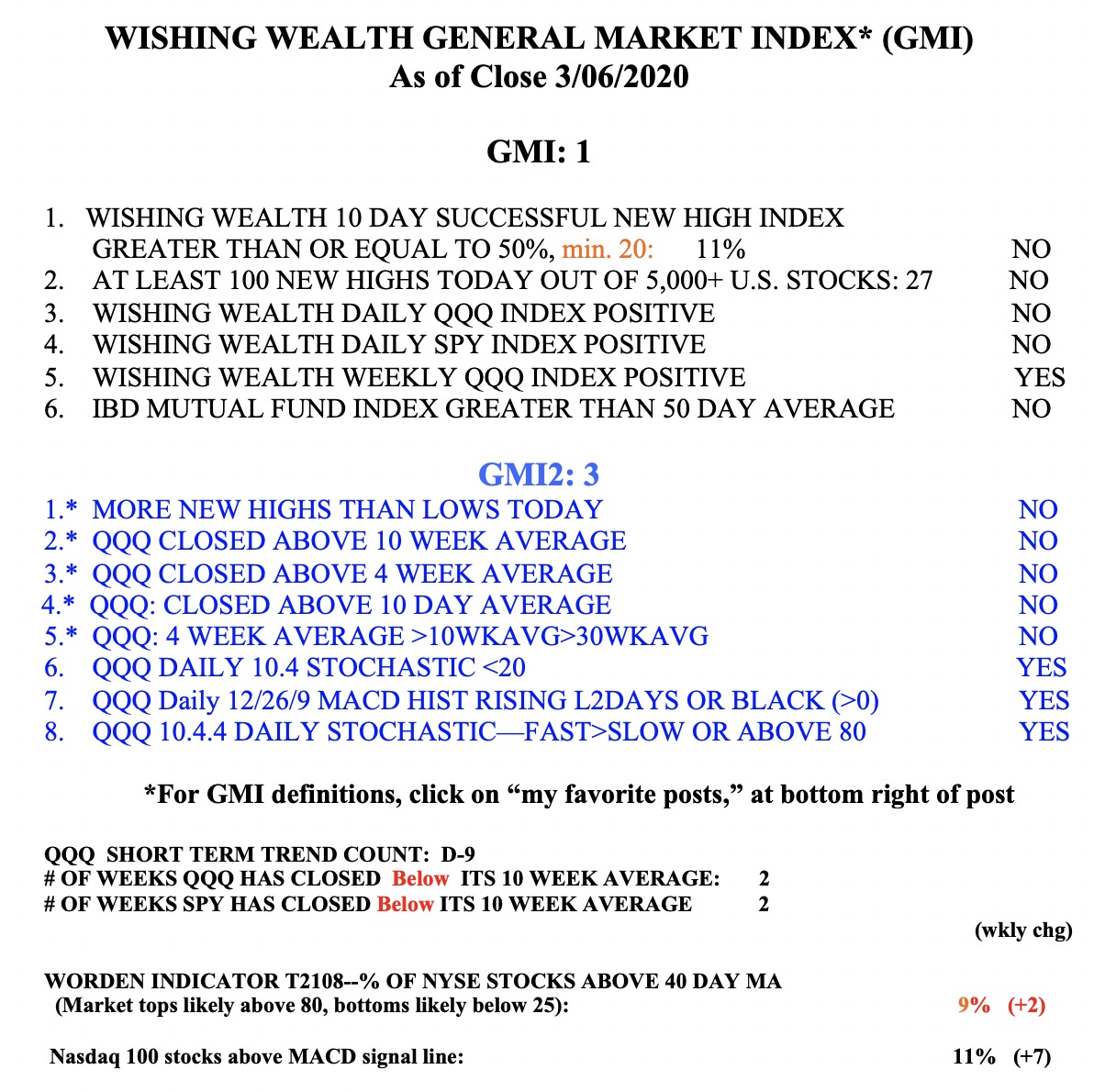
The GMI remains at 0 (of 6) and on a Red signal. The GMI turned Red on February 26.