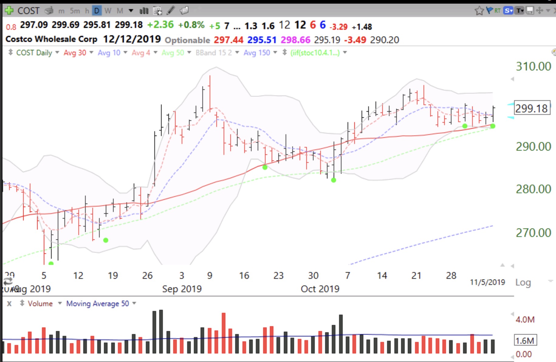
I did not tweet about STNE intraday Monday when it had a GLB because earnings were coming out after the close–always a risky bet. But I did purchase some and it is moving up nicely pre-market. What a beautiful chart pattern. I like IPOs that rest for a few months, form a green line top and then move to an ATH (all-time high). This is one to watch. You can receive my intraday tweets –@wishingwealth
All Posts
How I Avoid Getting Shaken Out of Strong Growth Stocks
One of the biggest problems I have faced is that I own a growth stock in a nice up-trend and get shaken out, only to see the stock continue rising. I believe that William O’Neil focused on weekly charts because daily charts contain so much noise. This is why I ask my students to have the rule of looking at the stock’s weekly chart before every sale of a long position. If the stocks is still holding its rising 10 week average I suggest not selling. Most of the time one gets shaken out of a good stock it is because there is a sudden drop below an indicator on the daily chart.
COUP provides an excellent example of this strategy. I bought COUP after its GLB (green line break-out) to an all-time high (ATH). COUP then went sideways for a few weeks and then had a sudden decline below the green line last Friday but closed above its green line. I also often teach my students to sell a GLB stock if it closes below its green line. COUP also declined on above average volume two days later. Both of these events tempted me to sell the stock. But I retained my position. Here is the daily chart.
When I looked at the weekly chart I saw no cause for selling. COUP has actually bounced up off of its rising 10 week average (blue dotted line), a strong technical sign of support. A stock’s failure to hold its 10 week average would be a reason for me to sell. In fact, the above average volume this week shows up as an up (black) bar! The moral of the story is that while I may time the purchase of a stock based on its set-up of daily indicators, I should only sell it after viewing its weekly chart.
$QQQ head and shoulders top unlikely–wall of worry back
This weekly chart shows that QQQ is now above the resistance line from the possible head and shoulders top pattern. The next test is the old all-time high, around 187. I am tiptoeing back into the market in my university pension accounts. The steep December decline dissipated the bullish euphoria and brought fear back into investors’ minds. A lot of people saw for the first time that the market can decline quickly and mercilessly. The market always climbs a wall of worry and “the wall” is back. And the GMI remains on a Green signal.