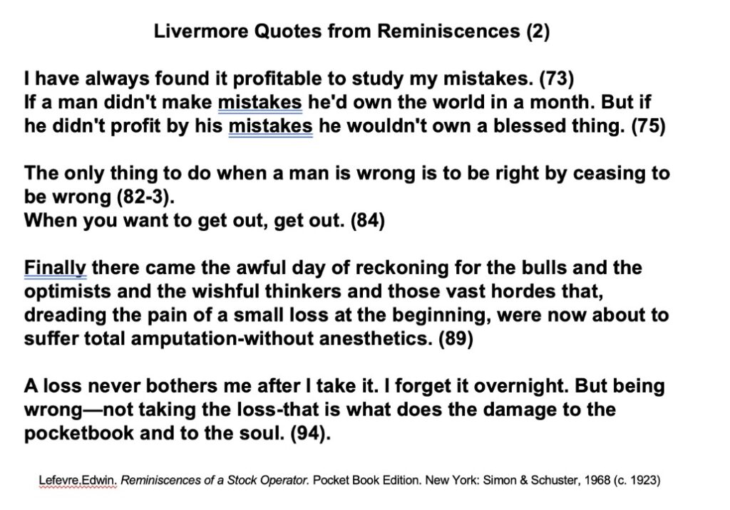
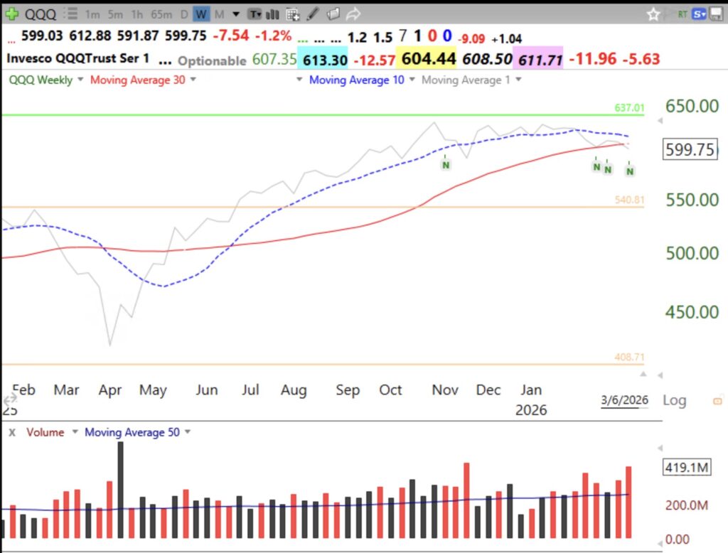
On February 4th I posted that a new QQQ short term down-trend had begun. QQQ went sideways after that but QQQ may now be entering a longer term Stage 4 down-trend. If it does so, we may be in for a sizable decline. That signal got me out early from the large declines since 2000. I have been posting that I prefer to be in cash. If the 30 week average turns down, all of my funds will be in cash. Be very careful. Most people who have not experienced a major market decline may be slaughtered. Look at recent above average weekly volume declines. Gray line in chart shows weekly close. If we enter a Stage 4 decline I will post the indicator I use to detect market bottoms. Study the Livermore quotes below that I showed my students.
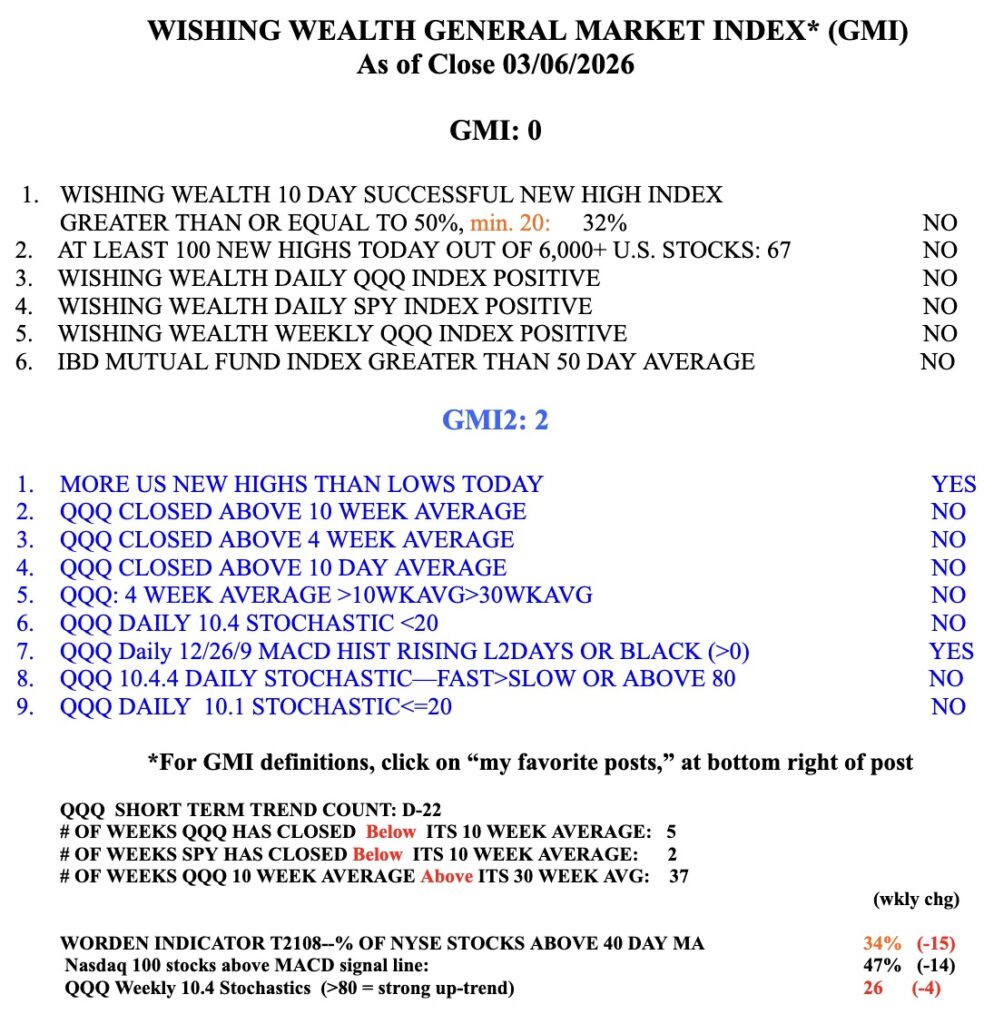
GMI=0 and RED.