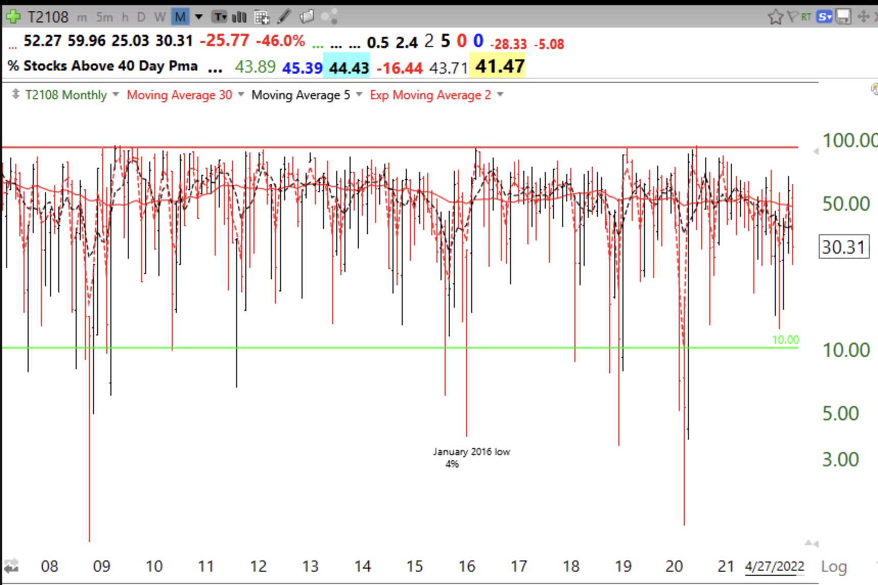
Blog post: 36th day of $QQQ short term up-trend and GMI=5 (of 6) and Green; I went to cash in my trading account last week; One reason, daily MACD histogram turned red, see chart

GMI5/6
GMI-24/9
T210829%

In the past, I exited mutual funds in my  university pension accounts only after the longer term trend had turned down. That has not happened yet. In my more tradable IRA accounts I exit the market more frequently when some weakness becomes apparent to me. I do not want to give back all of my recent gains. So when the major indexes appeared to me to be weakening, I sold my TQQQ and other stocks and went to the sidelines.

One indicator suggesting weakness is the 12/26/9 daily MACD histogram that turned red Friday, after days of declining. The chart below shows this relationship. The MACD histogram reflects the difference between the MACD line (blue) and the signal line (purple). When the MACD line crosses below the signal line the histogram turns negative, or red. Note what happened to QQQ when the histogram turned red in March and May. The MACD is a measure of momentum and as the histogram lines decline it indicates waning strength of the move. Similarly, when the lines are rising it indicates strength. During most of the recent QQQ short term up-trend since 5/24,  the histogram has been black, indicating that the MACD was above the signal line. But notice how it has been declining and turned red on Friday. The  histogram does not have to remain red for long, but it signals to me at least current short term weakness. By the way, the histogram for SPY also turned red on Friday. Check it out for yourself!

Blog post: 34th day of $QQQ short term up-trend; Small cap stocks in trouble? Weekly chart of $IWM shows Stage IV top could be developing; other warning signs I see

GMI6/6
GMI-27/9
T210835%

$IWM is now below its critical 30 week average–Stage IV on the horizon?  Green line top is now in place as advance has stalled. I am also a little concerned by the fact that T2108 is only at 38% when the indexes are setting records. This means that only 38% of the NYSE stocks are above their 40 day simple moving averages. The big stocks heavy weighted  in the indexes are stronger and may be making the indexes mask weakness in many other stocks. After earnings season we head to the fall and September, the weakest month for the market. This is not the time for me to be making new risky buys. I am looking to cut back now even though my charts are still strong. Remember, I am a chicken…..