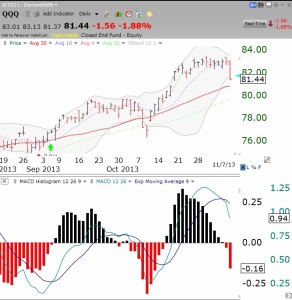
IBD now calls the “Uptrend under pressure.’ Meanwhile, I had already closed out my position in TQQQ earlier in the week. Why? I posted last Sunday night that I saw technical weakening in the QQQ, based on its diminishing stochastics and MACD histogram. Both indicators have continued to weaken. I want to show you, how the MACD histogram can illustrate something not seen in the price itself. This daily chart of the QQQ shows the MACD histogram below it. Note that in a 9 day period before Thursday’s decline, it looks to the naked eye like the price of QQQ remained level. At the same time, the MACD histogram was showing marked weakening! (The histogram plots the difference between the MACD and its signal line, which are both plotted on the histogram chart. When the histogram turns red, it means the MACD has fallen below its signal line.) The histogram actually turned red on Wednesday.
While my indicators show the QQQ remains in short and longer term up-trends, I did not want to own a 3X leveraged bullish QQQ ETF while the MACD histogram (and stochastics, not shown) was falling. Many suggest the MACD is a lagging indicator–not to me, or Judy, who taught me this! I will consider going back into TQQQ again when the histogram starts rising. Both the QQQ MACD histogram and stochastics were recently added to the indicators I count and post daily in the GMI-2 figure to the right.

I don’t see that it is reasonable to draw this conclusion re: MACD unless you have done a proper backtest, over a sufficiently long enough period, and look at what results from the signal as you’ve defined it. I think you might be surprised if you do that.
The MACD is just a measurement of two moving averages of “past” stock levels and a histogram of their relative gap difference. It can never predict anything with any reliability. Most decent traders realise that reliability or predictability is futile. We only work with statistical edges mostly around the 50% mark and even if we get high probability , there is the long tail event that brings the Expectancy back to earth.
For every time you see an MACD peak you will see a stock tank or whip back up again .. There is no predictable element with moving averages.It can be merely a point that the market takes a breather collecting new buyers or to a point where a significant turn is starting ..yes completely opposite trade directions . 🙂
This graph shows the MACD rolling away due to the fact that you can see the stock price levelling out ,so naturally the moving averages are going to work towards being tighter. The leading indicator is price flattening ..
I think the comment can be misleading to people who think this may be some magical technique or some leading indicator.
– I think at best it’s best use may give the untrained eye a perspective of the Stock intensity and if anything , normalises a perspective across all stocks for filtering lists on a computer system.
Thank you for your insightful comment. Your explanation of the mathematics involved in MACD is accurate. Many people would agree with you that the MACD has to be a lagging indicator given the mathematics. It was only after I saw my friend use the MACD histogram repeatedly to detect emerging up or down trends before I could that I became a user of the MACD. I was sharing in this post the idea that the visible pattern of the declining histogram in the face of a level price trend could be used to anticipate a declining price. If you do not find this pattern useful, just ignore it. It has proven useful to me and others may also find some value in it. Differing opinions is what makes it an interesting market.
I manually back test my ideas. If they work for me I use them. Some great discoveries come from being unreasonable.
Well let’s do a programmatic backtest. Using the rules: buy when the MACD crosses above the signal line, and sell when it crosses below. This is on a daily basis.
Using QQQ, going back to 1999, this produces only 37% winning trades and a net loss.
If we just restrict to 4/1/2009 to present, it produces 47% winning trades and a net profit of 61% — far less than just buy & hold.
No one in their right mind would use the simple set-up you tested.
given that outcome, for sure, no one would use. But you had suggested in the post above, using MACD to predict price decline. This was just meant to show, quantitatively, that MACD on it’s own is pretty useless.
If you have other rules to add that would allow for that prediction, I will add and run another test.
Not trying to be argumentative. I like the concept of your model, but I also think it should stand up to the scrutiny of doing a real test (not manual) over a sufficient history.
I admire your commitment to empirical testing. Someday I might take you up on your offer.
I’d be interested in trying to do a backtest of your model. (I’ve actually thought about doing this). Problem would be to find a ‘proxy’ for the items that are proprietary. I imagine that would be somewhat doable. (you can contact me via email if you want to discuss further)