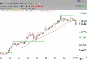
Just wanted to show you how you can use the green lines to diagnose a failing stock. Check out this monthly chart of the gold ETF, GLD. Look at the series of multi-month bases that formed on the way up from 2005-2011.
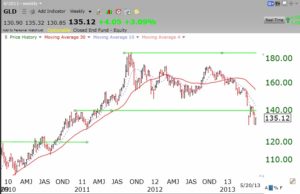
 Note the green line top since 8/2011 and the failure of the prior green line top to support the stock. Monthly charts can show a lot about a stock’s history and current strength. However, the weekly chart confirmed the Weinstein Stage 4 decline in February 2013 when the 30 week average (red line) turned down. The 30 week average stopped rising months earlier. I rarely hold a stock trading below its declining 30 week average.
