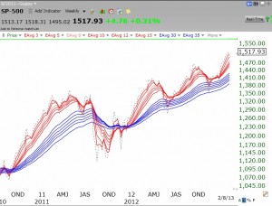
Below is a weekly GMMA chart of the S&P500 Index. A GMMA chart contains a set of 12 exponential moving averages. In my version of the GMMA, all of the shorter term averages are red and the longer term averages are blue. I add one more moving average, plotted in a dark dotted line. This moving average is set to one, and represents the closing price of the index plotted. The dotted line therefore shows where the index closed relative to all of the moving averages. A strong up-trend is apparent when all of the red lines are rising above the blue ones so that there is a white band between them. I call this a red white and blue (RWB) pattern. As long as there is a RWB pattern and the dotted line is rising above all of the other averages, it is clear sailing. The first sign of a possible weakening of the up-trend is evident to me when the the dotted line closes below the top (shortest) red moving average. (Click on the chart to enlarge it.)
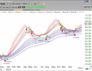
It is clear that the S&P500 Index (and the Dow 30, not shown) has an RWB pattern. The green line in the chart is at the S&P500 all-time high. See my discussion of the green line top of this index in last Monday’s blog. It is noteworthy that the Nasdaq 100 Index ETF (QQQ) has not been as strong as the other two indexes. However, the chart below shows that the QQQ is now in a RWB up-trend and may be gaining strength. Perhaps the tech stocks are about to catch up with the other stocks, especially now that AAPL may have formed at least a short term bottom and GOOG has hit an all-time high?
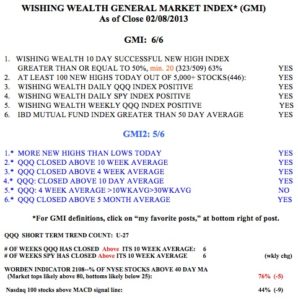
Meanwhile, the GMI remains at a strong 6 (of 6) and the GMI-2 is heading towards 6 also, for the first time since September 21.


Hi, JUDY, you and I are doing well with our shares of INVN! Don’t yo think it is forming a wide cup? It has gone up 45% up since I bought it. One month ago, Dr. Wish said he will start looking at INVN once it reaches abt $22 (when a cup is formed)