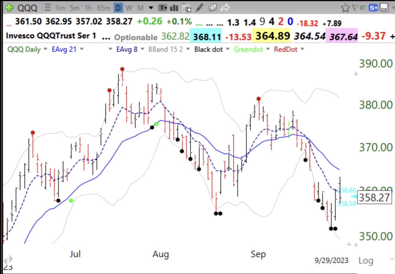
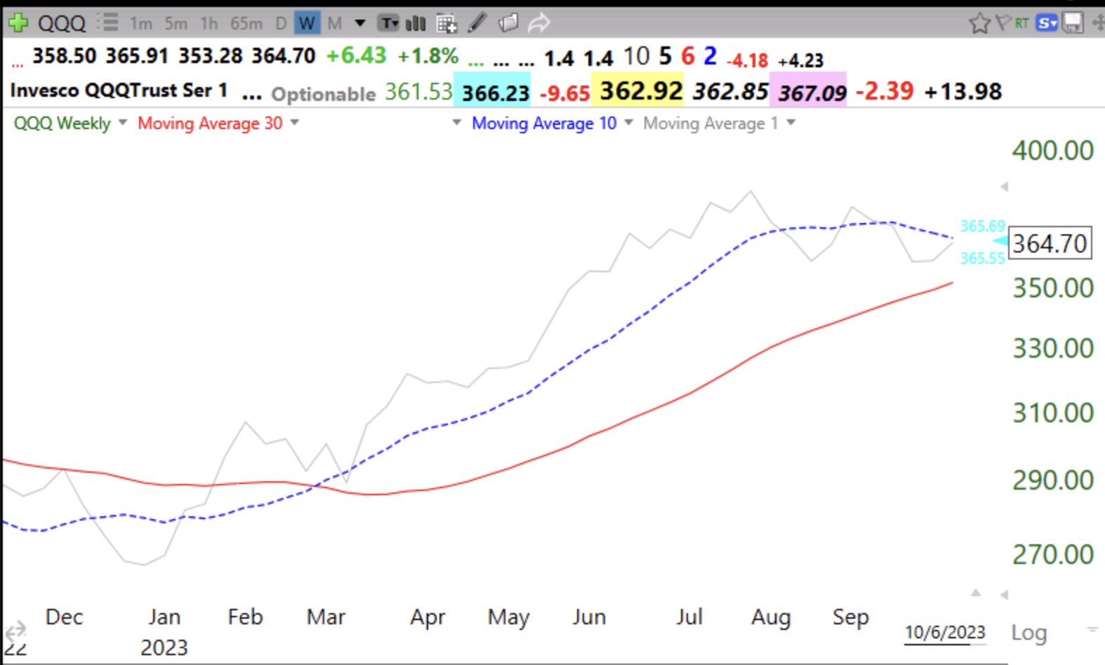
Note that the 10 week average remains above the 30 week average. I am looking for this ETF to climb back above its 10 week average and for that average to turn up. For now, I remain partially invested in growth mutual funds in my university pension accounts. The gray line tracks the weekly closes.
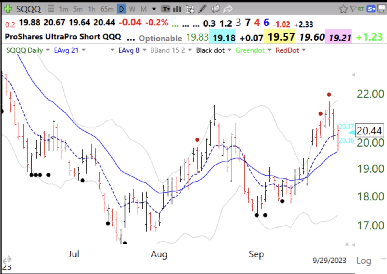
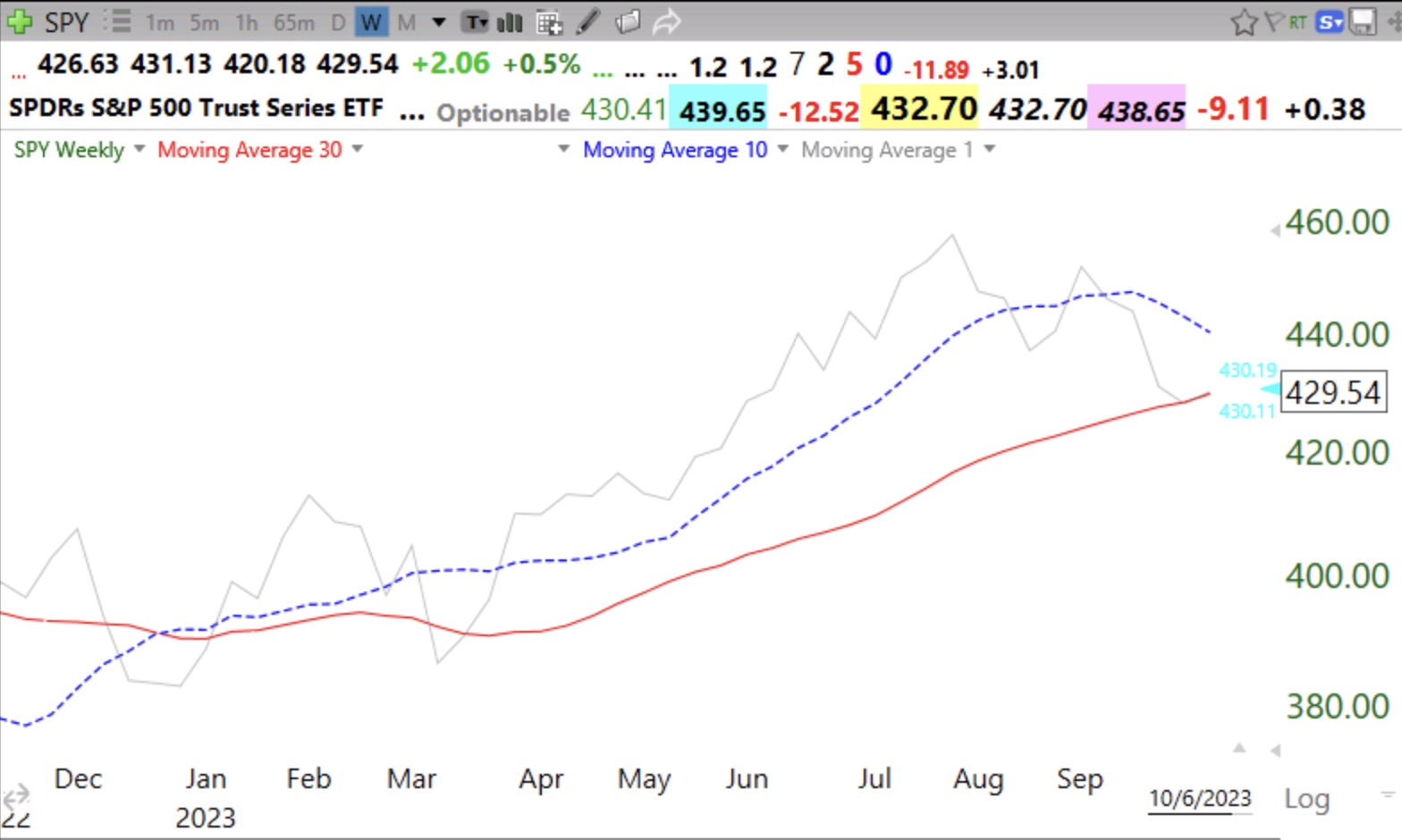
SPY is a little weaker.
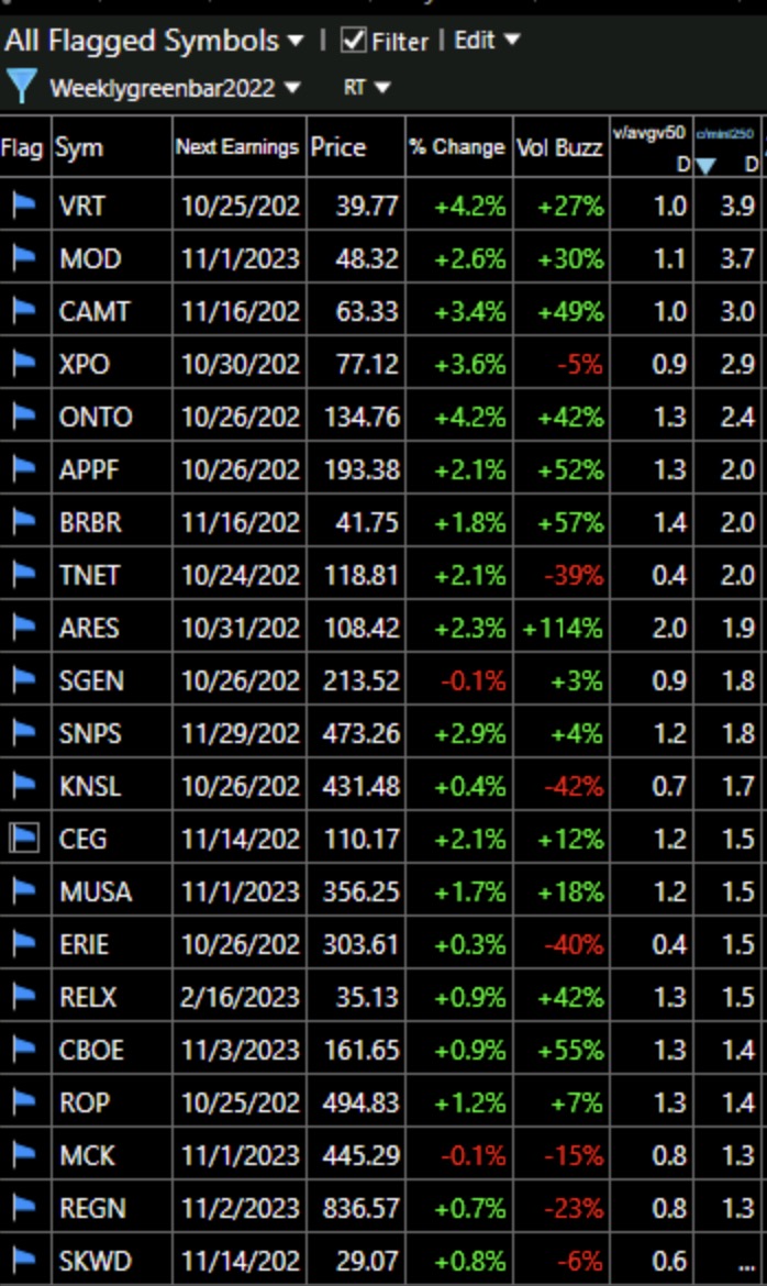
These 21 stocks had a weekly green bar last week (recent ATH and 4wk>10wk>30wk and bounced up off of rising 4 wk and 20 wk high in RS) and are worth monitoring. They are sorted by price/lowest price past 250 days.
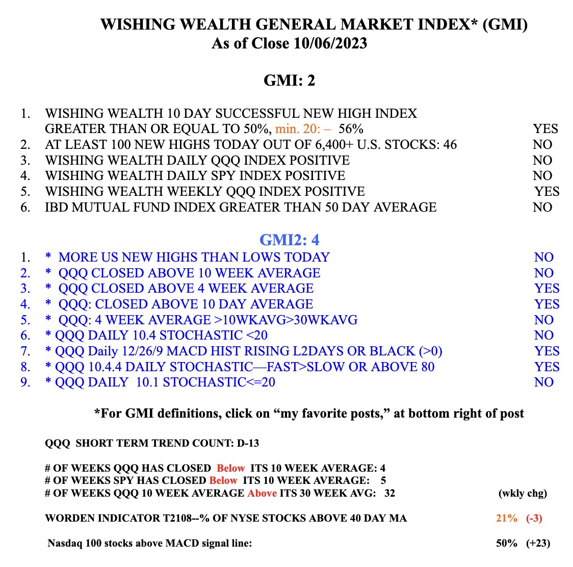
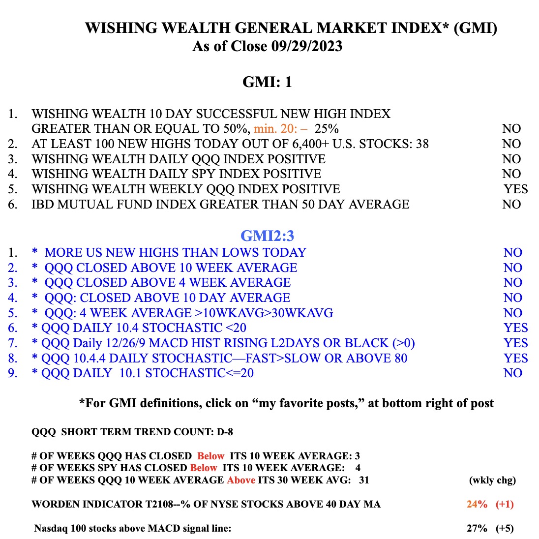
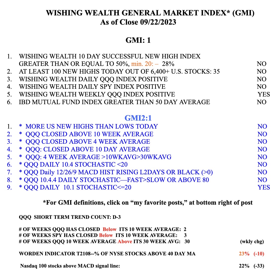
The GMI= 2 (of 6) and is still RED.