My new online class with 100 freshmen began on Friday. What a wonderful privilege to teach the next generation how to ensure their financial futures! Thanks to Mark Minervini (IBD), Irusha Peiris (MarketSmith) and Michael Thompson (TC2000) for making my class possible!!
Many of my students will be watching this blog and I will therefore take the time today to explain some things in more detail. Many people have asked to take my class and I have always responded that it was only open to a small group of university students. I have arranged with the university to offer a noncredit online workshop to all persons worldwide who wish to enroll. I will announce the workshop in a few months. It will likely be 10 2-hour sessions, once a week, in the evening. There will be a fee paid directly to the university and my research center on substance abuse will benefit from the proceeds. Stay tuned.
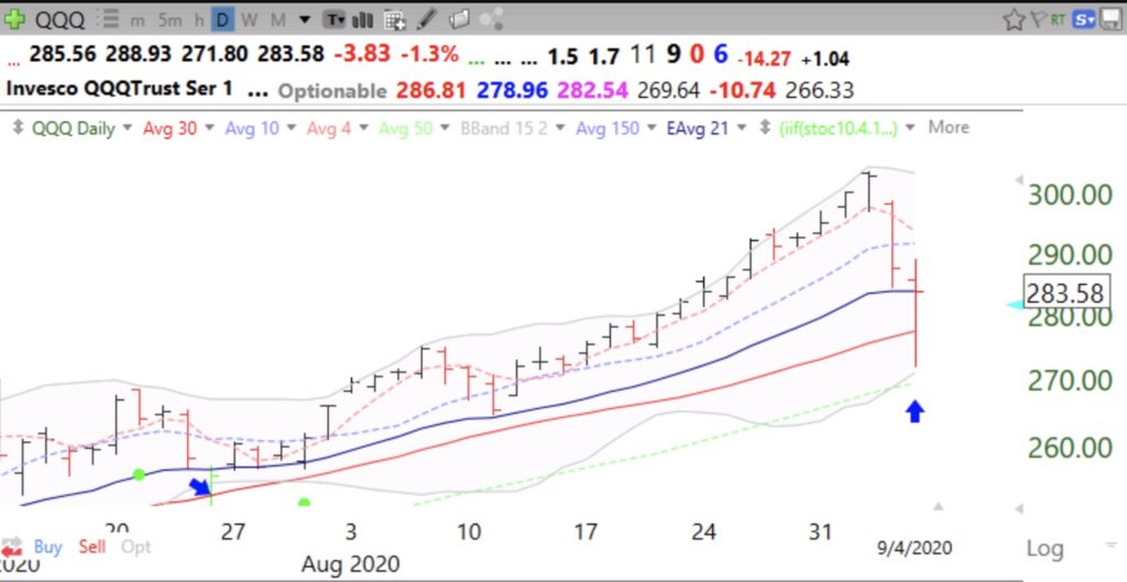
One of the most important indicators I put on my daily charts is Bollinger Bands. These bands create a 95% confidence interval around a moving average. I use a 15 day average and the lines are drawn 2 standard deviations above and below that average each day, yielding the 95% prediction. All you need to understand is that almost all prices will remain within these 2 bands and when a price moves outside it often times comes back in, reverting to the average or begins a new short term trend.
The bands are very useful. When a stock has been rising, once it goes above the upper band it can mean the end of the short term rise. However, if a stock has been consolidating, a rise above the upper band can signal a break-out. Similarly the lower band can show times when a stock will bounce up or begin a larger decline.
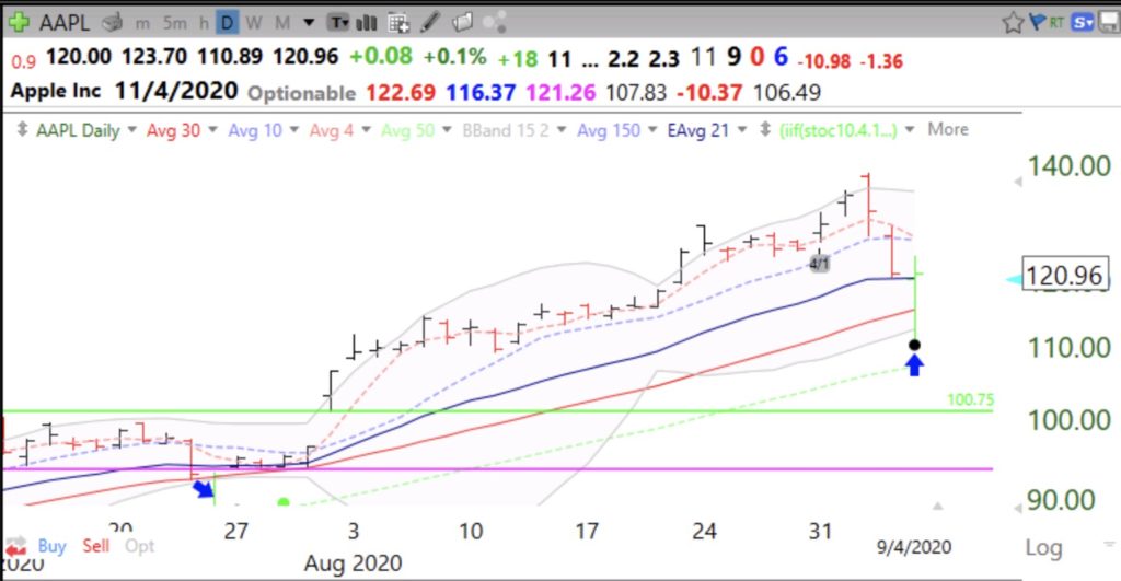
On Friday, the QQQ and APPL declined to near their lower bands and bounced. A failure of one of these bounces would suggest to me the likelihood of their further decline. The blue arrows show the last 2 times the QQQ has bounced off of its lower BB. An alternative interpretation could be that the indexes found support near their exponential 21 day moving average (blue solid line), an indicator used by many traders. If multiple indicators work, they must be somewhat correlated! I prefer the BB because I think it works better for me. Notice how the QQQ stays mostly within the bands and think how you might use this phenomenon in your trading rules..
AAPL, which is highly correlated with the QQQ (Nasdaq100 ETF), also bounced near its lower BB. Note that at its recent top, AAPL traded outside its upper BB and reversed to close below it, a sign that it was extended and could decline. The black dot indicates a bounce up off of an extremely oversold short term condition and the green dot in July represents the possible start of a new short term up-trend which was confirmed by a break-out above the upper band. The two green price bars show a bounce up off of the lower BB. My students learn how to create all of these indicators using the TC2000 charting software, see the upper tab on my blog. My talented former student and current teaching assistant, Richard Moglen, has created a series of youtube videos that you can access.
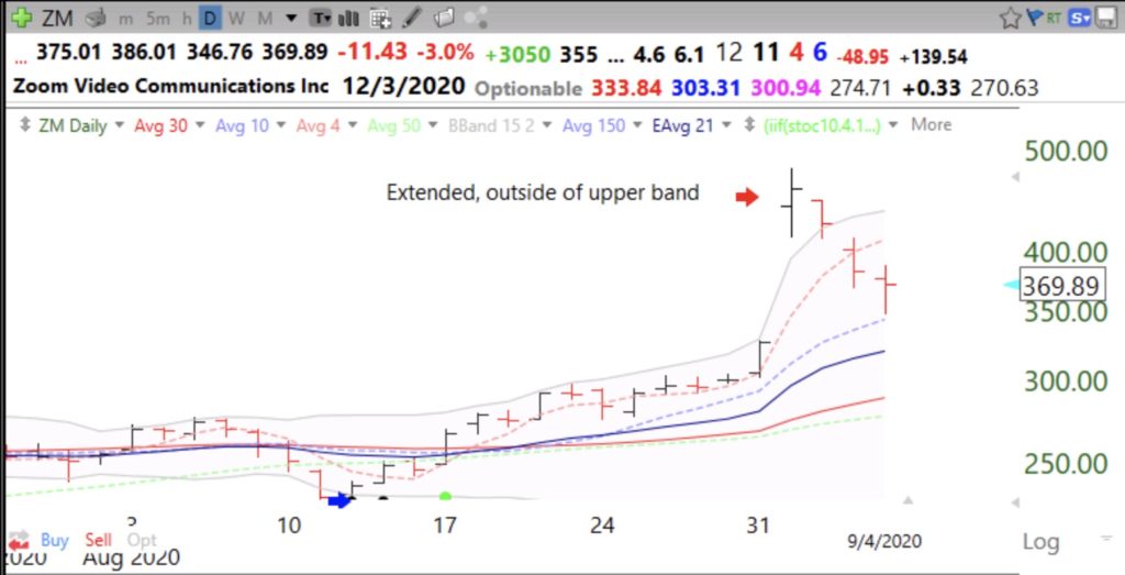
One more example, ZM. The large volume break above its upper band was a sign of ZM’s being extremely extended. I mentioned in a prior post that more than 50% of Nasdaq100 stocks had traded that day above their upper bands. The following day we had that large decline. Trading stocks without charts is like driving to a place for the first time without Waze!
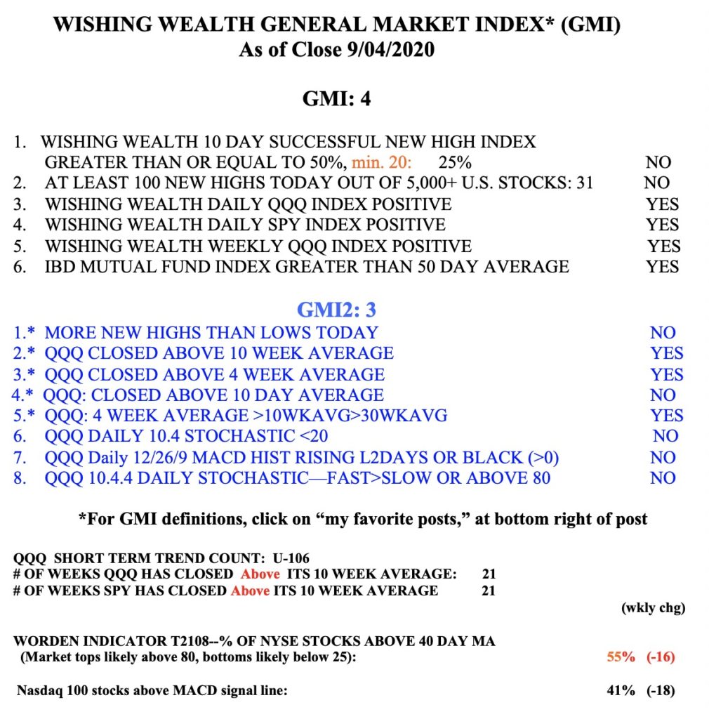
On Wednesday, 56% of the Nasdaq100 stocks traded above their upper BB. On Friday only 2% traded above their BB and 42% traded below their lower BB, suggesting to me at least a market bounce. Meanwhile my $QQQ short term indicator remains in an up-trend at day U-106. The GMI remains Green and is at 4 positives (of 6). The more sensitive GMI2 fell to 3 (of 8). Note there were more new lows than highs on Friday, for the first time since last May. In view of the extreme oversold condition of the market indexes and the many oversold stocks on Friday and the GMI on a Green signal, I have to say that last week may turn out to have been a rapid shake-out in the midst of a continuing up-trend. Enjoy the weekend!!!!!


Dear Dr. Wish, I am so happy to see that there might potentially be an online workshop! Cant wait to sign up!
Also looking forward to the possibility of an online workshop!
Thanks for the update of the market with stats resulting your conclusion! If I watch the news about the market and how quickly it failed last two sessions with its magnitude, it would appear we may be heading another V shape decline! I also would love to learn more about your class!
Dr Wish, Definitely interested in the online workshop. Will the workshops cover all the material your actual class would cover?
Dr. Wish,
I took your class in 2011 and still visit this site regularly. Glad to see it still being offered. It was definitely a fun and unique class.