Blog Post: Day 7 of $QQQ short term down-trend, likely to end Friday; 42 new US highs, 367 lows and 8 at ATHs; Two stocks I wrote about on Tuesday evening as having a GLB rocketed higher on Thursday to ATHs, $ANET, $CDNS, see daily charts

GMI1/6
GMI-26/9
T210822%

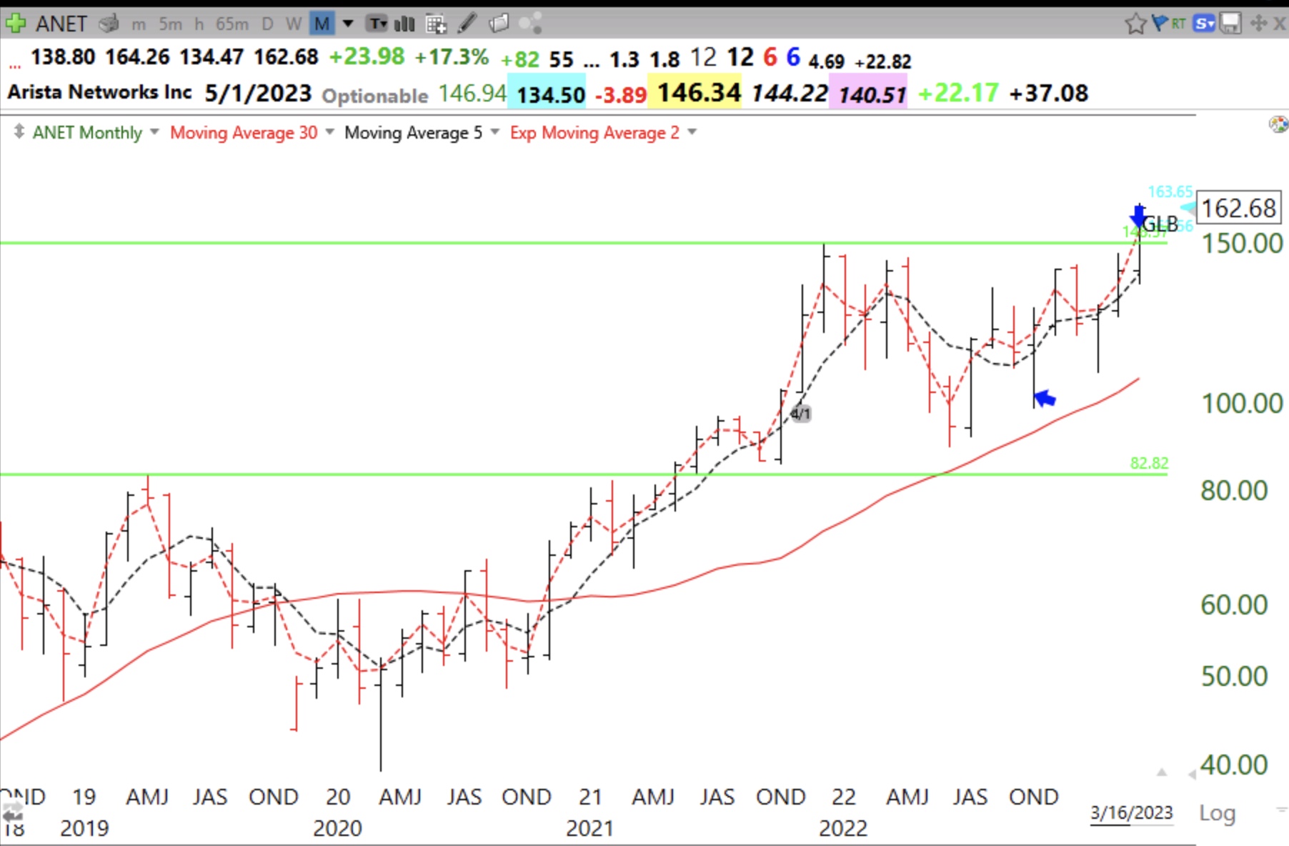
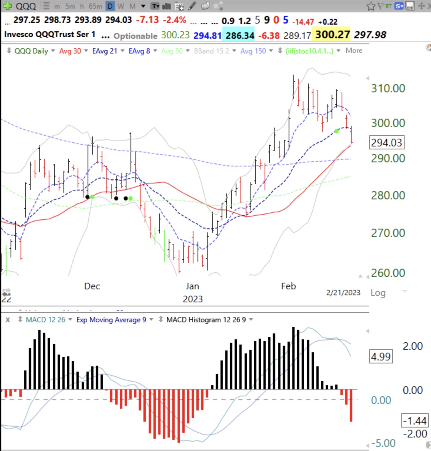
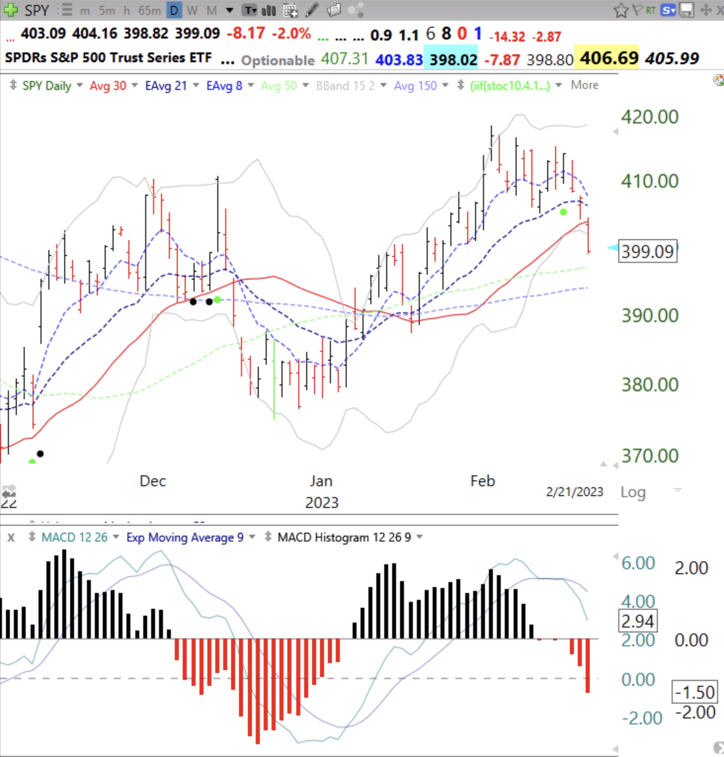
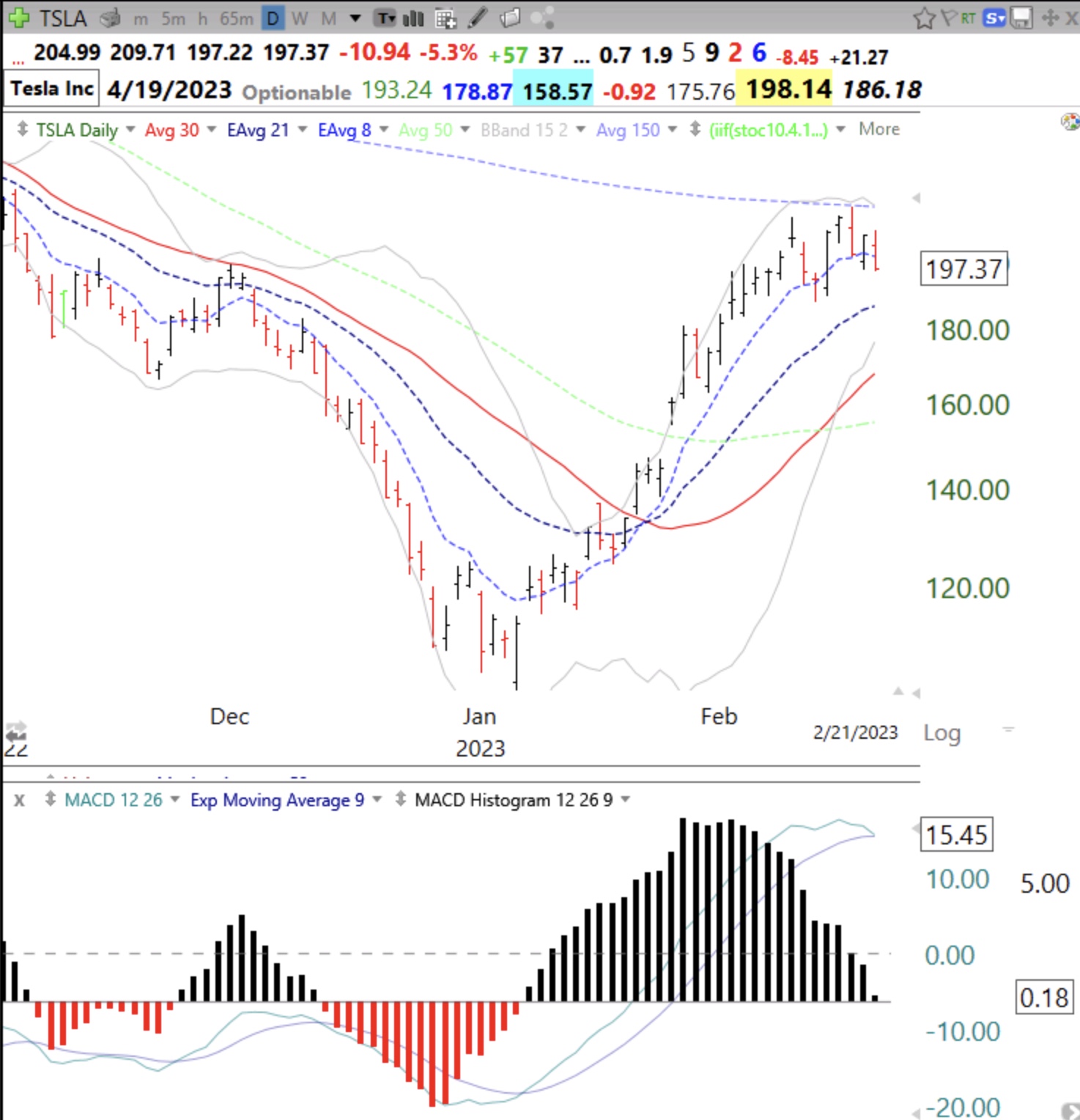
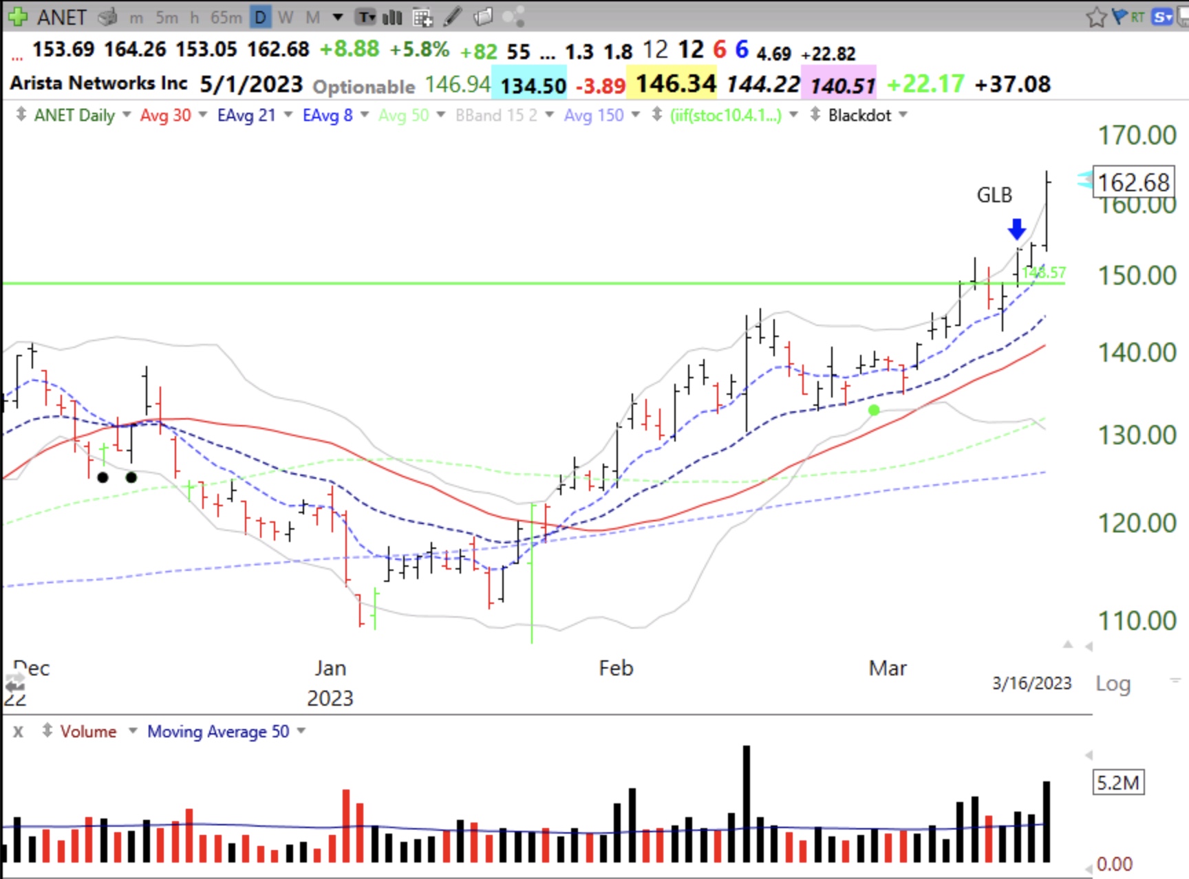
My Green Line Breakout (GLB) indicator is for me a great way to identify leading stocks. On a monthly chart I draw a horizontal green line on the top of the price bar that reached an all-time-high (ATH) that had not been surpassed for at least 3 months (3 bars). Think of it as a rocket that has climbed to a peak and then rested for at least 3 months. When the stock finally closes above the green line, a GLB, it can be the start of a major advance because the stock has overcome all of the selling by persons who had bought near the higher prior peak. I showed in my Trader Lion 2022 presentation that most of William O’Neil’s huge winners had begun with a GLB.  After a bear market, the number of stocks near an ATH are few. The last 5 days have had fewer than 10 out of more than 6,000 US stocks trading each day at ATHs. (I don’t count stocks under $20 or with negligible volume). Once the GLB occurs, hopefully on above average volume, if I bought, I sell if the stock CLOSEs below the green line. That is a failed GLB. If the stock retakes the green line the rise may resume and I may buy it back. See these daily charts for examples. CDNS had several GLBs which failed and then found support along the green line. ANET also had a failed GLB before taking off.

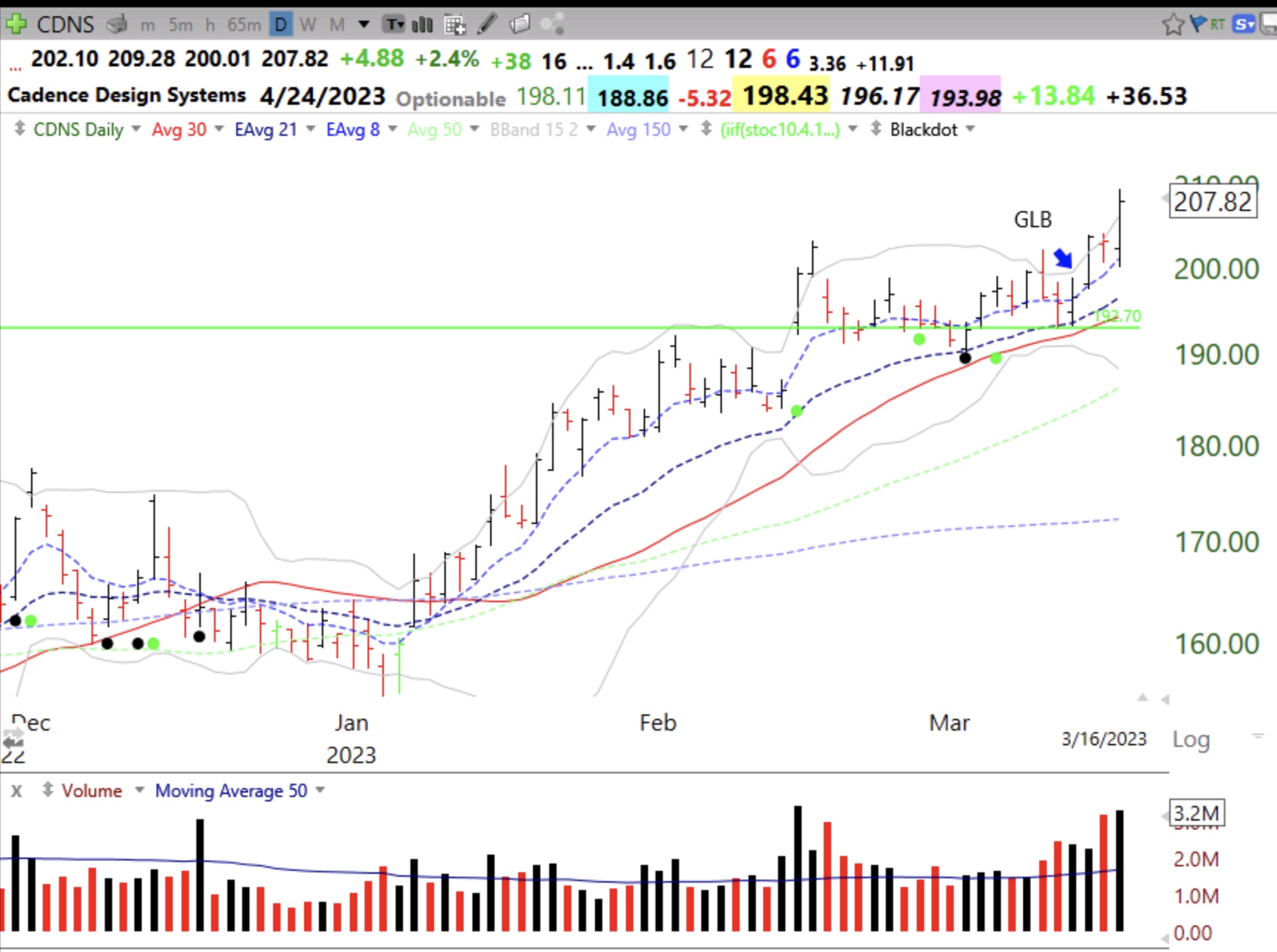
This monthly chart shows where I draw the green lines. Once I draw a green line I place an alert in TC2000 to tell me when the stock trades through it.


Blog Post: Day 4 of $QQQ short term down-trend; 129 new US highs, 181 lows; MACD histograms suggesting turn in GLD and UUP, see charts

GMI4/6
GMI-23/9
T210846%

The MACD histograms often show a change in trend before it is evident in the price. Look at how the histogram has been steadily rising as price declines=positive divergence.

In contrast, the dollar, UUP, is showing a negative divergence.

Gold rises as the dollar falls. Compare the two charts. As the value of the dollar declines, it takes more dollars to buy an ounce of gold.


Blog Post; 51 US new highs and 114 new lows; Indexes weakening and GMI falls to 3 (of 6); See rising short term rates indicator chart in a daily RWB up-trend, and see how I use MACD histograms to monitor turns in $QQQ, $SPY and $TSLA.

GMI3/6
GMI-22/9
T210852%

My QQQ short term trend indicator could turn down with a couple of more days of weakness in QQQ. The GMI could also flash RED. I am 95% cash in my trading account. With earnings season over, there is very little good news to propel stocks higher. There is often a post earnings season lull in the markets. And interest rates are rising. Look at this short term interest rate indicator. All of the shorter averages (red) are rising above the  longer term averages (blue) in a daily RWB up-trend.

MACD histograms are an interesting indicator I use to identify a likely change in the short term trend. They often move up or down before the change in trend is apparent in the prices.  You can more easily see the histograms gradually gaining or losing strength.  Check themselves out for yourself. The daily MACD histograms of QQQ have turned red, a sign of a developing down-trend. Note how they declined even when prices bounced up a few days ago.  I will watch for these histograms to start rising and to turn black again.

Here is SPY. Note how they rose at the recent bottom before they turned black.

And TSLA is about to turn red. Note how the red bars started to rise in early January before price got going, called positive or bullish divergence. (Thanks to my stock buddy, Judy, for teaching me how to interpret the MACD histogram indicator years ago.)